Importing Excel Data and Fitting a Curve to It
(Originally posted on Doug's MATLAB Video Tutorials blog.)
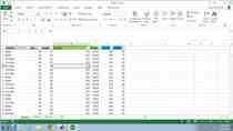
I recently got an e-mail from a MATLAB user that had a large dataset in Excel. They wanted to import the data and "take the average of the graph". It turns out that meant fitting a polynomial to the data. This three minute video covers the import of the data, finding the right combination of data to plot and then we fit a polynomial to it. Finally the graphic is cleaned up by changing the colors and line styles. All of this is done without having to write code or type a command. This video will be the most helpful for newer MATLAB users.
Recorded: 23 Sep 2008


