Comparison of the Merton Model Single-Point Approach to the Time-Series Approach
This example shows how to compare the Merton model approach, where equity volatility is provided, to the time series approach.
Load the data from MertonData.mat.
load MertonData.mat
Dates     = MertonDataTS.Dates;
Equity    = MertonDataTS.Equity;
Liability = MertonDataTS.Liability;
Rate      = MertonDataTS.Rate;
For a given data point in the returns, the corresponding equity volatility is computed from the last preceding 30 days.
Returns     = tick2ret(Equity);
DateReturns = Dates(2:end);
SampleSize  = length(Returns);

EstimationWindowSize = 30;
TestWindowStart      = EstimationWindowSize+1;
TestWindow           = (TestWindowStart : SampleSize)';

EquityVol = zeros(length(TestWindow),1);

for i = 1 : length(TestWindow)
    t = TestWindow(i);
    EstimationWindow = t-EstimationWindowSize:t-1;
    EquityVol(i) = sqrt(250)*std(Returns(EstimationWindow));
end
Compare the probabilities of default and the estimated asset and asset volatility values using the test window only.
[PDTS,DDTS,ATS,SaTS] = mertonByTimeSeries(Equity(TestWindow),Liability(TestWindow),Rate(TestWindow));

[PDh,DDh,Ah,Sah] = mertonmodel(Equity(TestWindow),EquityVol,Liability(TestWindow),Rate(TestWindow));

figure
plot(Dates(TestWindow),PDTS,Dates(TestWindow),PDh)
xlabel('Date')
ylabel('Probability of Default')
legend({'Time Series','With \sigma_E'},'Location','best')

The probabilities of default are essentially zero up to early 2016. At that point, both models start predicting positive default probabilities, but we observe some differences between the two models.
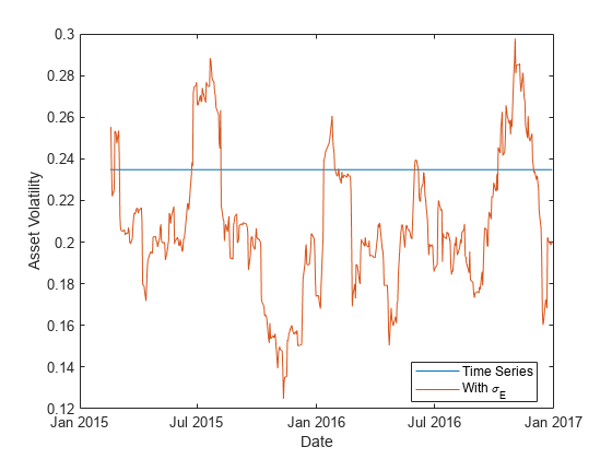
Both models calibrate asset values and asset volatilities. The asset values for both approaches match. However, the time-series method, by design, computes a single asset volatility for the entire time window, and the single-point version of the Merton model computes one volatility for each time period, as shown in the following figure.
figure
plot(Dates(TestWindow),SaTS*ones(size(TestWindow)),Dates(TestWindow),Sah)
xlabel('Date')
ylabel('Asset Volatility')
legend({'Time Series','With \sigma_E'},'Location','best')

Towards the end of the time window, the single-point probability of default is above the time-series probability of default when the single-point asset volatility is also above the time-series probability (and vice versa). However, before 2016 the volatility has no effect on the default probability. This means other factors must influence the sensitivity of the default probability to the asset volatility and the overall default probability level.
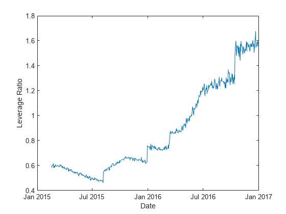
The firm's leverage ratio, defined as the ratio of liabilities to equity, is a key factor in understanding the default probability values in this example. Earlier in the time window, the leverage ratio is low. However, in the second half of the time window, the leverage ratio grows significantly as shown in the following figure.
Leverage = Liability(TestWindow)./Equity(TestWindow);

figure
plot(Dates(TestWindow),Leverage)
xlabel('Date')
ylabel('Leverage Ratio')

The following plot shows the default probability against the asset volatility for low and high leverage ratios. The leverage ratio is used to divide the points into two groups, depending on whether the leverage ratio is greater or smaller than a cut off value. In this example, a cut off value of 1 works well.
For low leverage, the probability of default is essentially zero, independently of the asset volatilities. For high leverage situations, such as the end of the time window, the probability of default is highly correlated with the asset volatility.
figure
subplot(2,1,1)
gscatter(Leverage,PDh,Leverage>1,'br','.*')
xlabel('Leverage')
ylabel('Probability of Default')
legend('Low Leverage','High Leverage','Location','northwest')
subplot(2,1,2)
gscatter(Sah,PDh,Leverage>1,'br','.*')
xlabel('Asset Volatility')
ylabel('Probability of Default')
legend('Low Leverage','High Leverage','Location','northwest')

See Also
mertonmodel | mertonByTimeSeries