Analyze Time Series Data
This example shows how to visualize and analyze time series data using a timeseries object and the regress function.
Air Passenger Data
First we create an array of monthly counts of airline passengers, measured in thousands, for the period January 1949 through December 1960.
%   1949 1950 1951 1952 1953 1954 1955 1956 1957 1958 1959 1960
y = [112  115  145  171  196  204  242  284  315  340  360  417    % Jan
     118  126  150  180  196  188  233  277  301  318  342  391    % Feb
     132  141  178  193  236  235  267  317  356  362  406  419    % Mar
     129  135  163  181  235  227  269  313  348  348  396  461    % Apr
     121  125  172  183  229  234  270  318  355  363  420  472    % May
     135  149  178  218  243  264  315  374  422  435  472  535    % Jun
     148  170  199  230  264  302  364  413  465  491  548  622    % Jul
     148  170  199  242  272  293  347  405  467  505  559  606    % Aug
     136  158  184  209  237  259  312  355  404  404  463  508    % Sep
     119  133  162  191  211  229  274  306  347  359  407  461    % Oct
     104  114  146  172  180  203  237  271  305  310  362  390    % Nov
     118  140  166  194  201  229  278  306  336  337  405  432 ]; % Dec
% Source:
% Hyndman, R.J., Time Series Data Library,
% http://www-personal.buseco.monash.edu.au/~hyndman/TSDL/.
% Copied in October, 2005.
Create Time Series Object
When we create a time series object, we can keep the time information along with the data values. We have monthly data, so we create an array of dates and use it along with the Y data to create the time series object.
yr = repmat((1949:1960),12,1);
mo = repmat((1:12)',1,12);
time = datestr(datenum(yr(:),mo(:),1));
ts = timeseries(y(:),time,'name','AirlinePassengers');
ts.TimeInfo.Format = 'dd-mmm-yyyy';
tscol = tscollection(ts);
plot(ts)
Examine Trend and Seasonality
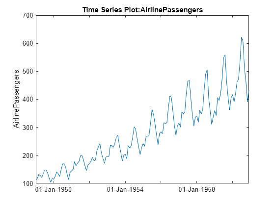
This series seems to have a strong seasonal component, with a trend that may be linear or quadratic. Furthermore, the magnitude of the seasonal variation increases as the general level increases. Perhaps a log transformation would make the seasonal variation be more constant. First we'll change the axis scale.
h_gca = gca;
h_gca.YScale = 'log';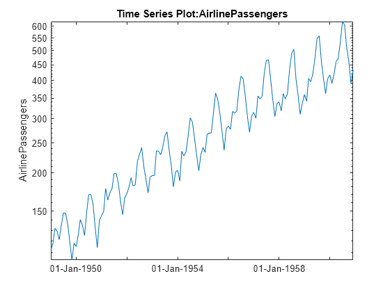
It appears that it would be easier to model the seasonal component on the log scale. We'll create a new time series with a log transformation.
tscol = addts(tscol,log(ts.data),'logAirlinePassengers');
logts = tscol.logAirlinePassengers;
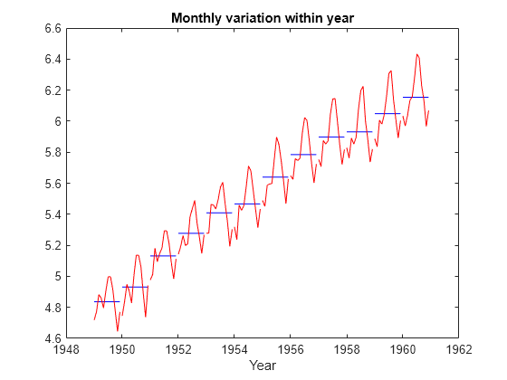
Now let's plot the yearly averages, with monthly deviations superimposed. We want to see if the month-to-month variation within years appears constant. For these manipulations treating the data as a matrix in a month-by-year format, it's more convenient to operate on the original data matrix.
t = reshape(datenum(time),12,12);
logy = log(y);
ymean = repmat(mean(logy),12,1);
ydiff = logy - ymean;
x = yr + (mo-1)/12;
plot(x,ymean,'b-',x,ymean+ydiff,'r-')
title('Monthly variation within year')
xlabel('Year')
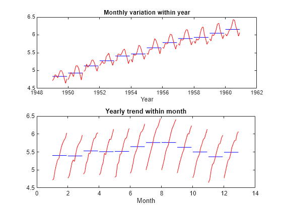
Now let's reverse the years and months, and try to see if the year-to-year trend is constant for each month.
h_gca = gca;
h_gca.Position = [0.13 0.58 0.78 0.34];
subplot(2,1,2);
t = reshape(datenum(time),12,12);
mmean = repmat(mean(logy,2),1,12);
mdiff = logy - mmean;
x = mo + (yr-min(yr(:)))/12;
plot(x',mmean','b-',x',(mmean+mdiff)','r-')
title('Yearly trend within month')
xlabel('Month')
Model Trend and Seasonality
Let's attempt to model this series as a linear trend plus a seasonal component.
subplot(1,1,1);
X = [dummyvar(mo(:)) logts.time];
[b,bint,resid] = regress(logts.data,X);
tscol = addts(tscol,X*b,'Fit1')
Time Series Collection Object: unnamed
Time vector characteristics
Start date 01-Jan-1949
End date 01-Dec-1960
Member Time Series Objects:
AirlinePassengers
logAirlinePassengers
Fit1
plot(logts)
hold on
plot(tscol.Fit1,'Color','r')
hold off
legend('Data','Fit','location','NW')
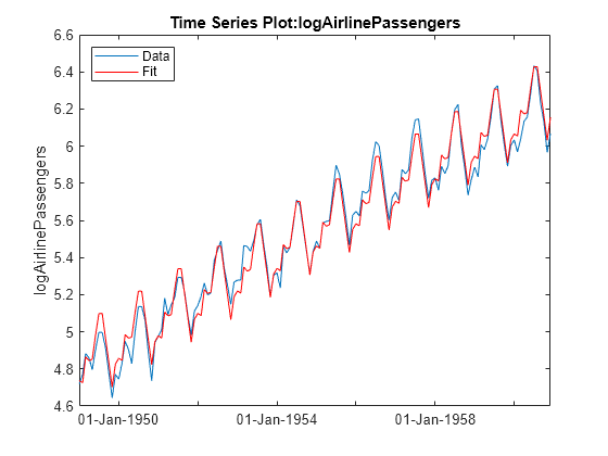
Based on this graph, the fit appears to be good. The differences between the actual data and the fitted values may well be small enough for our purposes.
But let's try to investigate this some more. We would like the residuals to look independent. If there is autocorrelation (correlation between adjacent residuals), then there may be an opportunity to model that and make our fit better. Let's create a time series from the residuals and plot it.
tscol = addts(tscol,resid,'Resid1');
plot(tscol.Resid1)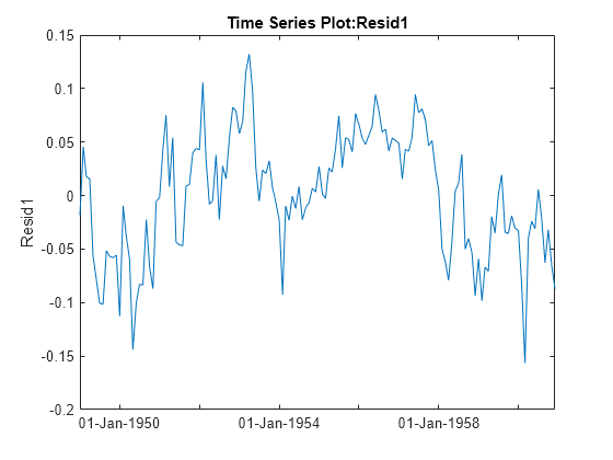
The residuals do not look independent. In fact, the correlation between adjacent residuals looks quite strong. We can test this formally using a Durbin-Watson test.
[p,dw] = dwtest(tscol.Resid1.data,X)
p =
7.7787e-30
dw =
0.4256
A low p-value for the Durbin-Watson statistic is an indication that the residuals are correlated across time. A typical cutoff for hypothesis tests is to decide that p<0.05 is significant. Here the very small p-value gives strong evidence that the residuals are correlated.
We can attempt to change the model to remove the autocorrelation. The general shape of the curve is high in the middle and low at the ends. This suggests that we should allow for a quadratic trend term. However, it also appears that autocorrelation will remain after we add this term. Let's try it.
X = [dummyvar(mo(:)) logts.time logts.time.^2];
[b2,bint,resid2] = regress(logts.data,X);
tscol = addts(tscol,resid2,'Resid2');
plot(tscol.Resid2)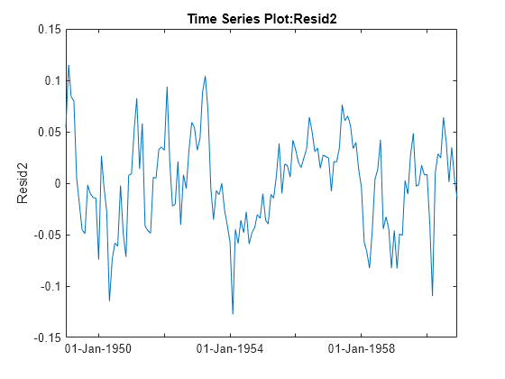
[p,dw] = dwtest(tscol.Resid2.data,X)
p =
8.7866e-20
dw =
0.6487
Adding the squared term did remove the pronounced curvature in the original residual plot, but both the plot and the new Durbin-Watson test show that there is still significant correlation in the residuals.
Autocorrelation like this could be the result of other causes that are not captured in our X variable. Perhaps we could collect other data that would help us improve our model and reduce the correlation. In the absence of other data, we might simply add another parameter to the model to represent the autocorrelation. Let's do that, removing the squared term, and using an autoregressive model for the error.
In an autoregressive process, we have two stages:
   Y(t) = X(t,:)*b + r(t)       % regression model for original data
   r(t) = rho * r(t-1) + u(t)   % autoregressive model for residuals
Unlike in the usual regression model when we would like the residual series r(t) to be a set of independent values, this model allows the residuals to follow an autoregressive model with its own error term u(t) that consists of independent values.
To create this model, we want to write an anonymous function f to compute fitted values Yfit, so that Y-Yfit gives the u values:
Yfit(t) = rho*Y(t-1) + (X(t,:) - rho*X(t-1,:))*b
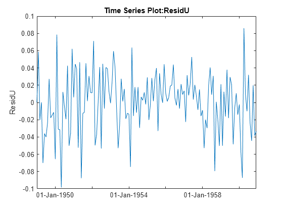
In this anonymous function we combine [rho; b] into a single parameter vector c. The resulting residuals look much closer to an uncorrelated series.
r = corr(resid(1:end-1),resid(2:end));  % initial guess for rho
X = [dummyvar(mo(:)) logts.time];
Y = logts.data;
f = @(c,x) [Y(1); c(1)*Y(1:end-1) + (x(2:end,:)- c(1)*x(1:end-1,:))*c(2:end)];
c = nlinfit(X,Y,f,[r; b]);

u = Y - f(c,X);
tscol = addts(tscol,u,'ResidU');
plot(tscol.ResidU);
Summary
This example provides an illustration of how to use the MATLAB® time series object along with features from the Statistics and Machine Learning Toolbox™. It is simple to use the ts.data notation to extract the data and supply it as input to any function. The controlchart function also accepts time series objects directly.
More elaborate analyses are possible by using features specifically designed for time series, such as those in Econometrics Toolbox™ and System Identification Toolbox™.