Exploring Risk Contagion Using Graph Theory and Markov Chains
By Ken Deeley, MathWorks
Recent financial crises and periods of market volatility have heightened awareness of risk contagion and systemic risk among financial analysts. As a result, financial professionals are often tasked with constructing and analyzing models that will yield insight into the potential impact of risk on investments, portfolios, and business operations.
Several authors have described the use of advanced mathematical and statistical techniques for quantifying the dependent relationships between investments, foreign exchange rates, industrial sectors, or geographical regions [1]-[7]. Bridging the gap between formal methods and a working code implementation is a key challenge for analysts.
This article shows how MATLAB® can be used to analyze aspects of risk contagion using various mathematical tools. Topics covered include:
- Data aggregation, preprocessing, and risk benchmarking
- Quantifying dependent relationships between financial variables
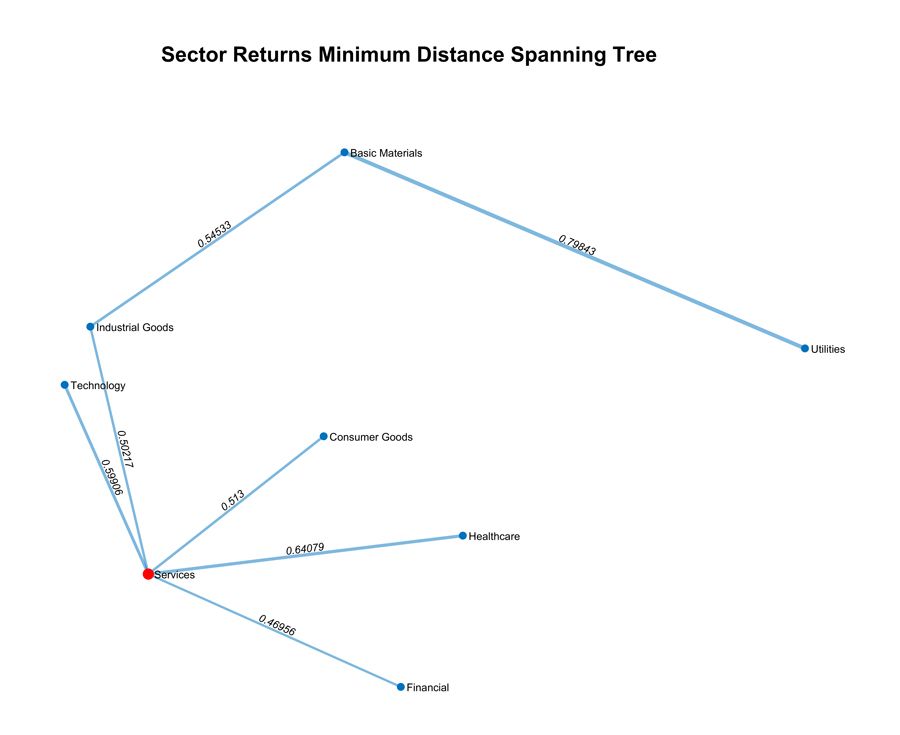
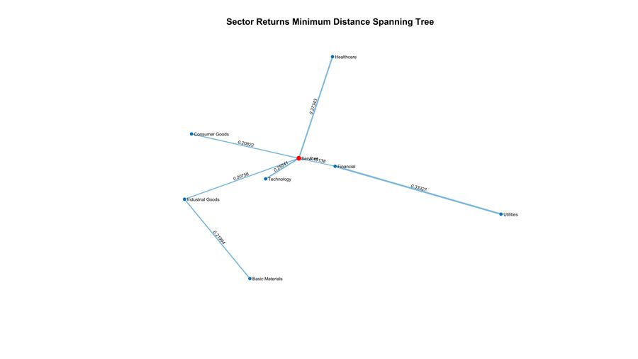
- Visualizing the resulting network of dependencies together with proximity information (Figure 1)
- Analyzing periods of risk contagion using hidden Markov models
Download the MATLAB live script of this article for interactive access to all the images, equations, and code. The live script contains all the code, output, equations, and images in the article. You can download the script, open it in MATLAB, and explore the steps in the analysis described in the article.
R2016a or above is required to use the MATLAB Live Editor. If you don’t have R2016a, you can download a free trial.
Learn more about the MATLAB Live Editor.
Data Aggregation and Preprocessing
We start with a collection of mid-cap security prices from various countries recorded over the period January 2008–December 2013. Each security comes with associated metadata such as market capitalization, industrial sector, and country. In this article we will be analysing the contagion between different sectors, but it is easy to study alternative groupings – for example, country of origin. We use the normalized market capitalizations to define individual security weights and then aggregate all securities from each sector using a weighted sum. The result is the benchmark price series shown in Figure 2.
Correlation Analysis
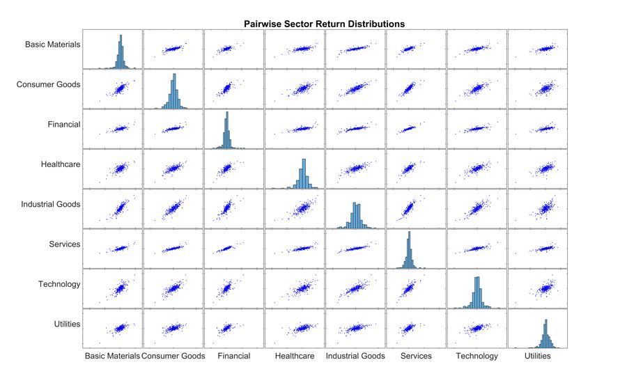
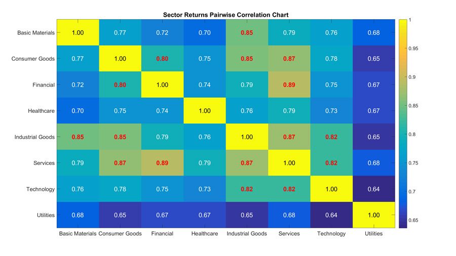
One of the simplest ways to study dependencies between variables is to compute the correlation matrix of the data. Using the MATLAB plotmatrix function and the Statistics and Machine Learning Toolbox™ corr function, we can create informative visualizations that indicate the pairwise relationships present in the sector return series data. Examples of these charts are shown in Figure 3 and Figure 4.
The off-diagonal elements in Figure 3 show the pairwise joint distributions, and the diagonal shows the marginal distributions of each variable on a histogram. Figure 4 quantifies the relative strength of the pairwise linear relationships shown in Figure 3 by illustrating the pairwise correlation coefficients between the industrial sector returns. To investigate more general monotonic relationships between variables, we could compute Kendall’s tau or Spearman’s rho coefficient using the corr function.
Visualizing Dependencies Using Graph Theory
It can be difficult to gain insight into risk contagion directly from a correlation matrix. Applying graph theory is an effective technique for quantifying and visualizing the proximity of variables. To measure proximity, we convert correlation coefficients into distances using a mapping such as \(f(C) = 1 - C\) or \(f(C) = \sqrt{2(1 - C)}\)
Assigning the industrial sectors to the nodes of a network, we then join up the nodes via edges with lengths given by the correlation distance. In [1] and [2], the authors compute the minimum spanning tree (MST) of this graph. The MST is a subgraph connecting all nodes in which the total edge length is minimized. In this context, we can think of the MST as the “backbone” network encapsulating the dependencies between sectors. In MATLAB we can use the graph and minspantree functions to compute the MST directly:
G = graph(sectorDist, sectors);
T = minspantree(G);
Here, sectorDist is the correlation distance matrix and sectors is a cell array containing the sector names.
There are several options for visualizing the resulting MST. The simplest approach is to use the graph plot function directly on the tree. An alternative approach providing a 2D representation [1] is to use nonlinear multi-dimensional scaling on the distance matrix via the Sammon mapping:
coords = mdscale(sectorDist, 3, 'Criterion', 'Sammon');
To create a 2D visualization, we pass the resulting array of Euclidean coordinates coords to the graph class plot method:
plot(T, 'XData', coords(:, 1), 'YData', coords(:, 2))
When combined with some simple plot settings, this approach allows us to create the visualization shown in Figure 1. We assess the quality of the graph embedding by creating a Shepard plot (Figure 5). If the scattered points do not deviate substantially from the reference line, then we have a good quality embedding.
Assessing Sector Importance Using Graph Centrality Measures
Representing the data in graph form helps us to quantify relationships between variables. Since mathematical graphs intrinsically provide measures of node significance, we can assess sector importance by computing these quantities. We use the centrality method associated with graph objects:
incidence = centrality(T, 'degree');
closeness = centrality(T, 'closeness', 'Cost', edgeWeights);
betweenness = centrality(T, 'betweenness', 'Cost', edgeWeights);
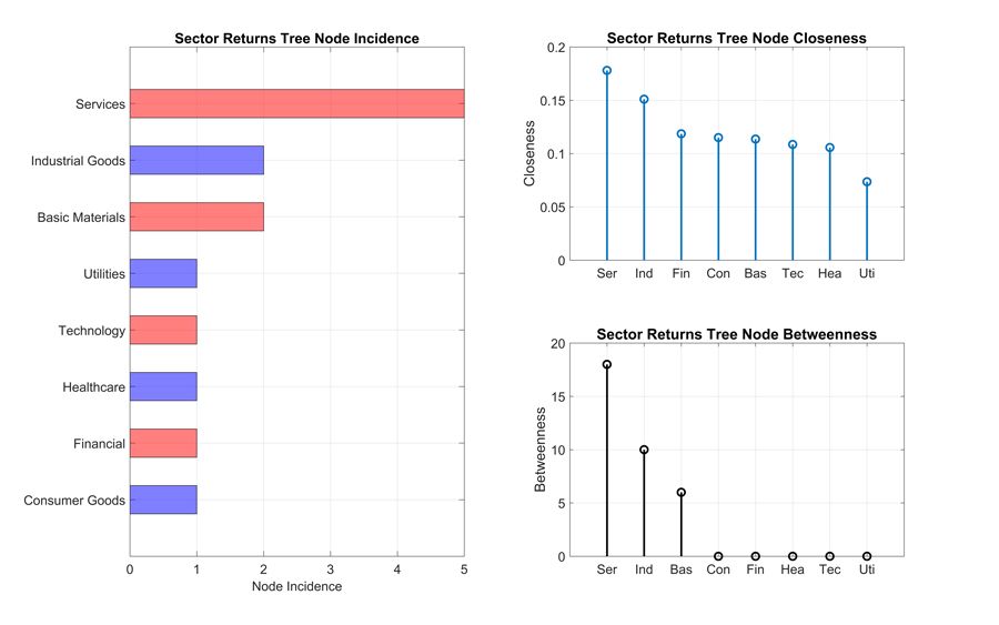
The incidence of a node counts the number of edges adjoining that node, whereas the closeness is the reciprocal of the sum of the distances from the node to all other nodes. A high closeness value therefore implies that the node is central, or important. Similarly, the betweenness of a node measures how often that node appears on a shortest path between two other nodes in the graph. A high betweenness value implies that the node is important.
Computing these measures for the MST above produces the results shown in Figure 6. We see that the services sector has the highest values for all measures. The central services node is highlighted in red in Figure 1.
Visualizing Risk Contagion via Rolling Windows
The analysis described in the previous section uses the full data set from 2008–2013. It is common in risk models to perform analysis in a rolling window so as to assess dynamic changes in variables of interest. To implement the previous analysis in sequential six-month rolling windows, we use a for-loop to increment the start date for each window.
The graphics from this process can be captured in a video file using the VideoWriter class, showing the incidence of highly correlated (> 0.80) sector pairs over time (Figure 7).
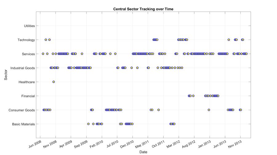
Figure 8 shows the variation in the central sector over time. We note that the services, industrial goods, and consumer goods sectors have high importance throughout this period.
Quantifying Dependencies with Alternative Distance Metrics
Although correlation is simple to interpret and compute, it may not describe the complex nature of dependencies between financial variables completely. In [5], the author uses a metric based on the statistical concepts of entropy and mutual information theory. If \(f_X\) is the probability density function of a random variable \(X\), then the entropy of \(X\) is
\[H_X = - \int f_X(x)\log f_X(x)\mathrm{d}x\]
We can think of the entropy as a measure of the disorder, or randomness, of the variable. A high entropy indicates a high degree of disorder. Similarly, if we have two random variables \(X\) and \(Y\) with joint density \(f_{X,Y}\), then the mutual entropy of \(X\) and \(Y\) is
\[H_{X,Y} = - \iint f_{X,Y}(x,y) \log f_{X,Y}(x,y) \mathrm{d}x\mathrm{d}y\]
The mutual information content of \(X\) and \(Y\) is defined as
\[I_{X,Y} = H_X + H_Y - H_{X,Y}\]
Mutual information can be converted into a distance using the formula
\[d_{X,Y} = 1 - \sqrt{1 - e^{2I_{X,Y}}}\]
Note that the maximum distance is one. This result is only achieved if the mutual information content of \(X\) and \(Y\) is zero, which, in turn, only occurs if \(X\) and \(Y\) are independent [5]. If \(X\) and \(Y\) are closely related, then their mutual information content is large, and consequently, the distance is close to zero.
We can estimate the joint density of two random variables in MATLAB using the Statistics and Machine Learning Toolbox function ksdensity. This technique has the advantage of avoiding any distributional assumptions on the data.
Assuming that \(X\) and \(Y\) are the return series for two sectors, sample code for computing \(H_{X,Y}\) is as follows:
x = linspace(min(X), max(X), 250);
y = linspace(min(Y), max(Y), 250);
[Xgrid, Ygrid] = meshgrid(x, y);
pts = [Xgrid(:), Ygrid(:)];
fXY = ksdensity([X, Y], pts);
fXY = reshape(fXY, size(Xgrid));
integrandXY = fXY .* log(fXY);
integrandXY(isnan(integrandXY)) = 0;
HXY = - trapz(y, trapz(x, integrandXY, 2));
This code estimates the joint density of \(X\) and \(Y\) over a 250x250 lattice and then computes the double integral defining \(H_{X,Y}\) using the trapz function to perform numerical trapezoidal integration. Some NaN values occur in the integrand if the estimated values for \(f_{X,Y}\) are zero. We will set these to zero before integrating.
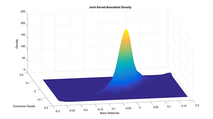
Figure 9 shows the estimated joint density for the first two sectors, basic materials and consumer goods.
We use a similar approach to estimate \(H_X\) and \(H_Y\), and then compute the information distance \(d_{X,Y}\). Estimating the joint density function over a fine lattice can be a time-consuming process, so we use the parfor construct in Parallel Computing Toolbox™ to estimate the pairwise distance matrix in parallel, which requires nSector(nSectors-1)/2 distinct distances to be computed. Figure 10 shows the resulting MST computed using the information distance metric. Consistently with the previous analysis, the central sector is services, highlighted in red in Figure 10.
Modeling Risk Contagion Using Hidden Markov Models
When moving from descriptive analysis to modeling, several authors use statistical techniques such as hidden Markov models (see, for example, [6]). Returning to the rolling window analysis, we view the number of highly correlated sector pairs as a basic proxy for the level of risk contagion present in the market.
For simplicity, we’ll assume that three latent, unobserved risk contagion levels, which we name “low”, “medium”, and “high” make up the states of a hidden Markov chain. We take the observed emissions sequence from the Markov chain to be the number of highly correlated sector pairs, which can range from 0 to 28.
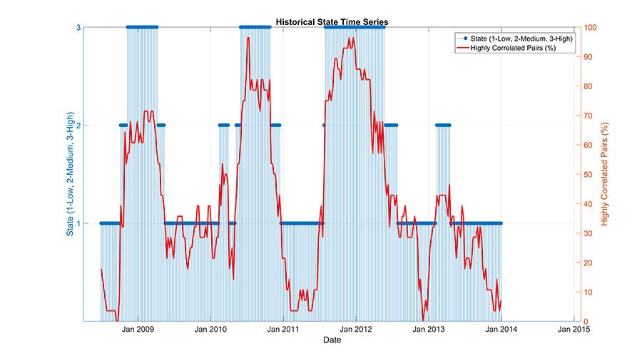
Figure 11 shows the observed data over the time period 2008–2013. We see that there are several periods of high contagion, and that high contagion appears to dissipate at different rates. The lower chart shows the sequence of emission transitions – that is, the differences in the numbers of highly correlated pairs from one window to the next.
Statistics and Machine Learning Toolbox provides a framework for constructing hidden Markov models. To estimate the state and emission transition matrices, we use the hmmtrain function, providing initial guesses TR and EM for the unknown matrices:
[estTR, estEM] = hmmtrain(emissions, TR, EM);
To check the robustness of the estimated matrices, we could cross-validate on subsets of the emissions vector to make sure that the algorithm converges to the same matrices. Figure 12 shows the Markov chain obtained from the data visualized in Figure 11. Table 1 shows that there are high probabilities of remaining in the same state, and small but non-trivial probabilities of transitioning by one level up or down. There is a negligible chance of transitioning two levels up or down in one step.
| State | Low | Medium | High |
|---|---|---|---|
| Low | 0.964 | 0.036 | 0.000 |
| Medium | 0.107 | 0.833 | 0.060 |
| High | 0.000 | 0.035 | 0.965 |
Table 1. Markov chain transition probabilities computed using hmmtrain.
The hmmviterbi function retrospectively estimates the most likely sequence of states:
states = hmmviterbi(emissions, estTR, estEM, …
 'Statenames', {'Low', 'Medium', 'High'}).';
We also compute the posterior state probabilities using hmmdecode:
pstates = hmmdecode(emissions, estTR, estEM).';
The tabulated results provide insight into the market conditions over the historical period (Figure 13). The second column contains the output state from hmmviterbi, and columns 3-5 contain the posterior state probabilities from hmmdecode. Similarly, we gain insight into the efficacy of this model by comparing the likely states with the observed market data (Figure 14).

Summary and Next Steps
Understanding systemic risk requires careful modeling and analysis. In this article we implemented techniques for quantifying proximity between financial variables, including correlation and information distance. We have seen how to visualize proximity information using graph theory. Quantifying and visualizing relationships between variables is important at the exploratory stage of data analysis. Moving to the modeling stage, we created a simple model for risk contagion by fitting a hidden Markov model to the observed data.
To extend the techniques described in this article and include other aspects of systemic risk in our analysis, we could make use of advanced models available in other MATLAB toolboxes, including:
- Time-series and state-space models (in Econometrics Toolbox™)
- Market and credit risk models (in Financial Toolbox™)
- Instrument pricing functionality (in Financial Instruments Toolbox™)
Published 2016 - 92983v00
References
-
Resovsky, Marcel, Denis Horvath, Vladimir Gazda, and Marianna Sinicakova, “Minimum Spanning Tree Application in the Currency Market”, Currency Market, 7/2013 https://www.nbs.sk/_img/documents/_publik_nbs_fsr/biatec/rok2013/07-2013/05_biatec13-7_resovsky_en.pdf
-
McDoland, Mark, Omer Suleman, Stacy Williams, Sam Howison, and Neil F. Johnson, “Detecting a Currency’s Dominance or Dependence using Foreign Exchange Network Trees”, https://arxiv.org/abs/cond-mat/0412411
-
Ouyang, Hong-bing and Xiao-dong Liu, An Analysis of the Systemic Importance and Systemic Risk Contagion Mechanism of China's Financial Institutions Based on Network Analysis, Hong-bing Ouyang, Xiao-dong Liu, CMS, 2015,V23(10): 30-37
-
Lori, Giulia, Giulia de Masi, Ovidiu V. Precup, Giampaolo Gabbi, and Guido Caldarelli, “A Network Analysis of the Italian Overnight Money Market”, Department of Economics, Discussion Paper Series, No. 05/05 https://www.citystgeorges.ac.uk/__data/assets/pdf_file/0017/90260/0505_iori-et-al.pdf
-
Kaya,Hakan, “Eccentricity in asset management”,The Journal of Network Theory in Finance, Volume 1, Number 1 (https://www.jbs.cam.ac.uk/centres/risk/)
-
Staum,Jeremy C., and Ming Liu Staum,”Systemic Risk Components in a Network Model of Contagion”, January 2012. Available at SSRN: https://ssrn.com/abstract=1726107
-
Bisias, Dimitrios, Mark Flood, Andrew W. Lo, and Stavros Valavanis, “A Survey of Systemic Risk Analytics”, Office of Financial Research, Working Paper #0001, January 5th 2012 https://www.financialresearch.gov/working-papers/files/OFRwp0001_BisiasFloodLoValavanis_ASurveyOfSystemicRiskAnalytics.pdf
