How to Import Excel Data into MATLAB
Learn how to import Excel® data into MATLAB® with just a few clicks. In this video, you will learn how to use the Import tool to import data as a variable, and you will see how to create a function to import multiple sets of data. You can apply this approach to .csv files, text files, and other data files. You will also learn how to use the Plots tab to create plots from this data directly from the workspace.
Published: 18 Jan 2020
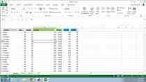
Hi everyone. Today I will be showing you how to import Excel data into MATLAB without writing any code. This is very useful when you have to do analysis on data but don’t want to spend the time learning the functions to import that data or if you have multiple Excel files you need to import but don’t want to import each one individually. But first, let’s look at the data I’m going to be using in this video. Here I have data on cars manufactured from 1970 to 1982 with headers and multiple columns containing details about the cars.
To import this data let’s start by opening the import tool. You can do this by clicking the Import Data icon under the Home tab and navigating to the Excel file you that want to import. But I like to simply double-click on the file from the current folder directory.
With the Import tool open you can select data by left clicking and dragging the data that you want. You can see that the range field is updated as I do this. But I’m just going to use the initial selection range. What’s great about this is that MATLAB automatically leaves out the headers in the selection. But we can see that the columns will be named when we import the data.
With our data selected, we simply press this green check mark to import it. We’ll then get this notification saying the data was imported properly. By default, data is imported as a table. If you would like to change this, go to the drop-down under output type. Column vectors are probably what most of you are used to so let's import this as well. This time in the notification we can see that multiple variables are imported. This is because when we import the data as column vectors each column of data is stored into an individual variable.
Some of you might be wondering why some of the cells are highlighted this tan color instead of blue. This is because they are classified as an unimportable cell. In this case it’s because there is no data in the cell. Up here under the unimportable cells section we can see that these cells will be imported as a NaN or Not a Number. NaNs are MATLAB’s way of representing values that are not real or complex numbers. You could change these cells to import as number if you would like but we’re not going to need to do that in this video. Switching back to MATLAB we can see the data that we imported.
But what if you have multiple Excel files of data such as lab results from several different tests but you don’t want to open up the Import tool each time to import each set of data? To solve this, we can generate a function to import each data set for us. To do this let’s go back to the Import tool. Right under the green check mark where we imported the data, we click the drop-down. From this you can see that we can also generate scripts and live scripts but let’s select the generate function option.
This will pull up a new function in MATLAB. In the function we can see all the code that we were saved from writing. I enjoy using this feature because all the code is commented, which makes it easy to edit and incorporate into any other scripts that I’m writing. If we want to use this function, we just have to save the function and then call it using the file we want to import. I’m going to import a different set of car data using the function I just generated.
With that, you know everything you need to know to get started with the Import tool. With the data imported, I’m going to show you some visualization you can do with it. And once again without writing any code.
Say we want to determine if there is any correlation between horsepower and MPG. We can do this by creating a scatter plot. To do this I will select the two variables, go to the Plot tab and then select scatter plot. We can even try other plots to see if another one makes more sense, with the click of a button. We can even create more interesting plots such as a box plot to show the variance of MPG by country.
But if you really want to impress your friends, try creating a word cloud to visually show the manufacturers in the data set. The bigger the name the more of that manufacturer’s cars were in the data set. What’s great about making plots this way is the code for the plot is shown in the command window so you can incorporate it into your scripts with no problem.
With that, that completes my video. For more information regarding content in this video, check out the links in description. Thanks for watching.


