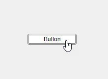
Create Custom Button with Hover Effect Using HTML
This example shows how to create a custom button component with a hover effect in App Designer by using an HTML UI component. For more information about custom UI components, see Create a Simple Custom UI Component in App Designer.

App creators can add this button to their apps and customize its appearance and behavior. The component interface consists of:
Public properties
TextColorandTextto customize the button appearancePublic callback
ButtonPushedFcnthat executes when an app user pushes the button in an app
The HoverButton component appearance and hover effect are defined using HTML in the Button.html source file. The component interface and behavior, including its public properties and callback, are defined in the HoverButton.mlapp file in App Designer.
The underlying component in the HoverButton.mlapp file is an HTML UI component with its HTMLSource property specified as the Button.html file. The two files communicate with each other using the Data property and DataChanged event, which are synchronized between the HTML UI component in MATLAB® and the htmlComponent JavaScript® object in the HTML source file.
To verify the custom component behavior, create a HoverButton object programmatically in the MATLAB Command Window. Modify the default button text by specifying the Text property as a name-value argument. Hover over the button to see the hover effect.
comp = HoverButton(Text="Click me");

Update the button color to black and the font color to white.
comp.BackgroundColor = "black";
comp.TextColor = "white";

Create a callback function that displays text in the Command Window when a user pushes the button.
comp.ButtonPushedFcn = @(src,event)disp("Button pushed");
Click the button. The text "Button pushed" displays.