在 App 设计工具的设计视图中布局 App
App 设计工具中的设计视图提供了丰富的布局工具,用于设计具有专业外观的现代化应用程序。它还提供了一个包含很多 UI 组件的库,以便您创建各种交互式功能。您在设计视图中所做的任何更改都会自动反映在代码视图中。因此,您可以在不编写任何代码的情况下配置 App 的许多方面。
要在您的 App 中添加组件,请使用以下方法之一:
从组件库中拖动一个组件,并将其放到画布上。
点击组件库中的一个组件,然后将光标移到画布上。光标变为十字准线。点击鼠标将组件以默认大小添加到画布中,或在添加组件时点击并拖动以调整其大小。某些组件只能以其默认大小添加。

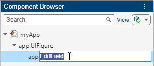
将组件添加到画布后,组件的名称会出现在组件浏览器中。您可以在画布或组件浏览器中选择组件。选择操作会在这两个位置同时发生。

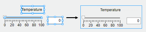
当您将某些组件(如编辑字段和滑块)拖到画布上时,系统会通过一个标签将它们组合在一起。
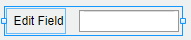
默认情况下,这些标签不会出现在组件浏览器中,但您可以通过在组件浏览器中的任意位置右键点击并选择在组件浏览器中包含组件标签来将它们添加到列表中。如果不希望组件有标签,可以在将组件拖到画布上时按住 Ctrl 键,这样就不会包含标签。如果您要在没有标签的组件上添加标签,请右键点击该组件并选择添加标签。
如果组件有标签,并且您更改了标签文本,则组件浏览器中组件的名称会更改以匹配该文本。您可以通过双击组件并键入新名称来自定义组件的名称。
自定义组件
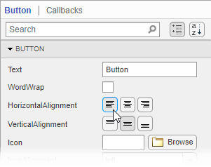
您可以通过选择组件,然后在组件浏览器的组件选项卡中编辑组件的属性来自定义其外观。例如,您可以从按钮选项卡更改按钮上显示的文本的对齐方式。
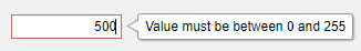
某些属性可控制组件的行为。例如,您可以通过更改 Limits 属性来更改数值编辑字段接受的值的范围。

当 App 运行时,编辑字段只接受该范围内的值。
通过双击组件可以直接在画布中编辑某些属性。例如,您可以通过双击按钮标签并键入所需的文本来编辑它。要添加多行文本,请按住 Shift 键,然后按 Enter。
对齐和间隔组件
在设计视图中,您可以通过在画布上拖动组件来排列组件和调整组件大小,也可以使用工具条的画布选项卡中提供的工具。
App 设计工具提供对齐提示,以帮助您在画布中拖动组件时对齐组件。穿过多个组件中心的橙色点线表示组件的中心是对齐的。边上的橙色实线表示边对齐。垂直线表示一个组件位于其父容器的中心。

除了在画布上拖动组件之外,您还可以使用工具条的对齐部分中的工具来对齐组件。
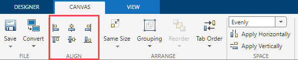
当您使用对齐工具时,所选组件将与定位点组件对齐。定位点组件是最后选择的组件,它的选择边框比其他组件的选择框粗。要选择不同定位点,请按住 Ctrl 或 Shift 键,然后点击所需的组件两次(一次用于取消选择组件,第二次用于再次选择组件)。例如,在下图中,格式选项标签是定位点。点击左对齐  按钮会将下拉列表和复选框的左边缘与标签的左边缘对齐。
您可以使用工具条的间距部分中的工具来控制相邻组件之间的间距。选择三个或更多个组件,然后从工具条的间距部分的下拉列表中选择一个选项。如果选择均匀选项,会在组件占用的空间内均匀分配空间。如果选择 20 选项,会使组件之间间隔 20 个像素。如果要自定义组件之间的像素数,请在下拉列表中键入数字。
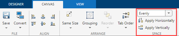
接下来,点击水平应用  或垂直应用
或垂直应用  。例如,选择均匀,然后点击垂直应用 ,会在一组垂直堆叠的组件中分配空间。
组件分组
您可以将两个或多个组件组合在一起,将它们作为单一单元进行修改。例如,您可以在最终确定一组组件的相对位置后对其进行组合,以便在不更改其关系的情况下移动它们。
要组合多个组件,请在画布中选择这些组件,然后在工具条的排列部分中选择组合 > 组合。
组合工具还提供适用于下列常见任务的功能:
对组中的所有组件取消组合 - 选择组。然后选择组合 > 取消组合。
向组中添加组件 - 选择组件和组。然后选择组合 > 添加到组。
从组中删除组件 - 选择组件。然后选择组合 > 从组中删除。
对组件重新排序
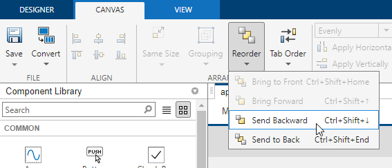
您可以使用设计视图中的重新排序工具来更改组件堆叠的顺序。
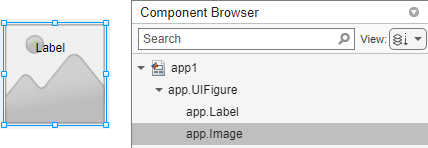
例如,创建一个标签,然后创建一个图像。默认情况下,图像显示在标签的上方。组件浏览器的默认视图根据组件的堆叠顺序显示组件,首先显示图像,因为它位于上方,然后显示标签。
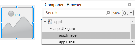
要对组件重新排序,使标签位于图像的上方,请在画布上选择图像,然后在工具条中选择重新排序。您也可以右键点击图像并选择重新排序工具。选择下移一层以将图像下移一层。
图像现在位于标签后面。当您对组件重新排序时,组件浏览器中组件的顺序也会更改。
修改组件的 Tab 键焦点切换顺序
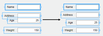
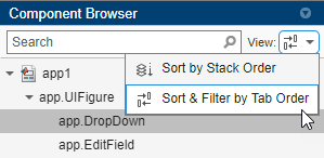
当用户运行您的 App 时,他们可以使用 Tab 键在 App 组件之间导航。要查看在用户按下 Tab 键时组件进入焦点的顺序,请在组件浏览器中展开视图下拉列表,并选择按 Tab 键切换顺序排序和过滤。组件浏览器仅列出 App 中可获得焦点的组件,按焦点跳转顺序排列。您可以通过在组件浏览器中点击并拖动组件名称来更改组件的 Tab 键切换顺序。
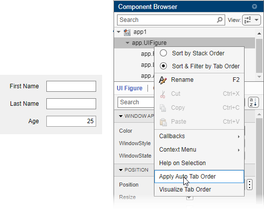
App 设计工具也可以自动为组件应用先从左到右再从上到下的 Tab 键焦点切换顺序。在组件浏览器中右键点击容器的名称,然后选择应用自动 Tab 键切换顺序。例如,下面所示的 App 具有一组编辑字段,用于用户输入他们的名字、姓氏和年龄,可右键点击组件浏览器中的 app.UIFigure 节点,并应用自动 Tab 键切换顺序。当用户运行该 App 时,他们可以使用 Tab 键在编辑字段之间导航,并依次输入名字、姓氏和年龄。
替换组件
您可以将一种类型的组件转换为另一种类似类型的组件。右键点击画布上的组件,然后选择替换为。然后,选择要转换为的组件类型。用一个组件替换另一个组件会保留在两个组件中都存在的属性值和回调。
例如,创建一个包含一些项的下拉组件。通过指定 BackgroundColor 属性来配置组件的颜色。
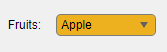
通过右键点击下拉组件并选择替换为 > 列表框,将下拉组件替换为包含相同项的列表框。由于列表框也有 BackgroundColor 属性,因此保留指定的颜色。
在容器中排列组件
将组件拖到容器(如面板)中时,容器会变为蓝色,表示该组件是容器的子级。这种将组件放入容器中的过程称为建立父子关系。
组件浏览器通过在父容器下缩进子组件的名称来显示父子关系。

在 App 设计工具中创建和编辑上下文菜单
在 App 设计工具中创建上下文菜单有几种方法。由于上下文菜单仅在您右键点击运行的 App 中的组件时才可见,因此当您在设计视图中时,它们不会出现在图窗中。这使得编辑上下文菜单的工作流与编辑其他组件的工作流略有不同。下列各节说明创建和编辑上下文菜单的方法。
创建上下文菜单
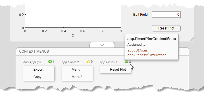
要创建上下文菜单,请将其从组件库拖到 UI 图窗或其他组件上。这会将上下文菜单赋给该组件的 ContextMenu 属性。创建上下文菜单时,它会出现在图窗下方画布上的区域中。此上下文菜单区域为您提供您创建的每个上下文菜单的预览,并指出为每个上下文菜单分配了多少个组件。例如,下面就是一组上下文菜单在画布上的显示方式:
如果您要创建上下文菜单而不将其分配给组件,请将其拖动到上下文菜单区域。
您也可以通过右键点击特定组件并选择上下文菜单 > 添加新上下文菜单来创建上下文菜单并将其分配给该组件。
所有上下文菜单均创建为 UI 图窗的子组件,并被添加到组件浏览器中,即使没有为它们分配组件也一样。
编辑上下文菜单
在上下文菜单区域中双击上下文菜单,或右键点击上下文菜单并选择菜单名称的编辑选项,即可编辑上下文菜单。这会使上下文菜单显示在上下文菜单编辑区域中,您可以在其中编辑和添加菜单项和子菜单。
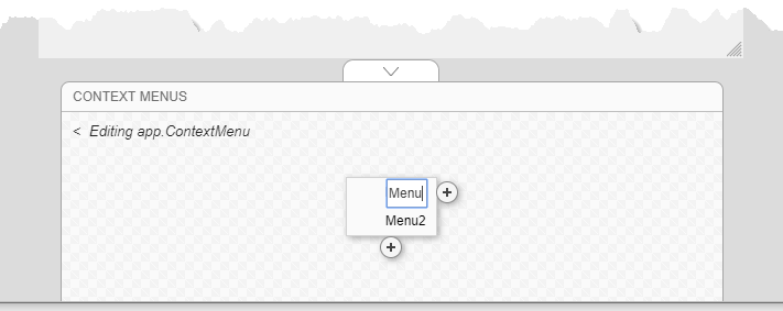
完成编辑后,点击后退箭头 (<) 退出编辑区域。
更改上下文菜单分配
要取消上下文菜单与组件的关联,请右键点击组件,然后选择上下文菜单 > 取消分配上下文菜单。
要将分配给某个组件的上下文菜单替换为另一个,您可以将要替换的上下文菜单拖到该组件上,或右键点击该组件,点击上下文菜单 > 替换为,然后选择您创建的其他上下文菜单之一。如果您只创建了一个上下文菜单,则不会出现替换为选项。
或者,在组件浏览器中选择一个组件,并从组件选显卡中选择交互性。然后,展开 ContextMenu 下拉列表,并选择一个不同的上下文菜单来分配给该组件。