Compare Calibrations to Data
Setting Up the Data Set
You can use the Data Sets view in CAGE to compare features, tables, and models with experimental data. You can use data sets to plot the features, tables, etc., as tabular values or as plots on a graph.
Data sets enable you to view the data at a set of operating points. You can determine the set of operating points yourself, using Build Grid. Alternatively, you can import a set of experimental data taken at a series of operating points. These operating points are not the same as the breakpoints of your tables.
This tutorial takes you through the basic steps required to compare a completed feature calibration to a set of experimental data.
Start CAGE by typing
cage
To set up the data set tutorial, you need to
Add the
Torquefeature to the data set.
Your data set contains all the input factors and output factors required. As the imported data contains various operating points, this information is also included in the data set.
Opening an Existing Calibration
For this tutorial, use the file datasettut.cag, found in
the matlab\toolbox\mbc\mbctraining directory.
To open this file,
Select File > Open Project.
In the file browser, select
datasettut.cagand click Open.This opens a file that contains a complete calibrated feature with its associated models and variables. This particular feature is a torque calibration, using a torque table (labeled
T1) and modifiers for spark (labeledT2) and air/fuel ratio (labeledT3).Select File > New > Data Set to add a new data set to your session.
This automatically switches you to the Factor Information pane of the data set display.
Importing Experimental Data into a Data Set
To import data into a data set,
Select File > Import > Data > File.
In the file browser, select
meas_tq_data.xlsxfrom thembctrainingdirectory, and click Open.This set of data includes six columns of data, the test cell settings for engine speed (
RPM), and the measured values of torque (tqmeas), engine speed (nmeas), air/fuel ratio (afrmeas), spark angle (spkmeas), and load (loadmeas).The Data Set Import Wizard asks which of the columns of data you would like to import. Click Next to import them all.
The following screen asks you to associate variables in your project with data columns in the data.
Highlight
afrin the Project Assignments column andafrmeasin the Data Column, then click the assign button, shown.
Repeat this to associate
loadwithloadmeas,nwithRPM, andspkwithspkmeas. The dialog box should be the same as shown.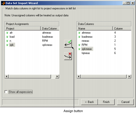
Click Finish to close the dialog box.
Note
If you need to reassign any inputs after closing this dialog box you can click
 in the toolbar or select Data > Assign.
Adding an Item to a Data Set
To add the Torque feature to the data set,
Highlight the
Torquefeature in the lower list of Project Expressions.Select Data > Factors > Add to Data Set.
This adds two objects to the data set: Torque: Model and
Torque: Strategy. These two objects make up the
Torque feature.
Torque: Modelis the model used as a reference point to calibrate the feature.Torque: Strategyis the values of the feature at these operating points.
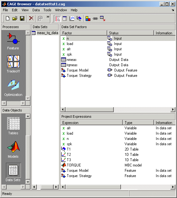
When these steps are complete, the list of factors includes four input factors and four output factors, as shown.
Comparing the Items in a Data Set
Viewing the Data Set as a Table
By viewing the data set, you can compare experimental data with calibrations or models in your project.
Click ![]() in the toolbar to view the data set as a table of
values.
in the toolbar to view the data set as a table of
values.
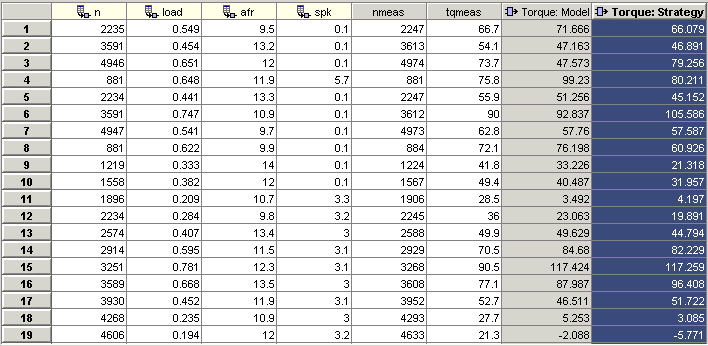
In the table, the input cells are white and the output cells are gray. Select
the Torque: Strategy column header to see the view shown. The
selected column turns blue and the column headers of the strategy's inputs
(n, load, afr and
spk) turn cream. Column headers are always highlighted in
this way when they are associated with the currently selected column (such as
model inputs, strategy inputs or linked columns).
In addition to viewing the columns, you can use data sets to create a column that shows the difference between two columns:
Select the
tqmeasandTorque: Strategycolumns by using Ctrl+click.Select Create Error from the right-click menu on either column header.
This creates another column that is the difference between
tqmeas and Torque: Strategy. Note that
all the columns that are inputs to this new column have highlighted
headers.
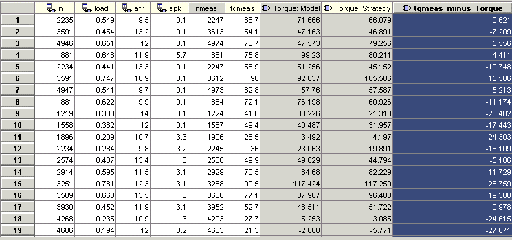
The error column is simply the difference between tqmeas
and Torque: Strategy. This provides a simple way of comparing
the feature and the measured data.
Viewing the Data Set as a Plot
Click
 or select View > Plot to view the data set as a plot.
The lower pane lists all the output expressions in the data set and in the project.
Use Ctrl+click to select
tqmeasandTorque: Strategyfrom the lower list.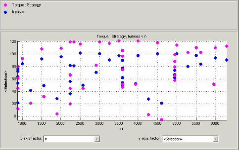
Change the x-axis factor to
nfrom the drop-down menu.This displays the calibrated values of torque from the feature, and the measured values of torque from the experimental data, against the test cell settings for engine speed.
Clearly there is some discrepancy between the two.
Displaying the Error
View the error between the calibrated and measured values of torque.
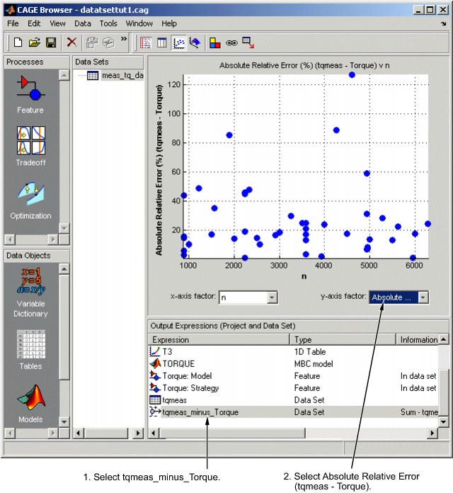
Select
tqmeas_minus_Torquefrom the lower list (Output Expressions).For the y-axis factor, select
Absolute Relative Error (tqmeas - Torque)from the drop-down menu.
As you can see, there seems to be no particular correlation between engine speed and the error in the calibration.
Coloring the Display
Select Color by Value from the right-click menu on the graph.
From the Color by drop-down menu, select
load.
In this display, you can see that some of the low values of load display a high error.
Limiting the Range of the Colors
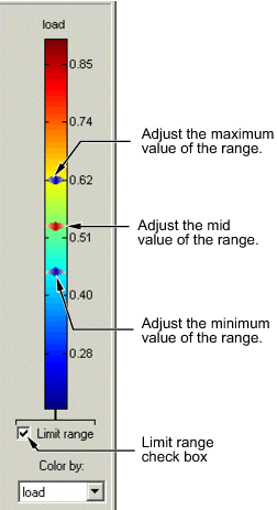
To view the colors in more detail, you can limit the range of the colors:
Select the Limit range box (or you could right-click the graph and select Restrict Color to Limits).
Set the minimum value of the color range to be as low as possible by dragging the minimum value down.
Set the maximum value of the color range to be around 0.4.
As the low values of load are causing large errors, it would be wise to
reexamine the calibration, particularly at small values of
load.
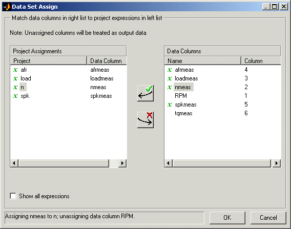
Reassigning Variables
You can alter the data set by changing which variables are used for project expressions.
Instead of using the test cell settings for the engine speed
(RPM), you might want to use the measured values of engine
speed (nmeas). So you have to reassign the variable
n to nmeas.
To reassign n,
Click
or select Data > Assign.In the dialog box that appears, select
nfrom the Project Assignments pane andnmeasfrom the Data Columns pane.Click the assign button.