Advanced Visualization Using Signal Integrity Viewer
Using the Signal Integrity Viewer app, you can display the various frequency and time domain waveforms. You can also plot the simulation results against single or multiple variables. Plotting in such a way is useful in identifying the trends and/or outliers which might otherwise be missed. You might be interested to analyze several factors in a design:
Cost vs. performance.
Stackup/via design.
ASIC/IP vendor selection.
Package pinout.
Connector selection.
Interconnect design.
Equalization settings.
Speed vs. length.
Reducing output power.
Extending backplane.
Impact of PVT.
Standards compliance.
Using the Plots mode in the Signal Integrity Viewer, you can perform these advanced visualization techniques.
A particular simulation run can contain multiple sets of eye diagrams. If the set of data is small, you can easily plot each result and identify which has the highest and widest eye opening.
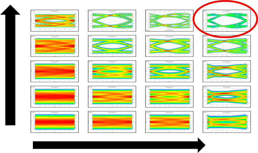
But when there are hundreds or even thousands of simulation results, manually plotting each eye is not feasible. Consider visualizing data from a large data set. You can plot the differences in performance of a channels based on three different IC packages. You can also analyze the corner process of the packages (FF/TT/SS) and three different via designs on the board. The criterion for this experiment is to make design choices based on maximizing eye height.
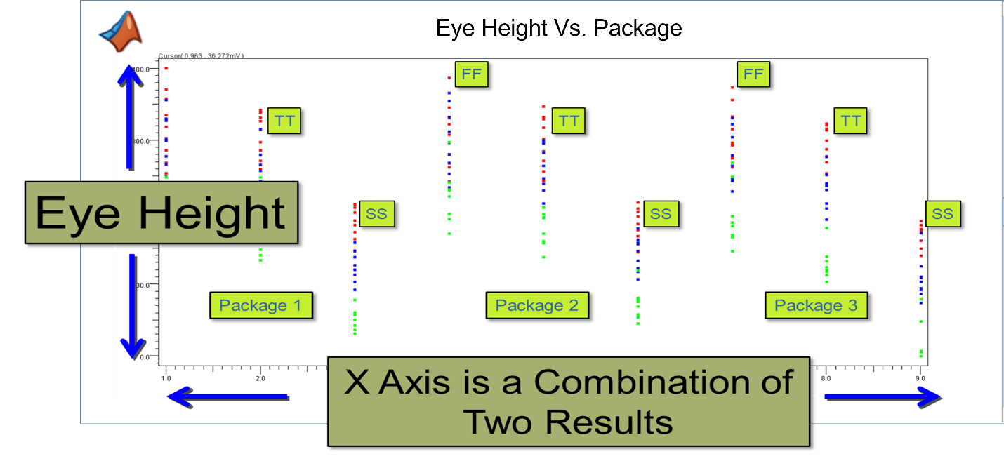
For each process corner, there are red, blue, and green dots which identify individual simulation results for eye height. Each simulation also has one of the three different via designs. These via designs are:
Through-hole via design (red dots), where the signal routed from the top layer of the board to the bottom layer, straight through the via.
Back drilled via (blue dots), where the stub caused by routing to an inner layer of the board is back drilled leaving only a small stub.
Non-back drill via (green dots), where the via has a long stub when routing to an inner layer of the board.
You can see that performance is similar between package and between the process corners of each package. You can also easily see that the red dots corresponding to through-hole via eye heights have the largest eye opening on average.
Set Up Axes for Advanced Visualization
To access the advanced visualization options, select the Plots tab in the Signal Integrity Viewer app window.
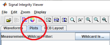
In Plots mode, the lower left corner of the window contains the various tabs. For Serial Link Designer, these correspond to the channel analysis reports and results. For Parallel Link Designer these correspond to timing and waveform reports and results.
Note
The correct tab must be selected to see the results of that specific analysis (for example: network, statistical, or time domain). If the results look strange, make sure you are in the right tab.
Plots mode gives you the control of both the x and y-axis to plot any results or variables contained in the simulation report. On the left-hand side of the window, there is a list of the variables that correspond to the y-axis. There is also a wildcard filter at the top of the dialog box to easily find the desired result or variable for plotting.
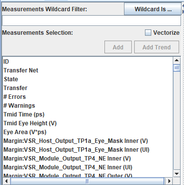
To set up the x-axis, select the gear icon at the top of the first column (named Row) in the results table. This opens the Table Column Control dialog box where you can select the x-axis results and variables for a given plot.
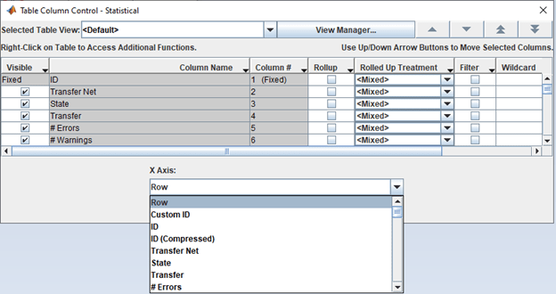
After defining the x and y-axes, you can do scatter plots or trend plots.
Scatter Plot
To display the scatter plot, click the Add button. If you have not defined the x-axis variable, it defaults to Row which is the order of simulation results.
Consider the scatter plot for simulations of a design involving a backplane with line cards on either end. The trace lengths of the backplane and line cards are swept along with a 2-tap FFE (feed-forward equalizer) in the transmitter. The taps include a main tap (0) and a post-cursor tap (1). The DFE (decision feedback equalizer) taps in the receiver are swept for 7, 9 , and12. This results in 1350 simulations. You can how the number of DFE taps affect eye height and eye width across all the trace lengths and FFE settings.

The plot shows the minimum eye height and width values. The upper right are the results that meet the criteria of the design. Although the plot does not provide any definite answers, it demonstrates the process of visualizing the data.
You can further analyze the data by taking one of the DFE tap numbers and plotting the lengths of the backplane or line card. This shows which number of taps might be optimum for a given length. In some cases, it may take many of these types of plots to find problems in a design or determine how to make a design work.
Trend Plot
To display the trend plot, click the Add Trend button.
Note
For trend plots, the data must be sorted on a unique variable such as corner process, tap setting, or trace length.
Consider a trend plot that shows the effect on eye height when sweeping Tx FFE tap values. The transmitter has two taps: a main tap (0) and a post-cursor tap (1). The values of the main tap are swept from 0.7V to 1.0V. The post cursor tap weights are applied to normalize the result. For example, if tap 0 is set at 0.7, tap 1 is set at 0.3V. An eye height limit is set at 250mV. Each trend plot red, green, and blue correspond to process corners FFFE, TTTE, and SSSE respectively.
You can set the main tap from 0.7V to 0.84V meet the eye height limit of 0.25V.

The optimal tap settings are 0.78V for the main tap and 0.22V for the post-cursor tap which gives a maximum eye height of approximately 0.33V.