controlchart
Control charts
Syntax
Description
controlchart( creates an X-bar chart of the
measurements in the matrix X)X. The X-bar chart plots the arithmetic mean
of each subgroup, and indicates out-of-control points that are more than three standard
deviations above and below the mean of X.
controlchart(___,
specifies options using one or more name-value arguments in addition to any of the input
argument combinations in the previous syntaxes. For example, you can specify the control
limits, specification limits, and chart type.Name=Value)
stats = controlchart(___)
Examples
Load the parts data set and display its size.
load parts
size(runout)
ans = 1×2
36 4
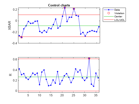
The matrix runout contains 36 subgroups. Each subgroup contains four replicate measurements of the same quantity.
Create X-bar and R (range) control charts for the data, and return the subgroup statistics.
stats = controlchart(runout,ChartType=["xbar","r"]);
Display the process mean and standard deviation.
stats.mu
ans =
-0.0864
stats.sigma
ans =
0.1302
The X-bar chart plots the arithmetic mean of each subgroup. The green center line indicates the mean of all the elements of runout, and the red lines indicate the upper and lower control limits.
The R chart plots the range of each subgroup. The green center line indicates the mean range, averaged over the subgroups.
In both charts, the circled points indicate subgroups that violate the control limits.
Load the parts data set and keep only the first measurement of each subgroup.
load parts
X = runout(:,1);
Create I (individual) and MR (moving range) control charts. Use a window width of two measurements to calculate the moving range.
controlchart(X,ChartType=["i","mr"],Width=2)
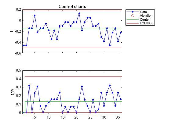
The I chart plots the individual measurement values in sequential order. The MR chart plots the absolute difference between each measurement and the previous measurement. The green center line in each chart represents the mean quantity, and the red lines represent the control limits.
Generate a simulated data set X that contains pass or fail measurements of 10 units, taken on 40 consecutive days. Each day represents a subgroup, and each unit measurement has a 20% chance of indicating a failure. Represent a failure as a logical 1 (true) and a pass as a logical 0 (false).
rng(0,"twister")  % For reproducibility
failureProbability = 0.2;
randomMatrix = rand(40,10);
X = logical(randomMatrix < failureProbability);
Create P (proportion of units that are defective) and NP (number of defective units) control charts of the measurements. Return the subgroup statistics and plotted point values. Specify a unit size of 1 to indicate that each element in X is a logical value for a single unit.
[stats,plotted] = controlchart(X,ChartType=["p","np"],Unit=1);
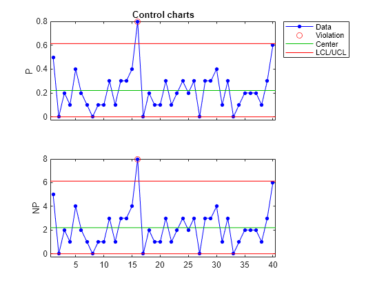
The P chart plots the fraction of failure measurements in each subgroup. The NP chart plots the number of failure measurements in each subgroup.
Display the mean fraction of failure measurements.
stats.p
ans =
0.2200
Display the indices of points that are out of control.
find(plotted(2).ooc)
ans =
16
Subgroup 16 is marked as a control violation in both charts because it contains eight failures, which exceeds the upper control limits.
Generate a simulated data set X that contains pass or fail measurements of a unit, taken on each weekday for several months. Half as many measurements are made on Thursdays and Fridays as compared to the other weekdays. Each unit measurement has a chance of indicating a failure that is 23% on Mondays and Fridays, 20% on Tuesdays, and 18% on the other days of the week. Represent a failure as a logical 1 (true) and a pass as a logical 0 (false).
rng(0,"twister")  % For reproducibility
n = 25000;
group = repelem(1:5, [n/4, n/4, n/4, n/8, n/8]);
failureProbability = [0.23 0.2 0.18 0.18 0.23];
X = rand(n,1) < failureProbability(group)';
Display a P (proportion of units that are defective) control chart of the measurements. Specify subgroups using the weekday number in groups, and specify a unit size of 1 to indicate that each element in X is a logical value for a single unit.
controlchart(X,group,ChartType="p",Unit=1);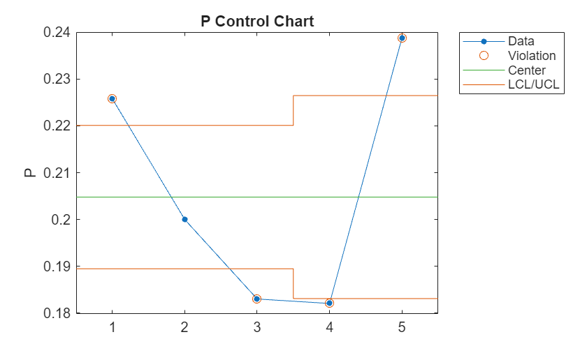
The P chart shows that only the second subgroup (Tuesday) is within the control limits, despite the fact that each P value is close to the true failure probability of the corresponding subgroup.
Display a Laney P' chart of the measurements by specifying DispersionControl="on".
controlchart(X,group,ChartType="p",Unit=1,DispersionControl="on");
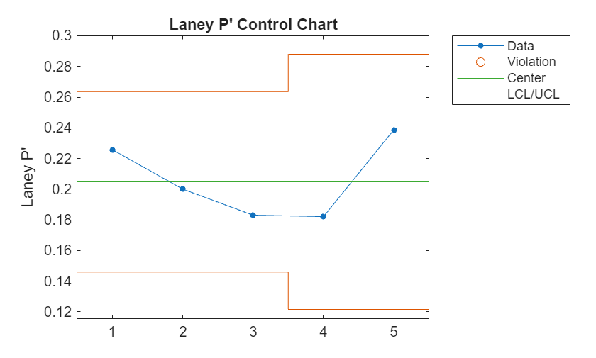
None of the subgroups are marked as out-of-control in the P' chart, because the control limits take into account the subgroup sizes and interday variations in the failure probability.
Generate simulated measurements of the number of defects in five units, taken on 50 consecutive days. Each unit has a size between 1 and 10 cm, and the expected number of defects per cm is 0.25.
rng(0,"twister")  % For reproducibility
unitSize = [10,3,5,2.5,8];  % Unit sizes
lambda = 0.25;  % Expected number of defects per cm
nDays = 50;
X = [];
units = [];
for i = 1:nDays
    defects = poissrnd(lambda*unitSize);
    X = [X; defects];
    units = [units; unitSize];
end
Create a U (defects per unit) chart of the measurements, and return the subgroup statistics and plot data.
[stats,Uplot] = controlchart(X,ChartType="u",Unit=units);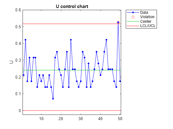
The U chart plots the number of defects per cm for each day, measured over all units. Display the value of the center line , which is the mean number of measured defects per cm, averaged over all days.
stats.m
ans =
0.2407
The value is close to the expected defect rate of 0.25. The red lines represent the upper and lower control limits, which are equal to , where is sum(unitSize). Display the value of the upper control limit.
Uplot.ucl(1)
ans =
0.5164
Create a C (number of defects) chart of the measurements, and return the subgroup statistics and plot data.
[stats,Cplot] = controlchart(X,ChartType="c",Unit=units);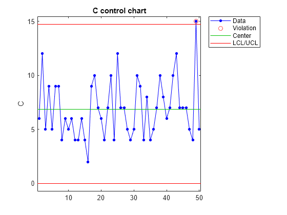
The C chart plots the number of measured defects on each day. Display the value of the center line , which is the mean number of measured defects, averaged over all days.
Cplot.cl(1)
ans =
6.8600
Display the value of the upper control limit, which is equal to .
Cplot.ucl(1)
ans =
14.7175
Display the total number of defects and defects per cm for day 49.
Cplot.pts(49)
ans =
15
Uplot.pts(49)
ans =
0.5263
The function marks day 49 as a violation in both charts, because its total number of defects and defects per cm exceed the upper control limits.
Input Arguments
Measurements, specified as a numeric matrix, numeric vector, or
timeseries object. If ChartType contains
"p", "np", "u", or
"c", then the elements of X must be
nonnegative.
If you specify X as a matrix:
Each row of
Xis a subgroup of measurements containing replicate measurements taken at the same time.The rows of
Xmust be in time order.When you specify
group, the function groups the measurements by rows, and usesgroupto label the x-axis of the last chart.
If you specify X as a vector and
ChartType contains "xbar",
"s", or "r", then you must also specify
group.
If you specify X as a timeseries object, the
sample at each time must contain replicate measurements.
Data Types: single | double
Subgroups, specified as a numeric vector that has length equal to
size( (or X,1)size(X.data,1), if
X is a timeseries object). If
X is a matrix, the function groups the measurements according to
the rows of X, and only uses group to label
the x-axis of the last chart. If X is a vector,
a subgroup consists of consecutive measurements X(n) that share the
same value of group(n) for 1 ≤ n ≤
length(X). Subgroups can have different numbers of
measurements.
Data Types: single | double
Name-Value Arguments
Specify optional pairs of arguments as
Name1=Value1,...,NameN=ValueN, where Name is
the argument name and Value is the corresponding value.
Name-value arguments must appear after other arguments, but the order of the
pairs does not matter.
Example: controlchart(X,ChartType=["xbar","r"]) specifies to create
X-bar and R control charts.
Type of control chart, specified as a character vector, string scalar, string array, or cell array of character vectors containing one or more of the following values.
| Value | Description |
|---|---|
"xbar" | X-bar or mean |
"s" | Standard deviation |
"r" | Range |
"ewma" | Exponentially weighted moving average |
"i" | Individual measurement |
"mr" | Moving range of individual measurements |
"ma" | Moving average of individual measurements |
"p" | Proportion of units that are defective |
"np" | Number of defective units |
"u" | Defects per unit |
"c" | Number of defects |
You can also create Laney P', NP', U', and C' charts by specifying
DispersionControl="on" and setting
ChartType to
"p","np","u", or
"c". You cannot set Limits in Laney
charts.
If you specify "p" or "np", you must also
specify Unit.
If you specify "xbar", "s", or
"r", then X must be a matrix, or a vector
with subgroups specified in group.
If you specify more than one element in ChartType, the
elements must be compatible according to these four sets of compatible types:
"xbar","s","r", and"ewma""i","mr", and"ma""p"and"np""u"and"c"
If you specify X as a vector and do not specify
group, then "ewma" is compatible with
"i", "mr", and "ma".
Example: ChartType={'u','c'}
Example: ChartType=["u","c"]
Data Types: char | string
Flag to display the control charts, specified as "on" or
"off", or as a logical 0
(false) or 1 (true).
Specify Display="off" and the stats output
argument, for example, to return subgroup statistics and not display the control
charts.
Example: Display="off"
Data Types: char | string | logical
Since R2026a
Flag to use Laney control limits, specified as "on" or
"off", or as a logical 0
(false) or 1 (true).
Specify DispersionControl="on" to produce Laney P', NP', U', and C'
charts, which adjust the control limits for the subgroup sizes and inter-subgroup
variations according to [2].
controlchart sets
DispersionControl="off" when you specify
Limits, or when ChartType does not contain
"p", "np", "u", or
"c".
Example: DispersionControl="on"
Data Types: char | string | logical
Subgroup labels for chart data tips, specified as a string array or a cell array
of character vectors with length equal to size( (or X,1)size(X.data,1), if
X is a timeseries object).
Example: Label=["a","b","c","d","e","f","g"]
Data Types: char | string
Smoothing parameter, specified as a scalar in the range (0,1).
For the exponentially weighted moving average chart
(ChartType="ewma"), Lambda controls how much
each moving average value is influenced by past measurements. A higher
Lambda value gives more weight to the more recent measurements in
the moving average calculation.
Example: Lambda=0.3
Data Types: single | double
Control limits, specified as a 3-by-1 numeric vector. The elements of
Limits contain the values of the lower control limit, center
line, and upper control limit in the control chart, respectively. If a point lies
outside the control limits, the function flags it as out of control (see plotdata).
You cannot specify Limits if DispersionControl
is "on" or ChartType contains more than one
chart type.
Example: Limits=[0.5 1 1.5]
Data Types: single | double
Mean, specified as a numeric scalar or []. If
Mean is [] (the default), the function
estimates Mean from X. The definition of
Mean depends on the chart type. For P and NP charts,
Mean is the average proportion of items that are defective. For U
and C charts, Mean is the average number of defects per unit size.
For all other charts, Mean is the process mean.
Example: Mean=0.5
Data Types: single | double
Standard deviation, specified as a positive scalar or one of the following standard deviation estimation methods:
| Value | Description |
|---|---|
"std" (default) | Average within-subgroup standard deviation |
"range" | Average subgroup range |
"variance" | Square root of pooled variance |
For the I, MR, and MA charts, if the data is not in subgroups, the function computes the estimate using a moving range.
Example: Sigma=0.5
Data Types: single | double | char | string
Number of standard deviations for the control limits, specified as a positive
scalar. The function sets the upper control limit as the center line plus
NSigma times Sigma, and the lower control
limit as the center line minus NSigma times
Sigma. If a point lies outside the control limits, the function
flags it as out of control (see plotdata).
If you specify Limits, the function ignores the value of
NSigma.
Example: NSigma=5
Data Types: single | double
Axes handle of the control chart, specified as an axes handle. If
Parent is [] (the default), the function
creates the control chart in a new figure. You cannot specify
Parent if ChartType contains more than one
chart type.
Control rules, specified as a character vector, string scalar, string array, or
cell array of character vectors containing one or more of the allowed values of
rules in
the controlrules function. The function
uses these rules, together with the control limits, to determine whether a point is
out of control in these chart types: X-bar, I, C, U, P, and NP. If you do not specify
Rules, the function uses only the control limits to determine
whether a point is out of control.
Example: Rules=["we1","n1"]
Data Types: char | string
Specification limits, specified as a numeric vector. The function plots a red
horizontal dotted line in the control chart at each value of
Specs. The function does not plot specification lines in R, S,
and MR charts.
Example: Specs=[0.5 2]
Data Types: single | double
Number of inspected items or size of the inspected unit, specified as a numeric
matrix or vector that has the same dimensions as X, or as a
numeric scalar. All values of Unit must be positive. When you
specify Unit as a numeric scalar,
controlchart uses the same Unit value for
all the elements of X.
For P and NP charts,
Unitis the number of inspected items, and it must contain only positive integer values. Each element ofUnitmust be greater than or equal to the corresponding element ofX.For U and C charts,
Unitis the size of the inspected unit, and its default value is1.
If you specify Unit for P, NP, U, or C charts, then
X must contain the counts of the number of defects or number of
defective units found. For all other chart types, the function ignores the value of
Unit.
Example: Unit=1
Data Types: single | double
Window width, specified as a positive integer. The function uses a window with the
specified width to compute the moving ranges and averages for the MR and MA charts,
and the standard deviations for the I, MR, and MA charts. The value of
Width cannot be larger than size( (or X,1)size(X.data,1), if
X is a timeseries object).
Example: Width=10
Data Types: single | double
Output Arguments
Subgroup statistics and parameter estimates, returned as a 1-by-k
structure array, where k is the number of plotted charts. The fields
in stats depend on the chart type.
| Field | Description |
|---|---|
mean | Subgroup means |
std | Subgroup standard deviations |
range | Subgroup ranges |
n | Subgroup size, or total inspection size or area |
i | Individual data values |
ma | Moving averages |
mr | Moving ranges |
count | Count of defects or defective items |
mu | Estimated process mean |
sigma | Estimated process standard deviation |
p | Estimated proportion of units that are defective |
m | Estimated mean defects per unit |
Plot data, returned as a 1-by-k structure array, where
k is the number of plotted charts. The structure array contains the
following fields.
| Field | Description |
|---|---|
pts | Plotted point values |
cl | Center line |
lcl | Lower control limit |
ucl | Upper control limit |
se | Standard error of plotted point |
n | Subgroup size |
ooc | Flags for out-of-control points, specified as logical
0 (false) or 1 (true) |
Since R2025a
Axes handles to the individual plots, returned as an array of
Axes objects. If you want to return ax,
Display must be "on".
More About
Control charts, which were developed by Walter A. Shewhart in 1924, are useful for
monitoring the stability of processes over time. Statistics and Machine Learning Toolbox™ offers several types of control chart, which you can specify using the
ChartType
name-value argument. Each chart is a time series graph of points that represent either the
measured values of a process or statistics derived from the measurements. The chart contains
a center line with two control limit lines, one above and one below, that are usually
equidistant from the center line. Any point located outside the region defined by the
control limit lines is flagged as out-of-control. You can also apply additional statistical
rules to flag out of control points (see controlrules).
The simplest control chart is the I (individual) chart, which plots the measurement values in time order. This chart is often used together with the MR (moving range) chart, which plots the largest absolute difference between any two of the last k measurements, where k is the window width. The MA (moving average) chart plots the moving average over a window of width k. Instead of using a window, the EWMA (exponentially weighted moving average) chart uses a weighted moving average, where newer measurements have higher weights than older measurements.
Some control charts are useful for analyzing grouped data. For example, you might gather n measurements of a single unit at regular intervals over a specific time period. Each set of n measurements you gather at time t is a subgroup. An X-bar chart plots the mean of each subgroup in time order. This chart is often used together with the R (range) chart, which plots the largest absolute difference between any two measurements within each subgroup, or an S (standard deviation) chart, which plots the standard deviation of measurements within each subgroup.
Several charts are specifically designed for logical measurements (for example, whether a unit is defective or not defective). The P and NP charts plot the fraction of defective units and the number of defective units within each subgroup, respectively. Some charts are designed for discrete measurements, such as the number of defects in a unit of a specific size. The C (number of defects) chart plots the total number of defects in each subgroup, and the U (defects per unit) chart plots the mean number of defects per unit size within each subgroup. Laney charts (P', NP', U', and C') adjust the control limits to account for subgroup sizes and inter-subgroup variations according to [2].
References
[1] Montgomery, Douglas C. Statistical Quality Control. 7th ed. Nashville, TN: John Wiley & Sons, 2012.
[2] Laney, David B. “Improved Control Charts for Attributes.” Quality Engineering 14, no. 4 (June 18, 2002): 531–37.
Version History
Introduced in R2006bCreate Laney P', NP', U', and C' charts which adjust the control limits for subgroup sizes and inter-subgroup variations according to [2].
When you specify both the Limits and Rules
name-value arguments, the center line value is equal to the middle element value of
Limits. In previous releases, the center line value is equal to the
arithmetic mean of all measurement values.
Return graphics handles to the individual plots as an array of Axes
objects by using the ax output argument.
MATLAB Command
You clicked a link that corresponds to this MATLAB command:
Run the command by entering it in the MATLAB Command Window. Web browsers do not support MATLAB commands.
选择网站
选择网站以获取翻译的可用内容,以及查看当地活动和优惠。根据您的位置,我们建议您选择:。
您也可以从以下列表中选择网站:
如何获得最佳网站性能
选择中国网站(中文或英文)以获得最佳网站性能。其他 MathWorks 国家/地区网站并未针对您所在位置的访问进行优化。
美洲
- América Latina (Español)
- Canada (English)
- United States (English)
欧洲
- Belgium (English)
- Denmark (English)
- Deutschland (Deutsch)
- España (Español)
- Finland (English)
- France (Français)
- Ireland (English)
- Italia (Italiano)
- Luxembourg (English)
- Netherlands (English)
- Norway (English)
- Österreich (Deutsch)
- Portugal (English)
- Sweden (English)
- Switzerland
- United Kingdom (English)