Haar Transforms for Time Series Data and Images
This example shows how to use Haar transforms to analyze time series data and images.
First, visualize the Haar wavelet.
[~,psi,x] = wavefun('haar',10);
x = x(2:end-1);
psi = psi(2:end-1);
plot(x(1:512),psi(1:512))
line(x(513:end),psi(513:end))
xlabel('t')
ylabel('\psi(t)','fontsize',14)
title('Haar Wavelet')
grid on
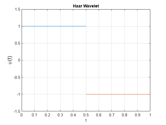
The Haar wavelet is discontinuous. As a result, it is typically not used in denoising or compression applications where smoothness of the reconstruction wavelet is an important consideration. However, Haar transforms are useful in a number of applications due to their superior time (spatial) localization and computational efficiency. Wavelet Toolbox™ supports Haar analysis in most of the discrete wavelet analysis tools. This example features Haar lifting implementations which support integer-to-integer wavelet transforms for both 1-D and 2-D data and multichannel (multivariate) 1-D data.
Analyze Signal Variability By Scale
Load and plot the clock_571 dataset. This example is essentially a recreation of the analysis presented in Percival & Walden [3], pp 13–16.
load clock_571
plot(clock_571)
xlabel('Days')
grid on
title('Daily Average Fractional Frequency Deviates -- Cesium Clock')
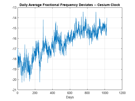
The data are daily average fractional frequency deviates for a particular cesium beam atomic clock with respect to the U.S. Naval Observatory master clock. If the value of the time series is 0, that means the cesium clock has neither lost nor gained time with respect to the master clock over the duration of the day. If the value is negative, the clock has lost time that day, a positive value means that the clock has gained time. For this data, the values are all negative. For certain applications, like geodesy, it is important to know whether there are certain time scales where the clock's deviation from the master clock is at its lowest value. In other words, are there certain scales where the clock agrees most closely with the master clock? The Haar transform is useful here because it possesses two important properties: It decorrelates data by scale and it partitions signal energy among scale.
To illustrate the decorrelating property, obtain the Haar transform down to level 6. Plot the autocorrelation sequence of the original data along with the autocorrelation of the wavelet coefficients by scale for scales of 2,4,8,16, and 32 days. Dashed lines on the plots delineate 95% confidence intervals for white noise inputs. Values exceeding those lines are indicative of significant autocorrelation in the data.
[s,w] = haart(clock_571,6);
helperAutoCorr(clock_571,w)
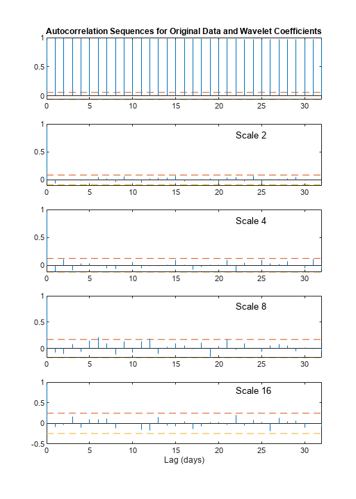
The top plot shows the autocorrelation sequence for the original data. Subsequent plots show the autocorrelation sequences for wavelet coefficients at increasingly coarser scales. It is clear that the autocorrelation sequence of the original data exhibits correlation at all lags while the Haar transform coefficients are decorrelated. Next, demonstrate energy conservation.
sigenergy = norm(clock_571,2)^2
sigenergy =
2.7964e+05
energyByScale = cellfun(@(x)norm(x,2)^2,w);
haarenergy = norm(s,2)^2+sum(energyByScale)
haarenergy =
2.7964e+05
The total signal energy is preserved by the Haar transform. Because of these properties, you can make meaningful inferences based on the proportion of signal energy captured by the wavelet coefficients at each scale.
scales = 2.^(1:6);
figure
plot(scales,energyByScale,'-o')
xlabel('Scale (days)')
set(gca,'xscale','log')
set(gca,'xtick',2.^(1:6))
ylabel('Proportion of Signal Energy')
grid on
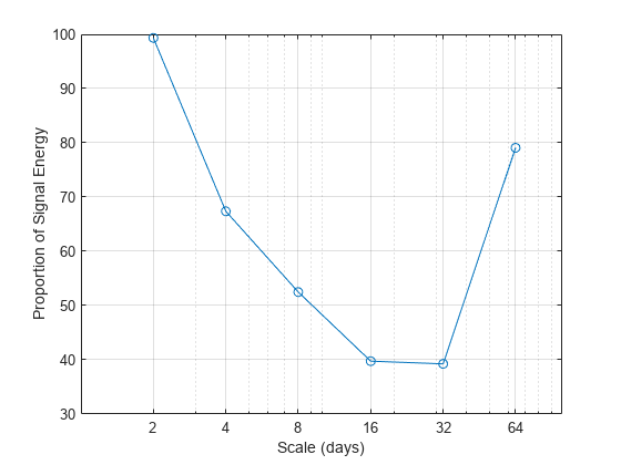
You see that the energy is at a minimum for scales of 16 and 32 days. For the Haar wavelet (and all Daubechies wavelets), the wavelet coefficients at a given scale represent differences between weighted averages of the data over a duration 1/2 the length of the scale. This plot indicates scales over which the cesium clock is in best agreement with the master clock. This means that considering data over approximately two-week or even one-month periods is more accurate than data on smaller or longer scales. As previously mentioned, this has important implications for geodesy where extremely precise time measurements are critical.
Although the Haar wavelet is discontinuous, it is still effective at representing various kinds of time series. Examples include count data and data where values of a time series are tied to some specific state, which affects the level of the time series. As an example, consider the relationship between heart rate and sleep state.
Create Signal Approximations
The data consist of two time series. One time series is the heart rate of a 66-day old infant sampled every 16 seconds for just over 9 hours. The heart rate time series is integer-valued. The other time series is the expertly scored sleep state of the same infant over the same period with the same sampling rate. The sleep state data was scored based on the infant's EEG and EOG (eye movement) data, not based on the heart rate. The sleep state codes are 1=quiet sleep, 2=between quiet and active sleep, 3=active sleep, and 4=awake. Both time series were recorded by Prof. Peter Fleming, Dr Andrew Sawczenko, and Jeanine Young of the Institute of Child Health, Royal Hospital for Sick Children, Bristol and kindly provided for use in this example. Plot the heart rate data along with the sleep states.
load BabyECGData
figure
yyaxis left
plot(times,HR)
ylabel('HR')
xlabel('Hrs')
YLim = [min(HR)-1 max(HR)+1];
yyaxis right
plot(times,SS)
ylabel('Sleep State')
YLim = [0.5 4.5];
title('Baby ECG and Sleep State')
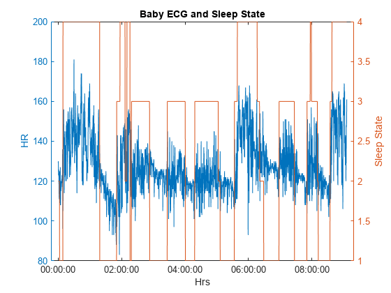
An inspection of the data reveals an apparent correlation between sleep state and heart rate, but the data is extremely noisy. Because the Haar transform provides a staircase approximation to a signal, it is often useful in situations where a response is dependent on a predictor variable with a small number of discrete states. Here the discrete states are the four sleep stages. Obtain the Haar approximation of the heart rate data using a level 5 approximation. Because the heart rate data is integer-valued, use the 'integer' flag to ensure that integer-valued data is returned. Plot the result.
[S,W] = haart(HR,'integer');
HaarHR = ihaart(S,W,5,'integer');
figure
hL = plotyy(times,HaarHR,times,SS);
Ax1 = hL(1);
Ax2 = hL(2);
Ax1.YLim = [min(HaarHR)-1 max(HaarHR)+1];
Ax1.YLabel.String = 'HR';
Ax2.YLim = [0.5 4.5];
Ax2.YLabel.String = 'Sleep State';
xlabel('Hrs')
title('Haar Approximation and Sleep State')

The Haar approximation more clearly shows the relationship between the sleep state and the heart rate data. You can assess this change by looking at the correlation between the raw data and the sleep state time series.
corr(SS,HR)
ans =
0.5576
Now compare the value of 0.56 with the correlation between the sleep state data and the Haar approximation
corr(SS,HaarHR)
ans =
0.6907
The correlation has increased from 0.56 to 0.69. More advanced wavelet analysis and modeling of this data is presented in Nason, von Sachs, & Kroisandt [1] and Nason, Sapatinas, & Sawczenko [2].
Digital Watermarking of Images
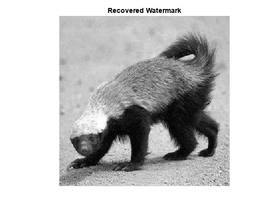
Watermarking is an important data protection tool. It is a passive protection technique where a marker is covertly inserted in some data in order to verify the authenticity or integrity of the data. Wavelet techniques in general and the Haar transform in particular are frequently employed in watermarking images. This example illustrates the use of the Haar transform in watermarking an image and recovering the watermark. The example employs a simple watermarking scheme chosen for ease of illustration. In this scheme, the watermark is inserted in the approximation coefficients at level 3.
Watermark an image of a Mandril with one of a honey badger. Read in the Mandrill image. Resize it to 2048-by-2048 and display the result.
coverIM = imread('mandrill.jpg');
coverIM = rgb2gray(coverIM);
coverIM = imresize(im2double(coverIM),[2048 2048]);
imagesc(coverIM)
colormap gray
title('Original Image to Watermark')
axis off
axis square
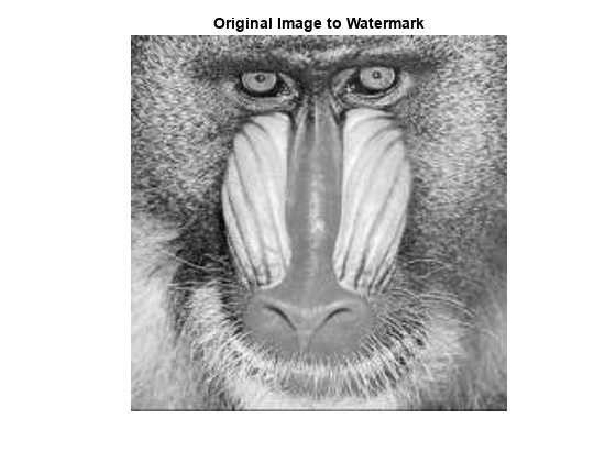
Obtain the Haar transform of the Mandrill image down to level 3.
[LLorig,LHorig,HLorig,HHorig] = haart2(coverIM,3);
imagesc(LLorig)
title('Level 3 Haar Approximation')
axis off
axis square

Read in watermark image and resize it.
watermark = imread('honeybadger.jpg');
watermark = im2double(rgb2gray(watermark));
watermark = imresize(watermark,[2048 2048]);
Obtain the Haar transform of the watermark image down to level 3.
[LLw,LHw,HLw,HHw] = haart2(watermark,3);
imagesc(LLw)
colormap gray
title('Level 3 Haar Approximation--Watermark')
axis off
axis square
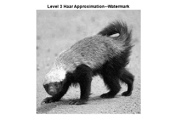
Add the honey badger watermark to the Mandril image by attenuating the level-3 approximation coefficients of the watermark and inserting the attenuated coefficients into the level-3 Mandrill approximation coefficients.
LLwatermarked = LLorig+1e-4*LLw;
markedIM = ihaart2(LLwatermarked,LHorig,HLorig,HHorig);
imagesc(markedIM)
title('Watermarked Image')
axis off
axis square
colormap gray
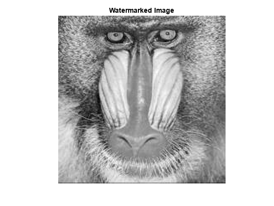
The watermark (honey badger) is not visible in the watermarked image. Because you know what algorithm was used to insert the watermark, you can recover the watermark using the Haar transform.
[LLr,LHr,HLr,HHr] = haart2(markedIM,3);
LLmarked = (LLr-LLorig).*1e4;
imagesc(LLmarked)
title('Recovered Watermark')
colormap gray
axis off
axis square
References
[1] Nason, G. P., R. von Sachs, and G. Kroisandt. “Wavelet Processes and Adaptive Estimation of the Evolutionary Wavelet Spectrum.” Journal of the Royal Statistical Society: Series B (Statistical Methodology) 62, no. 2 (May 2000): 271–92. https://doi.org/10.1111/1467-9868.00231.
[2] Nason, Guy P., Theofanis Sapatinas, and Andrew Sawczenko. “Wavelet Packet Modelling of Infant Sleep State Using Heart Rate Data.” Sankhyā: The Indian Journal of Statistics, Series B (1960-2002) 63, no. 2 (2001): 199–217. http://www.jstor.org/stable/25053171.
[3] Percival, Donald B., and Andrew T. Walden. Wavelet Methods for Time Series Analysis. Cambridge Series in Statistical and Probabilistic Mathematics. Cambridge ; New York: Cambridge University Press, 2000.