基于表格数据创建热图
热图是一种使用颜色实现数据可视化的方式。当您调用 heatmap 函数时,可以指定未聚合或预聚合的数据:
如果以表形式指定未聚合的数据,则
heatmap函数将聚合这些数据,并在每个单元格中显示反映聚合值的数字和颜色。例如,单元格可能显示每对 (x, y) 在表中出现的次数。沿 x 轴和 y 轴的标签显示表中的唯一值。如果以二维矩阵形式指定数据,则
heatmap函数将这些值视为聚合数据。矩阵的每个元素对应于图中的一个单元格。单元格的颜色指示矩阵中的某个值相对于矩阵中其他值的相对大小。您还可以选择指定沿图的 x 轴和 y 轴显示的标签。
此主题说明如何将文件作为表导入 MATLAB® 并根据表列创建热图。它还说明如何修改热图的外观,例如设置标题和轴标签。
以表的形式导入文件
加载示例文件 TemperatureData.csv,此文件包含 2015 年 1 月至 2016 年 7 月间的日均温度。将此文件读取到一个表中并显示前五行。
tbl = readtable('TemperatureData.csv');
head(tbl,5)
Year Month Day TemperatureF
____ ___________ ___ ____________
2015 {'January'} 1 23
2015 {'January'} 2 31
2015 {'January'} 3 25
2015 {'January'} 4 39
2015 {'January'} 5 29
创建基本热图
创建一个热图,其中 x 轴表示月份,y 轴表示年份。通过设置 ColorVariable 属性,使用温度数据为热图单元格着色。将 HeatmapChart 对象赋给变量 h。在创建图后,可使用 h 对其进行修改。
h = heatmap(tbl,'Month','Year','ColorVariable','TemperatureF');
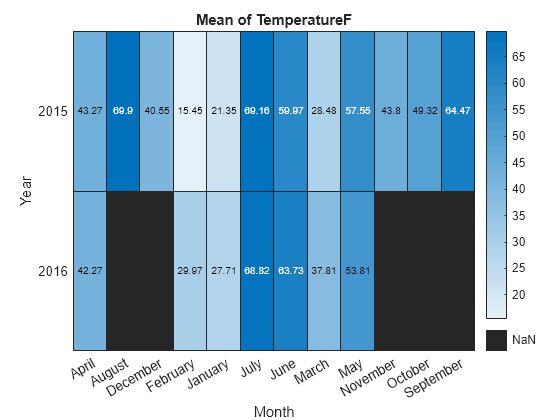
默认情况下,MATLAB 会将颜色数据作为每月的平均温度进行计算。但是,可通过设置 ColorMethod 属性来更改计算方法。
对轴值重新排序
轴值按字母顺序显示。对月份重新排序,以使其按年月顺序显示。可以使用分类数组或通过设置 HeatmapChart 属性来自定义标签。
要使用分类数组,首先将该表的 Month 列中的数据从元胞数组更改为分类数组。然后使用 reordercats 函数对类别重新排序。可以将这些函数应用于工作区中的表 (tbl) 或 HeatmapChart 对象的 SourceTable 属性中存储的表 (h.SourceTable)。将这些函数应用于 HeatmapChart 对象中存储的表可避免影响原始数据。
h.SourceTable.Month = categorical(h.SourceTable.Month);
neworder = {'January','February','March','April','May','June','July',...
    'August','September','October','November','December'};
h.SourceTable.Month = reordercats(h.SourceTable.Month,neworder);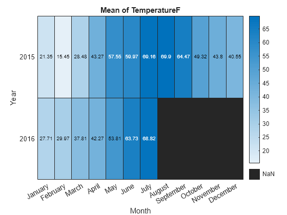
对于分类数组,同样可以使用 addcats、removecats 或 renamecats 函数添加、删除或重命名热图标签。
也可以使用 HeatmapChart 对象的 XDisplayData 和 YDisplayData 属性对轴值重新排序。
h.XDisplayData = {'January','February','March','April','May','June', ...
    'July','August','September','October','November','December'};
修改标题和轴标签
使用表格数据创建热图时,会自动生成热图的标题和轴标签。通过设置 HeatmapChart 对象的 Title、XLabel 和 YLabel 属性,自定义标题和轴标签。例如更改标题和删除 x 轴标签。另外还可以更改字体大小。
h.Title = 'Average Temperatures';
h.XLabel = '';
h.FontSize = 12;

修改缺失数据元胞的外观
由于缺少 2016 年 8 月至 2016 年 12 月的数据,因此这些元胞显示为缺失数据。使用 MissingDataColor 和 MissingDataLabel 属性修改缺失数据元胞的外观。
h.MissingDataColor = [0.8 0.8 0.8];
h.MissingDataLabel = 'No Data';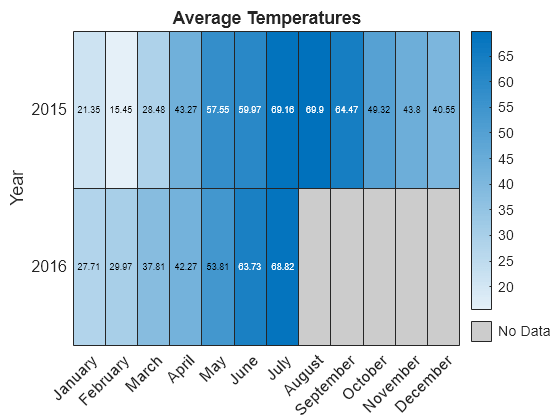
删除颜色栏
通过设置 ColorbarVisible 属性删除颜色栏。
h.ColorbarVisible = 'off';
设置元胞文本格式
通过设置 CellLabelFormat 属性自定义每个元胞中显示的文本的格式。例如,显示不带小数点的值文本。
h.CellLabelFormat = '%.0f';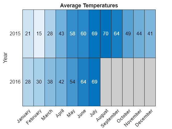
添加或删除轴值
通过设置 XDisplayData 属性,仅显示每个季度的第一个月。通过设置 YDisplayData 属性,沿 y 轴添加年份 2017。将这些属性分别设置为 XData 或 YData 中的值的子集、超集或置换。
h.XDisplayData = {'January','April','July','October'};
h.YDisplayData = {'2015','2016','2017'};
由于没有与 2017 年关联的数据,因此热图单元格使用缺失数据颜色。
另请参阅
函数
heatmap|table|readtable|addcats|removecats|renamecats|reordercats|categorical