Pie Charts and Donut Charts
Pie charts and donut charts are useful for making quick comparisons and seeing
part-to-whole relationships. Use the piechart
function to create a pie chart, and use the donutchart function to create a donut chart. You can customize labels,
colors, and other aspects of these charts by setting properties.
Before R2023b: Use the pie function to
create pie charts.
Create Pie Chart and Donut Chart
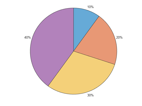
Create a pie chart from a vector of numbers. By default, each slice label displays a percentage value.
data = [1 2 3 4];
piechart(data)
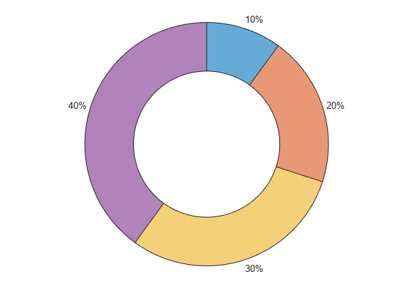
Create a donut chart using the same data.
donutchart(data)
Change Slice Labels
If you specify slice names when creating the chart, the names are included in the slice labels.
data = [1 2 3 4];
names = ["May" "June" "July" "August"];
piechart(data,names)

You can change the slice labels by setting the LabelStyle property of the chart. You can set properties as name-value arguments when you create the chart, or you can set properties later. The LabelStyle property has options for displaying different combinations of slice names, data values, and percentages.
For example, create a pie chart that displays the slice names with the data values. Return the PieChart object as p, so you can change the labels later.
p = piechart(data,names,LabelStyle="namedata");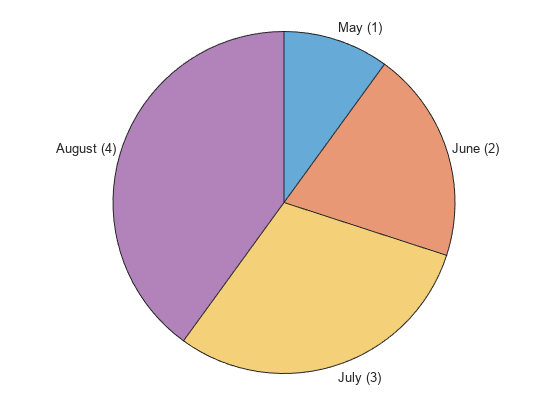
Change the value of LabelStyle to "name" so that only the slice names are visible.
p.LabelStyle="name";
Customize Colors and Center Hole Size
You can change the colors of the slices as well as the color and thickness of the slice outlines. For donut charts, you can resize the center hole and add a center label.
To change the colors of the slices, use the colororder function. For example, create a donut chart with the default colors.
data = [1 2 3 4];
names = ["May" "June" "July" "August"];
d = donutchart(data,names);
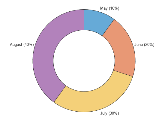
The colororder function provides several named color palettes to choose from, including gem (default), glow, sail, reef, meadow, dye, and earth. Change the color palette to meadow.
colororder meadow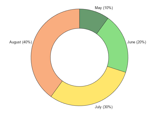
You can also create your own custom palette as an array of RGB triplets or a string vector containing hexadecimal color codes or color names.
Create a custom palette as a string vector of hexadecimal color codes, and pass it to the colororder function.
mycolors = ["#8C1A66" "#D966B3" "#78AB30" "#C7E0A3"];
colororder(mycolors)

Change the color and thickness of the slice outlines by setting the EdgeColor and LineWidth properties.
d.EdgeColor = "white";
d.LineWidth = 3;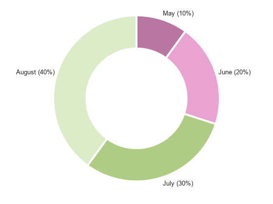
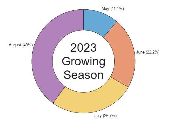
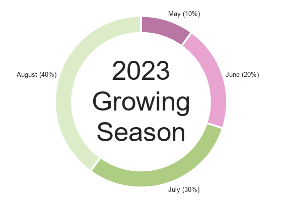
To change the size of the center hole and add a center label, set the InnerRadius and CenterLabel properties.
d.InnerRadius = 0.8;
d.CenterLabel = ["2023" "Growing" "Season"];
Arrange and Offset Slices
You can arrange the slices of your chart in different ways. Choose between a clockwise or counterclockwise arrangement, change the location of the first slice, or offset one or more slices from the rest of the chart.
By default, pie charts and donut charts have a clockwise arrangement. To arrange the slices in a counterclockwise direction, use the Direction property. For example, create a pie chart with the slices in the default "clockwise" direction.
data = [1 1 1 8];
names = ["May" "June" "July" "August"];
p = piechart(data,names);
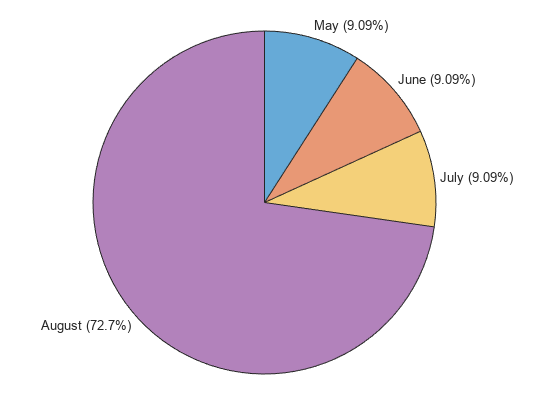
Reverse the direction by setting the Direction property to "counterclockwise".
p.Direction = "counterclockwise";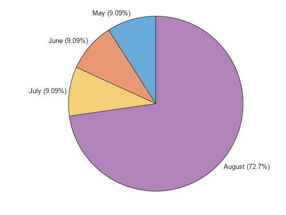
You can shift the position of the first slice by using the StartAngle property. The other slices shift in response. By default, the StartAngle value is 0, which means that the trailing edge of the first slice points up. In this example, the first slice is the May slice.
Shift the first slice by 90 degrees counterclockwise.
p.StartAngle = -90;

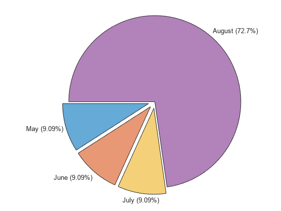
To offset a slice from the rest of the pie chart, use the ExplodedWedges property. Specify a number or vector of numbers that refer to the slices that you want to offset. For example, offset the first, second, and third slices.
p.ExplodedWedges = [1 2 3];
Visualize Table Data
You can use pie charts and donut charts to visualize variables of a table. For example, create a table containing four month names in one variable and corresponding farmers' market sales in another variable.
Month = ["May" "June" "July" "August"]';
Sales = [5000 10000 12000 18000]';
fmarket = table(Month,Sales)
fmarket=4×2 table
     Month      Sales
    ________    _____

    "May"        5000
    "June"      10000
    "July"      12000
    "August"    18000
Create a donut chart to visualize the sales data. Display the month and sales percentage next to each slice and add a center label.
d = donutchart(fmarket,"Sales","Month",LabelStyle="namepercent");
d.CenterLabel = ["2023" "Growing" "Season"];
