支持表的绘图
许多绘图函数可以直接从表中绘制数据。您将表作为第一个参量传递给函数,后跟要绘制的变量。您可以指定表或时间表,并且在许多情况下,您可以在同一坐标区中一起绘制多个数据集。
以下示例使用 plot 和 scatter 函数来演示从表中绘制数据的整体方法。要了解特定绘图函数是否支持表,请参阅该函数的文档。
创建简单的线图
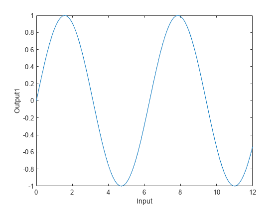
创建包含三个变量的表。然后将表作为第一个参量传递给 plot 函数,后跟要绘制的变量的名称。在本例中,在 x 轴上绘制 Input 变量,在 y 轴上绘制 Output1 变量。请注意,轴标签与变量名称匹配。
% Create a table
Input = linspace(0,12)';
Output1 = sin(Input);
Output2 = sin(Input/3);
tbl = table(Input,Output1,Output2);

% Plot the table variables
plot(tbl,"Input","Output1")
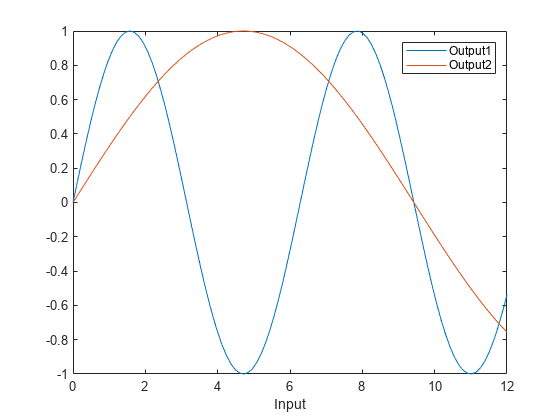
要一起绘制多个数据集,请为 x 坐标、y 坐标或两者指定表变量名称的字符串向量。例如,将 Output1 和 Output2 变量一起绘制在 y 轴上。
由于 y 坐标来自两个不同表变量,不清楚 y 轴标签应该是什么,因此轴标签保持空白。但是,如果您添加图例,则图例条目与对应的变量名称匹配。
plot(tbl,"Input",["Output1","Output2"])
legend
自定义线图
要自定义使用表绘图后的线条外观,请设置 LineStyle 和 Color 属性。例如,将 weather.csv 作为时间表读取,并绘制 Temperature 变量对行时间的图。将 Line 对象返回为 p,以便以后可以设置其属性。
注意:以下代码省略 x 坐标的变量。当您省略 x 坐标时,将绘制 y 坐标对行索引(对于表)或行时间(对于时间表)的图。
tbl = readtimetable("weather.csv");
p = plot(tbl,"Temperature");
将线型更改为虚线,并将颜色更改为紫色。
p.LineStyle = "--";
p.Color = [0.5 0 1];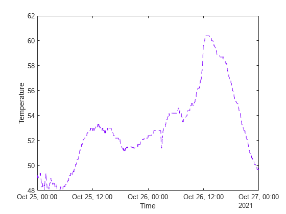
自定义散点图
您可以通过在使用表绘图后设置属性来自定义散点图中标记的外观。例如,将 patients.xls 作为表读取,并使用填充标记绘制 Diastolic 变量对 Systolic 变量的图。将 Scatter 对象返回为 s,以便以后可以设置其属性。
tbl = readtable("patients.xls");
s = scatter(tbl,"Systolic","Diastolic","filled");
将标记符号更改为正方形,用浅蓝色填充标记,并将标记大小更改为 80。
s.Marker = "sq";
s.MarkerFaceColor = [0.5 0.7 1];
s.SizeData = 80;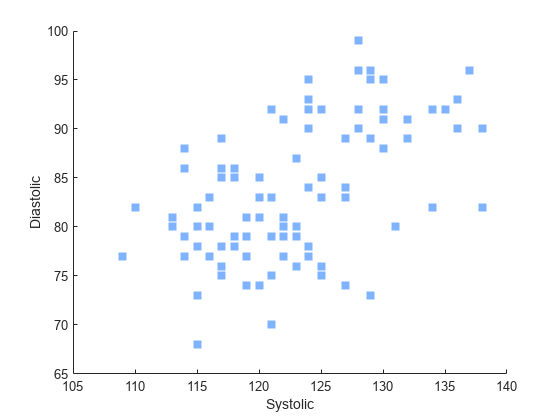
您还可以根据表变量改变标记的颜色和透明度。例如,通过将 MarkerFaceColor 属性设置为 "flat",然后将 ColorVariable 属性设置为 "Age",以根据 Age 变量改变颜色。
通过将 MarkerFaceAlpha 属性设置为 "flat",然后将 AlphaVariable 属性设置为 "Weight",以根据 Weight 变量改变透明度。
% Vary the colors
s.MarkerFaceColor = "flat";
s.ColorVariable = "Age";

% Vary the transparency
s.MarkerFaceAlpha = "flat";
s.AlphaVariable = "Weight";

通过修改表更新绘图
当您将一个表传递给绘图函数时,该表的副本会存储在绘图对象的 SourceTable 属性中。如果您更改该属性中存储的表的内容,绘图将自动更新以显示更改。(但是,如果您对工作区中的表进行更改,这些更改不会影响您的绘图。)
例如,将 patients.xls 作为表读取,并绘制 Weight 变量对 Height 变量的图。将 Scatter 对象返回为 s,以便稍后访问其属性。
tbl = readtable("patients.xls");
s = scatter(tbl,"Height","Weight","filled");
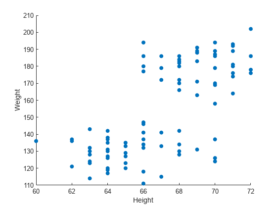
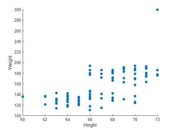
要更改表中的值,请使用圆点表示法从 Scatter 对象的 SourceTable 属性引用该表。在本例中,查找 Weight 变量的最大值并将其更改为 300。绘图将自动更新。
[~,idx] = max(s.SourceTable.Weight);
s.SourceTable.Weight(idx) = 300;
结合表和向量数据
许多支持表的绘图允许您使用表变量指定绘图的某些方面,并使用向量或矩阵指定其他方面。例如,您可以使用表中的坐标创建一个散点图,并通过将 CData 属性设置为向量、RGB 三元组或 RGB 三元组矩阵来自定义标记的颜色。
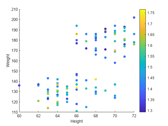
例如,使用表中的数据创建一个散点图。将 patients.xls 作为表读取,并绘制 Weight 变量对 Height 变量的图。
tbl = readtable("patients.xls");
s = scatter(tbl,"Height","Weight","filled");

接下来,使用向量更改绘制的点的颜色。当您像这样组合来自不同数据源的数据时,每个向量、矩阵或表变量的大小必须与您创建的绘图兼容。在本例中,通过将表中的收缩压值除以舒张压值来创建一个名为 bpratio 的向量。由于 bpratio 与 Height 和 Weight 变量派生自同一个表,因此它与这些变量具有相同数量的元素,从而与此绘图兼容。
通过将 CData 属性设置为 bpratio,根据血压比率为每个点着色。然后添加颜色栏。
% Vary the color by blood pressure ratio
bpratio = tbl.Systolic./tbl.Diastolic;
s.CData = bpratio;

% Add a colorbar
colorbar
您还可以绘制向量或矩阵,并使用表变量修改绘图。在创建绘图后,设置 SourceTable 属性,然后设置所需的表相关的属性。表相关的属性通常在其名称中包含 Variable 字样。例如,绘制两个包含 100 个随机数的向量。
x = rand(100,1);
y = rand(100,1);
s = scatter(x,y,"filled");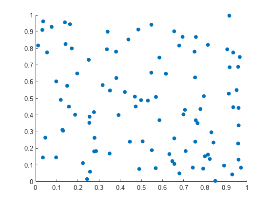
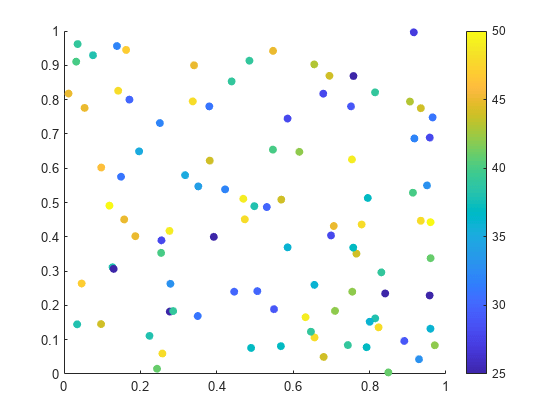
更改标记颜色,使其根据表变量中的值而变化。将 patients.xls 作为表 tbl 读取。设置 SourceTable 属性,并根据表中的 Age 变量改变标记颜色。由于表有 100 个行,绘图有 100 个点,因此 Age 变量与绘图兼容。然后,向绘图添加颜色栏。
% Set source table and vary color by age
s.SourceTable = tbl;
s.ColorVariable = "Age";

% Add a colorbar
colorbar
注意:独立可视化(如 heatmap)不支持表和向量数据的组合。
另请参阅
函数
plot|scatter|table|readtable|readtimetable