查看蜂窝塔位置的密度
此示例说明如何使用地理密度图来查看加利福尼亚地区蜂窝塔位置的密度。
加载蜂窝塔位置数据
将一个包含蜂窝塔位置数据的表加载到工作区中。下表中包含的字段通过纬度和经度来标识蜂窝塔的位置,并标识塔的类型。
load cellularTowers以地理散点图的方式查看数据
使用 geoscatter 函数绘制蜂窝塔数据。在下图中,旧金山附近有一些明显的区域因为塔的数量太密集而不能用散点图表示。
lat = cellularTowers.Latitude;
lon = cellularTowers.Longitude;
geoscatter(lat,lon,'.')
text(gca,37.75,-122.75,'San Francisco','HorizontalAlignment','right')

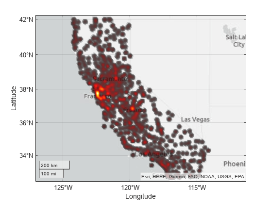
以地理密度图的方式查看数据
旧金山地区的蜂窝塔密集区域可以使用 geodensityplot 来显示。
geodensityplot(lat,lon)
text(gca,37.75,-122.75,'San Francisco','HorizontalAlignment','right')

创建指定半径的密度图
创建地理密度图时,默认情况下,密度图使用纬度和经度数据自动选择半径值。可以使用 Radius 属性手动选择以米为单位的半径。
radiusInMeters = 50e3; % 50 km
geodensityplot(lat,lon,'Radius',radiusInMeters)

使用坐标区属性调整透明度
设置为 'interp' 时,密度图的 FaceAlpha 和 FaceColor 属性分别使用底层地理坐标区的 Alphamap 和 Colormap 属性。更改 Alphamap 将更改密度值与颜色强度之间的映射。
geodensityplot(lat,lon)
alphamap(normalize((1:64).^0.5,'range'))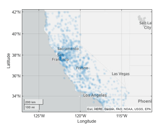
地理坐标区上的 AlphaScale 属性也可用于更改透明度。如果要显示所有有密度的位置,而不是只突出显示最密集的区域,此属性尤其有用。
figure
dp = geodensityplot(lat,lon)
dp =
  DensityPlot with properties:

        FaceColor: [0 0.4470 0.7410]
        FaceAlpha: 'interp'
     LatitudeData: [37.1189 37.3464 37.1575 37.3656 37.4019 37.2581 37.4339 37.4458 37.0081 38.9806 38.9403 38.8361 39.3886 39.3222 39.1967 39.3900 39.0958 39.1019 38.8036 39.1450 34.7386 34.8347 34.5264 34.5700 34.8883 34.9200 … ] (1×1193 double)
    LongitudeData: [-121.8336 -121.6303 -121.9839 -122.1356 -122.1769 -122.0336 -121.8867 -121.8925 -121.2875 -121.6619 -121.4147 -121.5636 -121.1775 -121.6694 -121.9978 -122.0133 -121.4058 -121.7769 -121.7211 -121.9100 -120.4456 … ] (1×1193 double)
       WeightData: [1×0 double]
           Radius: 1.8291e+04

  Show all properties
gx = gca
gx =
  GeographicAxes with properties:

     Basemap: 'streets-light'
    Position: [0.1300 0.1100 0.7750 0.8150]
       Units: 'normalized'

  Show all properties
gx.AlphaScale = 'log';
使用 DensityPlot 对象属性指定颜色
添加颜色。
dp.FaceColor = 'interp';
colormap hot
另请参阅
geodensityplot | DensityPlot 属性
相关主题
You can also select a web site from the following list:
Americas
- América Latina (Español)
- Canada (English)
- United States (English)
Europe
- Belgium (English)
- Denmark (English)
- Deutschland (Deutsch)
- España (Español)
- Finland (English)
- France (Français)
- Ireland (English)
- Italia (Italiano)
- Luxembourg (English)
- Netherlands (English)
- Norway (English)
- Österreich (Deutsch)
- Portugal (English)
- Sweden (English)
- Switzerland
- United Kingdom (English)