Main Content

focus

Focus UI component

Since R2022a

    Syntax

    Description

    focus(c) gives keyboard focus to the UI component c.

    Calling focus on a UI component has these effects:

    • The figure containing the component is displayed on top of all other figures.

    • The UI component is displayed with a blue focus ring.

    • App users can interact with the UI component using the keyboard.

    example

    Examples

    collapse all

    Create a UI figure with a label, drop-down component, and two buttons. Make the OK button the default button by giving it keyboard focus. The user can push the button by pressing Enter or the space bar.

    fig = uifigure(Position=[500 500 300 100]);
    gl = uigridlayout(fig,[2 2]);
    
    lbl = uilabel(gl,Text="Select a color:");
    dd = uidropdown(gl,Items=["Red" "Green" "Blue"]);
    btn1 = uibutton(gl,Text="OK");
    btn2 = uibutton(gl,Text="Cancel");
    
    focus(btn1)

    UI figure window with a label, drop-down component, and two buttons. The OK button has a blue focus ring.

    Create a new script file in your current folder. In the script, create a UI figure and a grid layout manager with two rows. Add a button to the first row, and specify that the app executes a callback function named createTextArea when a user pushes the button. Give keyboard focus to the button.

    fig = uifigure(Position=[500 500 300 200]);
    gl = uigridlayout(fig);
    gl.RowHeight = ["1x" "3x"];
    gl.ColumnWidth = "1x";
    
    btn = uibutton(gl,Text="Enter Comment", ...
        ButtonPushedFcn=@createTextArea);
    focus(btn)
    

    Define the createTextArea function at the bottom of the file. In the function, create a text area in the second row of the grid layout manager. Then, give keyboard focus to the text area.

    function createTextArea(src,event)
    gl = src.Parent;
    ta = uitextarea(gl);
    focus(ta)
    end

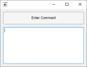
    Run the script. Press Enter to execute the ButtonPushedFcn callback, and the text area appears with keyboard focus. You can then type in the text area.

    UI figure window with a button and a text area. The text area has a blue focus ring.

    Input Arguments

    collapse all

    UI component to focus, such as a Button or EditField object.

    Focusable UI components are those that users can interact with by using a keyboard. Some UI components are not focusable, including most containers, as well as components with Enable or Visible set to 'off'.

    Version History

    Introduced in R2022a