uigridlayout
创建网格布局管理器
说明
g = uigridlayout(___,Name,Value)GridLayout 属性值。在上述任一语法中的所有其他参量之后指定名称-值对组参量。
示例
创建一个图窗和一个网格。然后通过设置行高和列宽来配置该网格。在本例中,配置 3×2 网格,其中前两行具有 22 像素的固定高度,而底行具有可变高度。将左列设置为具有 150 像素的宽度,将右列设置为具有可变宽度。网格填充整个图窗,但因为网格不可见,图窗看起来为空。
fig = uifigure('Position',[100 100 440 320]);
g = uigridlayout(fig);
g.RowHeight = {22,22,'1x'};
g.ColumnWidth = {150,'1x'};
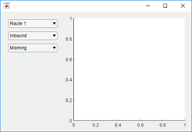
将两个下拉框、一个列表框和一个坐标区组件添加到网格中。如果没有为组件的 Layout 属性指定行或列位置,则默认情况下,组件会从左到右、从上到下填充网格。在本例中,通过设置 Layout 属性将第二个下拉框 (dd2) 和列表框 (chanlist) 移至特定的行和列。
% Device drop-down
dd1 = uidropdown(g);
dd1.Items = {'Select a device'};

% Range drop-down
dd2 = uidropdown(g);
dd2.Items = {'Select a range'};
dd2.Layout.Row = 2;
dd2.Layout.Column = 1;

% List box
chanlist = uilistbox(g);
chanlist.Items = {'Channel 1','Channel 2','Channel 3'};
chanlist.Layout.Row = 3;
chanlist.Layout.Column = 1;

% Axes
ax = uiaxes(g);

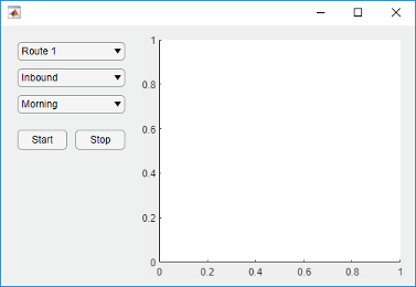
将坐标区设置为跨越行 1 到 3,填充垂直空间。
ax.Layout.Row = [1 3];
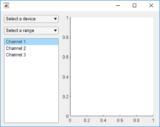
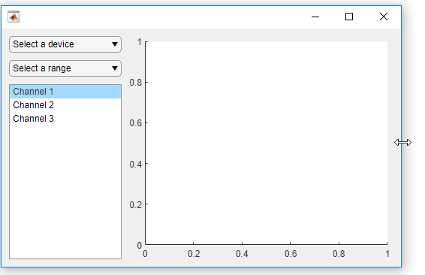
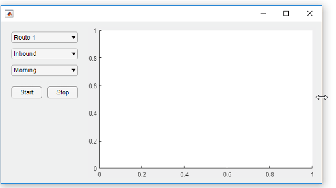
调整图窗大小时,坐标区会增大和缩小以填充左列未使用的可用空间。左侧的各组件保持固定,因为该列定义为具有 150 像素的宽度。
为可变宽度列指定不同权重时,每列的宽度与权重成比例。可变高度行以相同方式分配空间。
创建一个图窗和一个 2×2 网格。然后配置行高和列宽。在本例中,顶行具有 40 像素的固定高度,而底行具有可变高度。两列的宽度均可变,但第二列的权重是第一列的两倍。由于网格不可见,图窗看起来为空。
fig = uifigure('Position',[100 100 437 317]);
g = uigridlayout(fig,[2 2]);
g.RowHeight = {40,'1x'};
g.ColumnWidth = {'1x','2x'};
在顶行添加一个跨两列的标签。然后向底行的每列添加一个坐标区组件。
% Add title
title = uilabel(g,'Text','Market Trends');
title.HorizontalAlignment = 'center';
title.FontSize = 24;
title.Layout.Row = 1;
title.Layout.Column = [1,2];

% Add two axes
ax1 = uiaxes(g);
ax2 = uiaxes(g);
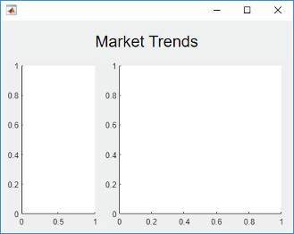
因为左列的权重为 1,右列的权重为 2,所以右侧坐标区使用的水平空间是左侧坐标区的两倍。调整图窗大小时,网格会保持此比率。
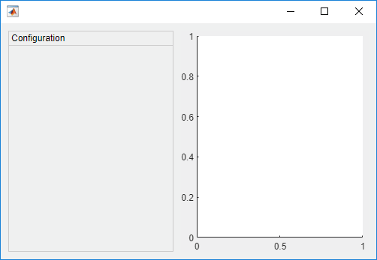
在面板中排列 UI 组件的一种方法是在面板中创建网格。
创建一个图窗和一个 1×2 网格。然后配置列宽。在本例中,左列具有 220 像素的固定宽度,而右列具有可变宽度。由于网格不可见,图窗看起来为空。
fig = uifigure('Position',[100 100 500 315]);
grid1 = uigridlayout(fig,[1 2]);
grid1.ColumnWidth = {220,'1x'};
将一个面板和坐标区添加到 grid1。
p = uipanel(grid1,'Title','Configuration');
ax = uiaxes(grid1);
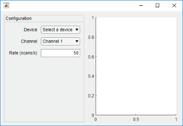
在面板中创建一个名为 grid2 的网格。然后在 grid2 中放置三个组件和三个标签。grid2 的左列将标签与组件对齐。由于每行高度仅为 22 个像素,因此面板中第三行下方具有额外空间。
% Grid in the panel
grid2 = uigridlayout(p,[3 2]);
grid2.RowHeight = {22,22,22};
grid2.ColumnWidth = {80,'1x'};

% Device label
dlabel = uilabel(grid2);
dlabel.HorizontalAlignment = 'right';
dlabel.Text = 'Device';

% Device drop-down
devicedd = uidropdown(grid2);
devicedd.Items = {'Select a device'};

% Channel label
chlabel = uilabel(grid2);
chlabel.HorizontalAlignment = 'right';
chlabel.Text = 'Channel';

% Channel drop-down
channeldd = uidropdown(grid2);
channeldd.Items = {'Channel 1', 'Channel 2'};

% Rate Label
ratelabel = uilabel(grid2);
ratelabel.HorizontalAlignment = 'right';
ratelabel.Text = 'Rate (scans/s)';

% Rate edit field
ef = uieditfield(grid2, 'numeric');
ef.Value = 50;
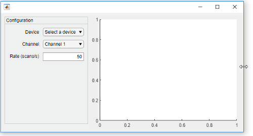
调整图窗大小时,坐标区会增大和缩小以填充 grid1 的左列未使用的可用空间。面板保持固定,因为该列定义为具有 220 像素的宽度。
嵌套网格允许您管理组件的子集。在本例中,有三个网格:一个网格覆盖整个图窗,第二个网格管理垂直堆叠的组件,第三个网格管理并排放置在垂直堆叠底部的两个按钮。
创建一个图窗和一个 1×2 网格。然后配置列宽。在本例中,左列具有 150 像素的固定宽度,而右列具有可变宽度。由于网格不可见,图窗看起来为空。
fig = uifigure('Position',[100 100 500 315]);
grid1 = uigridlayout(fig,[1 2]);
grid1.ColumnWidth = {150,'1x'};

在 grid1 的第一列内创建一个名为 grid2 的 4×1 网格。然后将一个坐标区组件添加到 grid1 的第二列。
grid2 = uigridlayout(grid1,[4 1]);
grid2.RowHeight = {22,22,22,44};

ax = uiaxes(grid1);
在 grid2 的前三行中添加三个下拉框。
% Routes drop-down
ddRoutes = uidropdown(grid2);
ddRoutes.Items = {'Route 1', 'Route 2'};

% Direction drop-down
ddDirection = uidropdown(grid2);
ddDirection.Items = {'Inbound', 'Outbound'};

% Time drop-down
ddTime = uidropdown(grid2);
ddTime.Items = {'Morning', 'Afternoon'};
在 grid2 的最后一行内创建一个名为 grid3 的 1×2 网格。然后将两个按钮添加到 grid3。去除 grid3 的左右边距,使按钮与下拉框的左右边缘对齐。
grid3 = uigridlayout(grid2,[1 2]);
grid3.Padding = [0 10 0 10];
b1 = uibutton(grid3,'Text','Start');
b2 = uibutton(grid3,'Text','Stop');
调整图窗大小时,坐标区会增大和缩小以填充 grid1 的左列未使用的可用空间。左侧的各组件保持固定,因为该列定义为具有 150 像素的宽度。
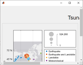
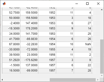
通过指定像素坐标或位置名称,以显示可滚动网格布局的子组件。
创建一个 5×2 网格布局,并将网格的 Scrollable 属性设置为 'on'。然后在该网格中添加一个标签、一个表和一个面板。将面板的 Scrollable 属性设置为 'off',然后向面板添加一个图。
fig = uifigure('Position',[782 497 435 311]);
g = uigridlayout(fig,'Scrollable','on');
g.RowHeight = {22,40,22,22,400};
g.ColumnWidth = {400,400};

lbl = uilabel(g,'Text','Tsunamis');
lbl.Layout.Row = 2;
lbl.Layout.Column = [1,2];
lbl.HorizontalAlignment = 'center';
lbl.FontSize = 28;

tsunamis = readtable('tsunamis.xlsx');
tsunamis.Cause = categorical(tsunamis.Cause);
t = uitable(g,'Data',tsunamis);
t.Layout.Row = [3,5];
t.Layout.Column = 2;

p = uipanel(g);
p.Scrollable = 'off';
p.Layout.Row = [3,5];
p.Layout.Column = 1;
gb = geobubble(p,tsunamis.Latitude,tsunamis.Longitude,...
    tsunamis.MaxHeight,tsunamis.Cause);
滚动到网格中的一个位置。
scroll(g,100,-30)
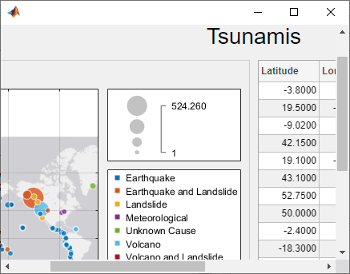
现在使用位置名称滚动到网格的右下角。
scroll(g,'bottom','right')
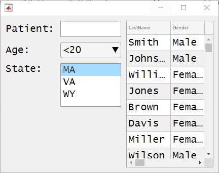
创建一个网格布局管理器,当您将标签等组件添加到 App 时,或当基于文本的组件的字体大小动态变化时,该管理器会自动调整其行和列的大小以适应这些组件。
创建一个 5×2 网格布局管理器。对第一列的宽度和前四行的高度指定 'fit'。
fig = uifigure('Position',[500 500 430 310]);

g = uigridlayout(fig);
g.ColumnWidth = {'fit',120,'1x'};
g.RowHeight = {'fit','fit','fit','fit','1x'};
创建一个占据所有列的标题标签。然后,在第一列和第二列的行中创建标签和控件。最后,在最后一列中创建占据第二行到第五行的一个表 UI 组件。请注意,当您将组件添加到具有 'fit' 高度和宽度的行和列时,这些行和列的大小会自动调整以适应新内容。
patientLabel = uilabel(g,'Text','Patient:');
patientLabel.Layout.Row = 2;
patientLabel.Layout.Column = 1;
patientEdit = uieditfield(g);

ageLabel = uilabel(g,'Text','Age:');
ageLabel.Layout.Row = 3;
ageLabel.Layout.Column = 1;
ageEdit = uidropdown(g,'Items',{'<20','20 - 40','40 - 60','>60'});

stateLabel = uilabel(g,'Text','State:');
stateLabel.VerticalAlignment = 'top';
stateLabel.Layout.Row = 4;
stateLabel.Layout.Column = 1;
stateLB = uilistbox(g,'Items',{'MA','VA','WY'});

tdata = readtable('patients.dat');
uit = uitable(g);
uit.Data = tdata;
uit.Layout.Row = [2 5];
uit.Layout.Column = 3;
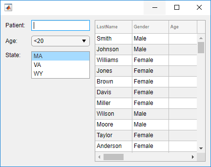
现在,更改网格中所有 UI 组件的字体名称和字体大小。
set(allchild(g),'FontName','Lucida Console','FontSize',20)
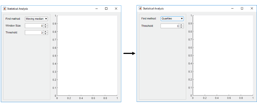
根据用户在下拉菜单中的选择,隐藏网格行中的组件。
创建一个名为 showhide.m 的程序文件。在该文件中,
在图窗中创建一个 1×2 网格,称之为
grid1。使用此网格来管理一个面板和一个坐标区组件。在该面板内创建一个 3×2 网格,称之为
grid2。使用此网格来管理一个下拉菜单、两个微调器及其标签的布局。为下拉菜单创建名为
findMethodSelected的回调函数。当下拉菜单的值更改为'Quartiles'时,此回调通过将grid2.RowHeight{2}设置为0来隐藏grid2的第二行中的组件。
然后,运行文件。
function showhide

    f = uifigure('Name','Statistical Analysis');

    % Create grid1 in the figure
    grid1 = uigridlayout(f);
    grid1.RowHeight = {'1x'};
    grid1.ColumnWidth= {220,'1x'};

    % Add a panel and axes
    p = uipanel(grid1);
    ax = uiaxes(grid1);

    % Create grid2 in the panel
    grid2 = uigridlayout(p);
    grid2.RowHeight = {22, 22, 22};
    grid2.ColumnWidth = {80,'1x'};

    % Add method label and drop-down
    findMethodLabel = uilabel(grid2,'Text','Find Method:');
    findMethod = uidropdown(grid2);
    findMethod.Items = {'Moving median','Quartiles'};
    findMethod.ValueChangedFcn = @findMethodSelected;

    % Add window size label and spinner
    winSizeLabel = uilabel(grid2,'Text','Window Size:');
    winSize = uispinner(grid2,'Value',0);

    % Add threshold label and spinner
    thresLabel = uilabel(grid2,'Text','Threshold:');
    thres = uispinner(grid2,'Value',3);

        function findMethodSelected(src,~)
            method = src.Value;

            switch method
            case 'Quartiles'
                % Collapse the second row (hides winSize spinner)
                grid2.RowHeight{2} = 0;
            case 'Moving median'
                % Expand the second row
                grid2.RowHeight{2} = 22;
            end
        end
end
当您在 App 中将 Find Method 设置为 Quartiles 时,Window Size 标签及其旁边的微调器将隐藏。
输入参数
名称-值参数
将可选参量对组指定为 Name1=Value1,...,NameN=ValueN,其中 Name 是参量名称,Value 是对应的值。名称-值参量必须出现在其他参量之后,但对各个参量对组的顺序没有要求。
如果使用的是 R2021a 之前的版本,请使用逗号分隔每个名称和值,并用引号将 Name 引起来。
示例: uigridlayout('RowHeight',{100,100}) 创建一个网格,其中包含高度为 100 像素的两个行。
注意
此处所列的属性只是一部分。有关完整列表,请参阅 GridLayout。
此 属性 为只读。
网格布局管理器的位置和大小,以 [left bottom width height] 形式的四元素向量形式返回。此表介绍该向量中的每个元素。
| 元素 | 描述 |
|---|---|
left | 父容器的内部左边缘与网格布局管理器的左边缘之间的距离 |
bottom | 父容器的内部下边缘与网格布局管理器的下边缘之间的距离 |
width | 网格布局管理器左边缘和右边缘之间的距离 |
height | 网格布局管理器下边缘和上边缘之间的距离 |
所有测量值都以像素为单位。
此图显示由具有一些 UI 组件的网格布局管理器的 Position 值(橙色实线)和 InnerPosition 值(蓝色虚线)定义的区域。

提示
要查看网格中组件对象的列表,请查询网格的
Children属性。更改列表中的顺序不会更改网格中的布局。您可以查询网格中组件对象的
Position属性以确定其位置和大小,但在将组件添加到网格时,属性值不会立即更新。