Analyze Data Using XY Plot
This example shows how to analyze data plotted on an XY plot in the Simulation Data Inspector using trend lines.
The XY plot used in this example is also available in the Record block and the XY Graph block. When you use the XY plot in the Record block and the XY Graph block, add the visualization and configure the appearance using the toolstrip. Plot data on the XY plot the same way shown in this example.
Import Data into Simulation Data Inspector
Open the Simulation Data Inspector.
Simulink.sdi.view
The data for this example is stored in the MAT file XYData.mat. To import the data using the UI, click Import ![]() .
.
In the Import dialog box, under Import from, select File. Then, enter XYData.mat in the text box and click Import.
Alternatively, import the data programmatically using the Simulink.sdi.createRun function.
xyRunID = Simulink.sdi.createRun("XY signals","file","XYData.mat");
Plot Data on XY Plot
By default, the Simulation Data Inspector uses time plots for each subplot in the layout. To plot the data on an XY plot, you need to add the visualization to the layout.
To add an XY plot to your layout, click Visualizations and layouts ![]() . Then, from Visualizations, click or click and drag the XY icon onto the subplot.
. Then, from Visualizations, click or click and drag the XY icon onto the subplot.

To plot signals on the XY plot, select signals in the table. Then, assign signal pairs to the x-Axis and y-Axis of a row in the XY Data dialog box. By default, the first signal you click is assigned to the x-Axis, and the second signal you click is assigned to the y-Axis of the same row. If you select more than two signals, the software assigns the data to the next row starting with the x-Axis. You can reassign signals using the drop-down menus.

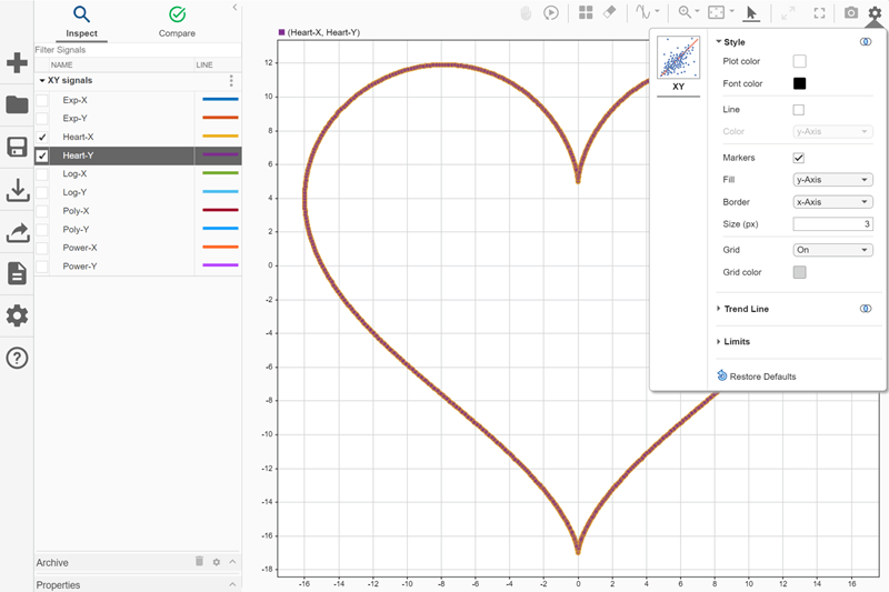
For example, select the check box next to the Heart-X signal. Then, select the check box next to the Heart-Y signal. Because you selected the Heart-X signal first, the software assigns Heart-X to the x-Axis and Heart-Y to the y-Axis. Click OK.
You can modify the appearance of XY plots in the layout using the Visualization Settings. To access the visualization settings for the XY plot, click Visualization Settings ![]() .
.
By default, data is displayed as a scatter plot with the marker fill matching the y-axis signal color and the marker border matching the x-axis signal color. To display only markers, only lines, or both markers and connecting lines, select or clear Line and Markers . The line and marker colors can match the color for the signal that provides the x data or the color for the signal that provides the y data. Specified settings apply for all XY plots in the layout.

You can also change the limits of the x-axis and y-axis from the Visualization Settings ![]() . To change the limits, first, clear Autoscale. Then, enter new values for the x and y limits. These limits apply to the currently selected XY subplot. By default, Autoscale is selected, which performs a fit-to-view on the XY subplot.
. To change the limits, first, clear Autoscale. Then, enter new values for the x and y limits. These limits apply to the currently selected XY subplot. By default, Autoscale is selected, which performs a fit-to-view on the XY subplot.

Analyze XY Data Using Trend Lines
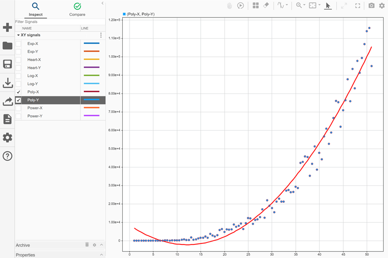
To analyze the relationship between the x- and y-data, add a trend line to the XY plot. Because a trend line is most useful when the relationship between the x- and y-data can be expressed as a function, plot the Poly-X and Poly-Y signals on the XY plot:
Clear the check boxes next to the
Heart-XandHeart-Ysignals in the table.Select the check box next to the
Poly-X. Then, select thePoly-Ysignal.The software automatically assigns
Poly-Xto the x-Axis andPoly-Yto the y-Axis of the first row.Click OK.
To add a trend line, click Visualization Settings ![]() and select Trend line. From the Type list, select
and select Trend line. From the Type list, select Polynomial. Trend lines are not supported while live streaming XY data.

By default, the Simulation Data Inspector computes the polynomial trend line in the form of a third-order polynomial. To see the equation for the trend line as well as information about how it fits the data, pause on the trend line. The tooltip for the trendline shows:
The names of the signals that provide the x- and y- data for the series.
The coordinates for the trend line point closest to the pointer.
The trend line equation and R-squared value.

When you use a polynomial trend line, you can specify the order of the polynomial between 2 and 6, inclusive. For example, to see how the order of the polynomial affects the fit of the trend line, change the order of the polynomial trend line to 2.
Open the visualization settings for the XY plot.
In the text box next to the trend line type selection, enter
2.
When you use a second-order polynomial, the trend line does not fit the start of the data as well.

To see how they fit the Poly-X and Poly-Y data, try other trend line options. You can add these types of trend line to the XY plot:
Linear: Trend line equation has the form .
Logarithmic: Trend line equation has the form . The x-data must not contain
0or negative values.Polynomial: Trend line equation has the form , where the number of terms is determined by the specified order.
Exponential: Trend line equation has the form . The y-data must not contain
0or negative values.Power: Trend line equation has the form . The x- and y-data must not contain
0or negative values.
Try plotting other pairs of signals in the XY plot and explore how each trend line option fits each data set.