Simulink Context Menu Architecture
Simulink® context menus are the menus that open when you right-click something in Simulink. You can customize a subset of these menus: the context menu of the Simulink model canvas and the context menus of model elements in the model canvas such as blocks, signal lines, and annotations. To do so, it is important to understand the default architecture of the context menus and know what modifications you can make.
Architecture
These context menus are made up of building blocks called widgets.
For example, the push buttons you see in the menu are a type of widget. Some widgets
are containers — widgets that contain other widgets. The
context menu itself is a container named RichMenu.
The RichMenu widget has three subdivisions:
Focus menu — Part of the context menu with the vertical bar at the left edge
Pre-Focus menu — Part of the context menu above the Focus menu, excluding the header row
Post-Focus menu — Part of the context menu below the Focus menu, excluding the Select Apps row and app options
The subdivisions are not containers, they are locations within the
RichMenu widget. At each of these locations, the
RichMenu widget contains MenuSection
widgets.
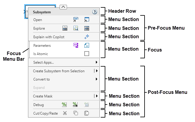
The MenuSection widgets are also containers.
MenuSection widgets can contain a variety of widgets,
including other containers. For example, a MenuSection widget can
contain a ButtonRowItem widget that contains
PushButton widgets.
In addition to the MenuSection widget collections in the
Pre-Focus, Focus, and Post-Focus menus, the RichMenu also
contains AppMenu widgets and the FormatBar
widget. These widgets are containers as well.
AppMenu widgets are the app sections that open when you pause
on Select Apps and select apps. Each AppMenu
widget contains options specific to a Simulink app.
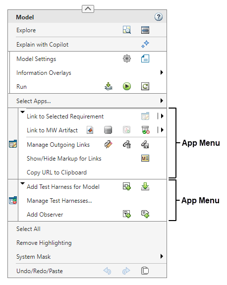
The FormatBar widget is the menu that opens and closes when you
click the arrow at the top of the context menu. The format bar contains widgets
related to clipboard and formatting operations.

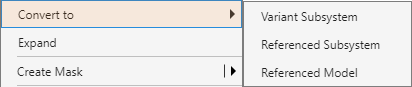
Some widgets in the context menu hierarchy have popups. Popups are widgets that appear in response to an interaction. For example, when you right-click the Simulink model canvas and pause your pointer on System Mask, the list of options that appears is a popup. When you right-click a signal line and pause your pointer on the arrow in the button row labeled Log Signal, the option that appears is a popup.
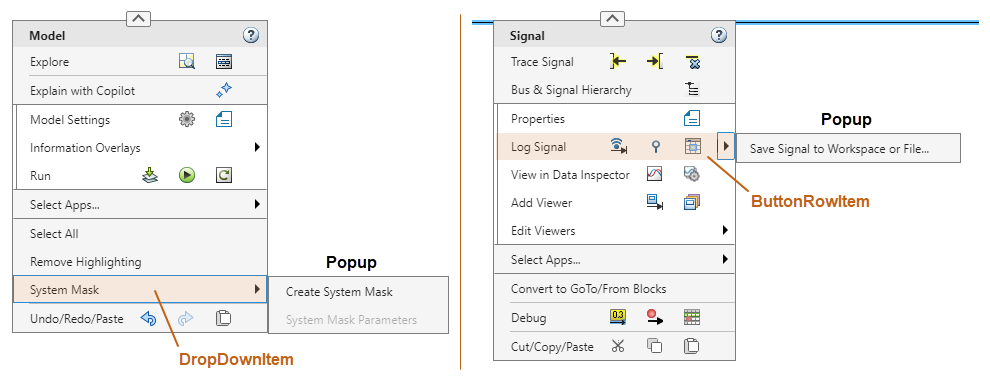
A popup must be a Menu widget, which is a container. While the
popup itself is a container, a widget with a popup is not necessarily a container.
Having a popup is different from containing other widgets. For example, a
DropDownItem widget such as the System
Mask option has a popup but is not a container. A
ButtonRowItem widget such as the Log
Signal row is a container and can have popups.
Available Modifications
You can customize the context menu by extending the RichMenu
widget. Extending a container means adding widgets at the extension points of the
container.
The extension points of the RichMenu widget are:
Bottom of the Pre-Focus menu
Bottom of the Focus menu
Bottom of the Post-Focus menu
By extending the RichMenu widget, you can add
MenuSection widgets at these locations and populate them, for
example with ButtonRowItem or MenuItem
widgets. Extending other containers is not supported. For example, you cannot add
buttons to the default button rows of the context menu or menu items to the default
menu sections.
This is the hierarchy of context menu widgets that you can add to the context
menu, including containers and popups. The hierarchy lists the widgets using their
JSON type values. To add a widget to the context menu, work your
way down the hierarchy from the container you want to extend, which is the
RichMenu container. For example, to add a
PushButton widget, add a MenuSection
container to the RichMenu container, add a
ButtonRowItem container to the MenuSection
container, and add a PushButton widget to the
ButtonRowItem container.
RichMenu (container)
Can contain:
MenuSection(container)Can contain:
MenuItemSplitItemCan have this popup:
Menu(container)Can contain:
MenuSectioncontainer (cycle back toMenuSectioncontainer at top of hierarchy)
DropDownItemCan have this popup:
Menu(container)Can contain:
MenuSectioncontainer (cycle back toMenuSectioncontainer at top of hierarchy)
ButtonRowItem(container)Can contain:
PushButton
Can have this popup:
Menu(container)Can contain:
MenuSectioncontainer (cycle back toMenuSectioncontainer at top of hierarchy)
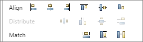
The table shows examples of the types of widgets in the hierarchy.
| Widget | Example |
|---|---|
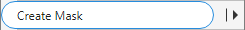
ButtonRowItem |
|
(Highlighted in orange) |
|
(Highlighted in orange) |
|
MenuItem |
|
MenuSection |
|
PushButton |
|
SplitItem |
|