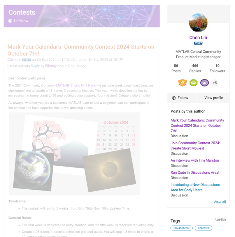
We are thrilled to announce the redesign of the Discussions leaf page, with a new user-focused right-hand column!

Why Are We Doing This?
- Address Readers’ Needs:
Previously, the right-hand column displayed related content, but feedback from our community indicated that this wasn't meeting your needs. Many of you expressed a desire to read more posts from the same author but found it challenging to locate them.
With the new design, readers can easily learn more about the author, explore their other posts, and follow them to receive notifications on new content.
- Enhance Authors’ Experience:
Since the launch of the Discussions area earlier this year, we've seen an influx of community members sharing insightful technical articles, use cases, and ideas. The new design aims to help you grow your followers and organize your content more effectively by editing tags. We highly encourage you to use the Discussions area as your community blogging platform.
We hope you enjoy the new design of the right-hand column. Please feel free to share your thoughts and experiences by leaving a comment below.
11 个评论
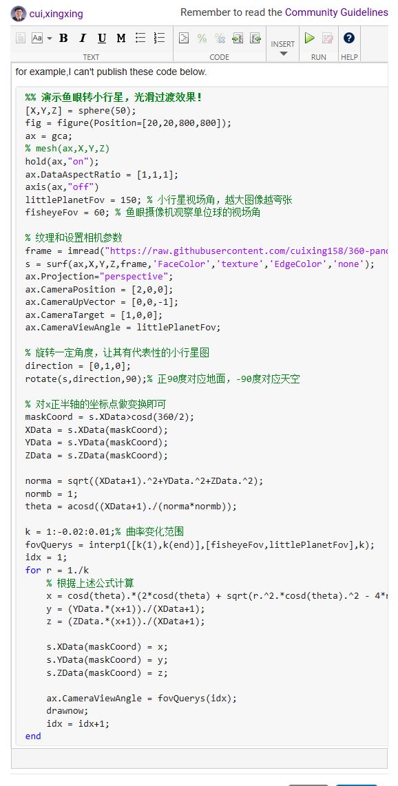
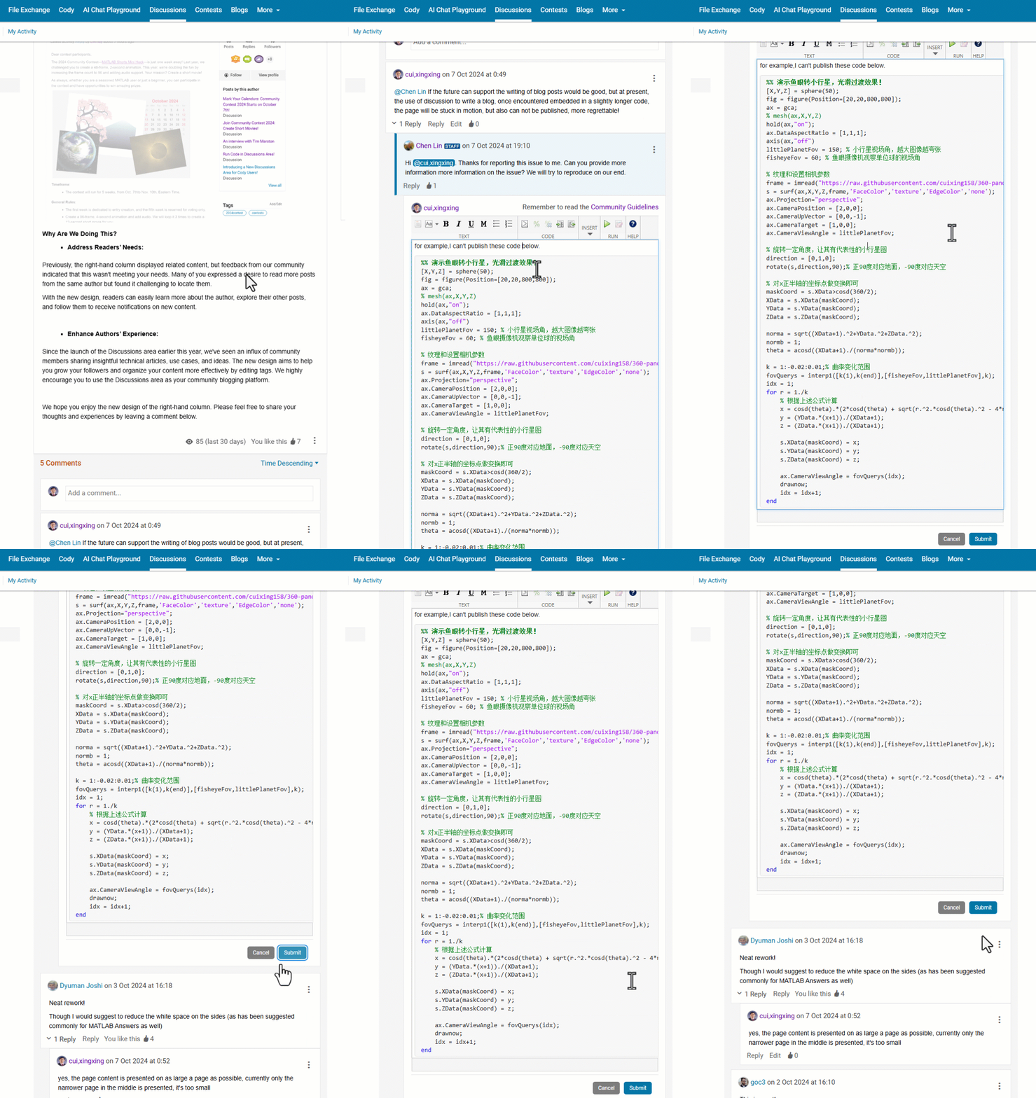
@Chen Lin If the future can support the writing of blog posts would be good, but at present, the use of discussion to write a blog, once encountered embedded in a slightly longer code, the page will be stuck in motion, but also can not be published, more regrettable!
Neat rework!
Though I would suggest to reduce the white space on the sides (as has been suggested commonly for MATLAB Answers as well)
This is great!


