Customized Presentations and Special Effects with Tiled Chart Layouts
A tiled chart layout lets you control the placement of elements in a visualization and create special effects. This topic covers four examples:
Stacked Colorbar and Plot with Shared Title
Tiled chart layouts have several features for presenting multiple elements together under a shared title. In this case, stack a colorbar on top of a plot under a shared title.
Create a 1-by-1 tiled chart layout. Then display a contour plot of the peaks data set.
figure
t = tiledlayout(1,1);
nexttile
contourf(peaks)

Create a colorbar, and specify the 'northoutside' location. Then add a shared title by passing the layout object, t, to the title function.
cb = colorbar('Location','northoutside');
title(t,'Contours of Peaks')

Colorbar That Adjusts as Tiles Reflow
Since R2022b
Tiled chart layouts have a GridSizeChangedFcn callback, which you can use to execute code when the size of the grid changes. Typically, you define this callback for layouts that have the "flow" tile arrangement.
For example, define a callback function in a program file called updateColorbar.m. The function moves a colorbar between the south and east tiles of a layout depending on whether the number of rows is greater than the number of columns in the layout's grid. The event argument provides the current grid size.
function updateColorbar(tcl,event)
    cb = findobj(tcl,Type="Colorbar");
    if isscalar(cb)
        if event.NewGridSize(1) > event.NewGridSize(2)
            cb.Layout.Tile = "south";
        else
            cb.Layout.Tile = "east";
        end
    end
end
In the Command Window, create a tiled chart layout with the "flow" tile arrangement, and set the GridSizeChangedFcn property to the updateColorbar function. Create a for loop that adds seven plots to the layout. Then add a colorbar to the east tile.
f = figure;
tcl = tiledlayout(f,"flow",TileSpacing="tight", ...
    GridSizeChangedFcn=@updateColorbar);

for i = 1:7
    nexttile;
    pcolor(rand(20))
end

cb = colorbar;
cb.Layout.Tile = "east";

Change the size of the figure so that the tiles reflow. The colorbar moves to the south tile.
f.Position(3:4) = [400 525];

Irregular Grid of Plots
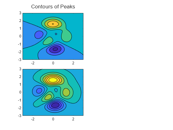
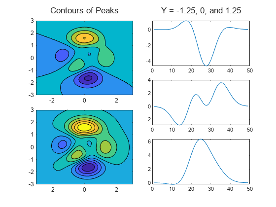
Tiled chart layouts can be nested. This is useful for varying the arrangement of the tiles in a layout. In this case, create two columns that each have a different number of tiles.
Create a 1-by-2 tiled layout called t1. Then create two nested layouts, t2 and t3, where t2 is in the first tile of t1, and t3 is in the second tile. Then display two contour plots in t2, and add a title above the plots.
figure
t1 = tiledlayout(1,2,'TileSpacing','Compact');
t2 = tiledlayout(t1,'flow','TileSpacing','Compact');
t3 = tiledlayout(t1,'vertical','TileSpacing','Compact');
t3.Layout.Tile = 2;

% Add two contour plots to left side
[X,Y,Z] = peaks;
nexttile(t2);
contourf(X,Y,Z)
nexttile(t2)
contourf(X,Y,Z,10)
title(t2,"Contours of Peaks")

Display three line plots within t3, and add a title.
nexttile(t3)
plot(Z(15,:))
nexttile(t3)
plot(Z(25,:))
nexttile(t3)
plot(Z(35,:))
title(t3,"Y = -1.25, 0, and 1.25")
Main Plot with Adjacent Smaller Plots
A tiled chart layout consists of a grid of tiles surrounded by four outer tiles. You can place legends, colorbars, additional axes, or even a nested layout into any of these tiles. In this case, create a main plot in the center, and use one of the outer tiles to display a set of supplemental plots.
First, create a matrix of sine waves and plot them together in a 1-by-1 tiled chart layout.
x = (0:0.1:10)';
y = sin([x x+1 x+2 x+3 x+4 x+5]);
figure
t = tiledlayout(1,1);
nexttile
plot(x,y)

Plot the individual sine waves below the main plot. To do this, create a new layout called ts in the south tile of layout t. When you create ts, specify the 'flow' tile arrangement so that the plots fill the entire south tile at each iteration of the for loop.
ts = tiledlayout(t,'flow');
ts.Layout.Tile = 'south';
for i=1:5
    nexttile(ts);
    plot(x,y(:,i))
end

Region-of-Interest Plot
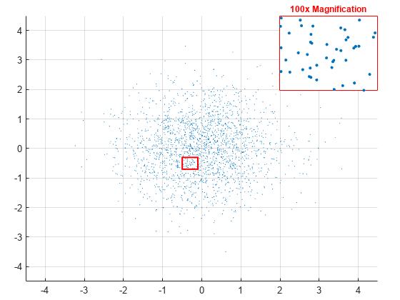
A plot can span multiple tiles of a layout. You can use this feature to display a main plot with an accompanying inset plot. In this case, the inset plot shows a zoomed-in view of a region of interest.
Create a 3-by-3 tiled chart layout, and create an axes that spans all of the tiles. Then display a scatter plot in the axes.
figure
t = tiledlayout(3,3,'Padding','compact');
ax1 = nexttile(1,[3 3]);
x = randn(2000,1);
y = randn(2000,1);
scatter(ax1,x,y,1,'filled');

Next, create a rectangle that defines the region of interest in the scatter plot. Set properties on the axes last, to ensure that those properties persist.
Define the bounds of the rectangle. Define
leftandbottomas the left and bottom edges of the rectangle. Specifyleftin x-axis units, and specifybottomin y-axis units. Similarly, definewidthandheightas the width and height of the rectangle, also in axis units.Display the rectangle. Call the
holdfunction to preserve the contents of the axes, and then call therectanglefunction.Set properties on the axes. Set the font size to
10points, set the x- and y-axis limits, and turn the grid on.
% Define bounds of the rectangle
left = -0.5;
bottom = -0.7;
width = 0.4;
height = 0.4;

% Display the rectangle
hold(ax1,'on');
r = rectangle('Position',[left bottom width height], ...
    'EdgeColor','red','LineWidth',1.5);

% Set properties on the axes
ax1.FontSize = 10;
ax1.XLim = [-4.5 4.5];
ax1.YLim = [-4.5 4.5];
grid(ax1,'on')

Display a smaller, zoomed-in plot with x- and y-axis limits that match the region of interest.
Create the axes for the zoomed-in view. Call the
axesfunction to create the axes. Move the axes to the third tile by setting theLayout.Tileproperty. Then plot the entire set of x and y data.Adjust the axis limits to match the region of interest. Set the
XLimandYLimproperties ofax2to match the region of interest. Then remove the ticks from the plot box.Set other properties on the axes. Turn the axes box on, set the x- and y- axis colors to red, and display a title.
% Create axes for zoomed-in view
ax2 = axes(t);
ax2.Layout.Tile = 3;
scatter(ax2,x,y,10,'filled');

% Adjust axis limits and remove ticks
ax2.XLim = [left left+width];
ax2.YLim = [bottom bottom+height];
ax2.XTick = [];
ax2.YTick = [];

% Set other properties on the axes
ax2.Box = 'on';
ax2.XAxis.Color = 'red';
ax2.YAxis.Color = 'red';
title(ax2,'100x Magnification','Color','red');

See Also
Functions
tiledlayout|colorbar|axes