raincloudplot
Syntax
Description
Vector and Matrix Data
raincloudplot( creates a rain cloud plot
for each column of the matrix ydata)ydata. If ydata is
a vector, then raincloudplot creates a single rain cloud plot.
raincloudplot(
groups the data in xgroupdata,ydata)ydata according to the unique values in
xgroupdata and plots each group of data as a separate rain cloud
plot. xgroupdata determines the position of each rain cloud plot
along the y-axis.
Table Data
raincloudplot(
creates a rain cloud plot of the data in tbl,xvar,yvar)yvar grouped by the data in
xvar, where xvar and yvar
are variables from the table tbl. To plot one data set, specify one
variable for xvar and one variable for yvar. To plot
multiple data sets, specify multiple variables for xvar,
yvar, or both. If both arguments specify multiple variables, they
must specify the same number of variables.
Additional Options
raincloudplot(___,
sets plot properties using one or more name-value arguments in addition to any of the
input argument combinations in the previous syntaxes. For example, you can specify the
plot orientation and marker symbol. For a list of properties, see RainCloudPlot Properties.Name=Value)
r = raincloudplot(___)RainCloudPlot object or a vector of RainCloudPlot
objects. Use r to set properties of the rain cloud plots after
creating them. For a list of properties, see RainCloudPlot Properties.
Examples
Create a single rain cloud plot from a vector of patient ages. Use the rain cloud plot to analyze the distribution of ages.
Load the patients data set. The Age vector contains the ages of 100 patients. Create a rain cloud plot to visualize the distribution of ages.
load patients
raincloudplot(Age)
xlabel("Age (years)")
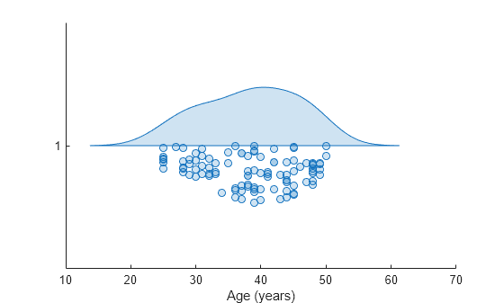
The upper half of the rain cloud plot is a violin plot whose outline is determined by the kernel density estimate (kde) for the probability density function. The kde is bell-shaped with a peak near 40 on the vertical axis. The plot shows that the data in Age is approximately normally distributed and the median patient age is around 40. The lower half of the rain cloud plot is a swarm chart, which is a scatter plot with the points offset in the y-direction.
Generate a matrix of normally distributed random numbers. Create a rain cloud plot for the data in each column of the matrix.
ydata = randn(100,3);
raincloudplot(ydata)
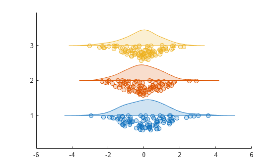
The three rain cloud plots have group labels 1, 2, and 3. The shapes of the rain cloud plots are slightly different due to randomness in the data. However, each rain cloud plot has the bell-shape characteristic of a normal distribution.
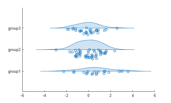
Generate a vector of normally distributed random numbers and a vector of grouping data.
ydata = randn(100,1);
xgroupdata = categorical(repelem(["group1";"group2";"group3"],[20,50,30]));
Create a set of rain cloud plots for the data in ydata grouped by the unique values in xgroupdata. Each rain cloud plot in the figure corresponds to a unique value in xgroupdata.
raincloudplot(xgroupdata,ydata)
Load the tsunami data set into a table. Create rain cloud plots for the Longitude and Latitude variables.
tbl = readtable("tsunamis.xlsx");
raincloudplot(tbl,["Longitude","Latitude"])
Generate two vectors of normally distributed data and three vectors of grouping data.
ydata1 = randn(100,1);
ydata2 = randn(100,1)+5;
xgroupdata1 = categorical(repelem(["group1";"group2"],[90,10]));
xgroupdata2 = categorical(repelem(["group1";"group2"],[10,90]));
xgroupdata3 = categorical(repelem(["group3";"group4"],[25,75]));
The variables ydata1 and ydata2 contain normally distributed data with means of 0 and 5, respectively. xgroupdata1 and xgroupdata2 contain different sequences of the same group labels. xgroupdata3 contains different group labels from those in xgroupdata1 and xgroupdata2.
Create a table from the sample data and grouping data.
tbl = table(xgroupdata1,xgroupdata2,xgroupdata3, ...
    ydata1,ydata2,VariableNames=["X1","X2","X3","Y1","Y2"]);
Create a set of overlaid rain cloud plots using the data in Y1 grouped by X1 and X2.
raincloudplot(tbl,["X1","X2"],"Y1")
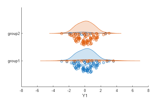
The figure shows two sets of overlaid rain cloud plots. The blue rain cloud plots represent the data in Y1 grouped by X1, and the orange rain cloud plots represent the same data grouped by X2. The overlaid plots show that the different groupings do not significantly change the median values for each group. However, the different groupings have a visible effect on the shape of the rain cloud plots corresponding to each group. This result suggests that the distribution of the data in each group is affected by how the data is grouped.
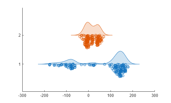
Create another set of rain cloud plots using the data in Y1 grouped by X1 and the data in Y2 grouped by X3.
raincloudplot(tbl,["X1","X3"],["Y1","Y2"])
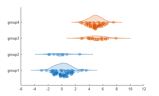
The blue plots corresponding to groups 1 and 2 represent the data in Y1, and the orange plots corresponding to groups 3 and 4 represent the data in Y2. The plots show that the median values for the data in groups 3 and 4 are larger than those for groups 1 and 2.
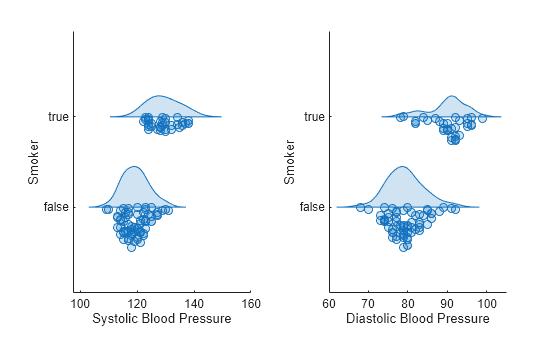
Create rain cloud plots from patient data to compare the blood pressure of smokers and nonsmokers. The plots show that smokers have higher average systolic and diastolic blood pressure than nonsmokers.
Load the patients data set.
load patientsCreate a 1-by-2 tiled chart layout using the tiledlayout function. Create the first set of axes ax1 by calling the nexttile function. In the first set of axes, display two rain cloud plots representing the systolic blood pressure values, one for smokers and the other for nonsmokers. Create the second set of axes ax2 within the tiled chart layout by calling the nexttile function. In the second set of axes, do the same for diastolic blood pressure.
tiledlayout(1,2)

% Left axes
ax1 = nexttile;
raincloudplot(ax1,categorical(Smoker),Systolic)
xlabel(ax1,"Systolic Blood Pressure")
ylabel(ax1,"Smoker")

% Right axes
ax2 = nexttile;
raincloudplot(ax2,categorical(Smoker),Diastolic)
xlabel("Diastolic Blood Pressure")
ylabel(ax2,"Smoker")
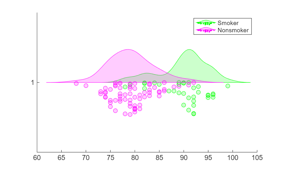
Load the patients data set.
load patientsThe variables Diastolic and Smoker contain data for patient diastolic blood pressure and smoker status.
Create two vectors containing the diastolic blood pressure data for smokers and nonsmokers, respectively.
diastolicSmoker=Diastolic(Smoker==1);
diastolicNonSmoker=Diastolic(Smoker==0);
Create a set of rain cloud plots using the diastolic blood pressure data for smokers and nonsmokers.
figure
hold on
r1 = raincloudplot(diastolicSmoker);
r2 = raincloudplot(diastolicNonSmoker);
You can modify the rain cloud plots by specifying the properties of the RainCloudPlot objects in r1 and r2. For more information, see RainCloudPlot Properties.
Update the colors of the raincloud plots so that the plot for smokers is green and the plot for nonsmokers is magenta.
r1.FaceColor="g";
r2.FaceColor="m";
legend("Smoker","Nonsmoker")
Input Arguments
Name-Value Arguments
Output Arguments
More About
Version History
Introduced in R2026a