Model Selection Window
Comparing Models
You can use the Model Selection window to help you select a best model by comparing several candidate models on the same plot.
Select Model > Selection Figure to open the Model Selection window and compare the child nodes of your current view.
You can select among the following:
Local models
Response features
Submodels of response features
Global models
However, you cannot select between response models or test plans.
Note
If you click Create Two-Stage in the Common Tasks pane at the local node and you need to select response features, then the toolbox opens the Model Selection window. You need the right number of response features to create a two-stage model, so you must choose which combination of response features to use to create the two-stage model. Compare the possible two-stage models and select the best.
After calculating a two-stage model with MLE, you can use the Model Selection window to compare the MLE model with the previous univariate model, and you can choose the best.
Model Selection might not be available if you are not ready to choose among the child nodes. For example, at the response node, the child nodes must have models assigned as best before you can select among them. Also, if a response feature has child nodes of alternate models, you must select the best, or the Browser cannot tell which to use to calculate that response feature.
Use the Model Selection window for visual comparison of several models. From the response level you can compare several two-stage models. From the local level, if you have added new response features you can compare the different two-stage models (constructed using different combinations of response feature models). If you have added child nodes to response feature models, you can compare them all using the Model Selection window.
When a model is selected as best it is copied up a level in the tree together with the outliers for that model fit.
A tree node is automatically selected as best if it is the only child.
If a best model node is changed the parent node loses best model status (but the automatic selection process will reselect that best model if it is the only child node).
Note
You can assign models as best in the Model Browser without needing to open the Model Selection window. See Compare Alternative Models.
Select a Best Model
In the Model Selection window, click the Assign Best button at the bottom of the window to mark the currently selected model as best, or you can double-click a model in the list.
To choose which model to select as best, use the plots and statistics in the Model Selection window described in the next section. To determine the best fit, you should examine both the graphical and numerical fit results. When you can no longer eliminate fits by examining them graphically, you should examine the statistics. For guidance on how to use the statistics for assessing models, see Guidelines for Selecting the Best Model Fit.
Plots and Statistics for Comparing Models
You can display several different views in the Model Selection window, depending on the type of models you are comparing:
You can change to any available view in the Model Selection window using the View menu or by clicking the buttons of the toolbar.
Information about each candidate model is displayed in the list at the bottom. The information
includes categories such as the number of observations and parameters, and various
diagnostic statistics such as RMSE and PRESS RMSE. You can click column headers in this list
to sort models by that category — for example, clicking on the column header for
PRESS RMSE sorts the models in order of increasing PRESS RMSE. As this
statistic is an indication of the predictive power of the model, it is a useful diagnostic
statistic to look at (the lower the better), but remember to also look at other
factors.
To print the current view, use the File > Printmenu item or its hot key equivalent Ctrl+P. In the Response Surface view you can also use the right-click context menu.
To close the Model Selection window, use the File > Close menu item or its hot key equivalent Ctrl+W. Model Selection is intended to help you select a best model by comparing several candidate models, so when you close the window you are asked to confirm the model you chose as best.
See also Model Evaluation Window, which includes some of the same views you see in the Model Selection window, and where you can use validation data.
Operating Points View
For a two-stage model the initial view is as follows:
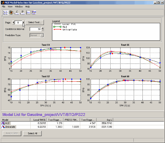
The operating points view shows the data being modeled (blue dots) and models that have been fitted to this data. The black line shows the local model that has been fitted to each operating point separately. The green line and red lines in this case show an MLE two-stage model and the Univariate two-stage model: you can see the local model curves reconstructed using response feature values taken from the global models, and compare the fits.
This view allows you to compare several models simultaneously. Using standard Windows multiselect behavior (Shift+click and Ctrl+click) in the list view, or by clicking the Select All button, you can view several two-stage models together. A maximum of five models can be selected at once. The legend allows you to identify the different plot lines.
If the local input has more than one factor, a Predicted/Observed View appears instead.
Clicking one of the plots (and holding the mouse button down) displays information about the data for that operating point. For example:
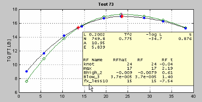
Here you see the values of the global variables for this operating point and some diagnostic statistics describing the model fit. Also displayed are the values (for this operating point) of the response features used to build this two-stage model and the two-stage model's estimation of these response features.
The controls allow navigation between operating points.
You can change the size of the confidence intervals; these are displayed using a context menu on the plots themselves.
The prediction type allows a choice of Normal or
PRESS (Predicted Error Sum of Squares) — although not if you
entered this view through model evaluation (rather than model selection). PRESS
predictions give an indication of the model fit if that operating point was not used in
fitting the model. For more on PRESS see PRESS statistic, Guidelines for Selecting the Best Model Fit, and Stepwise Regression.
Predicted/Observed View
For a one-stage model, or when you are comparing different models for one Response Feature, the initial view is as follows:
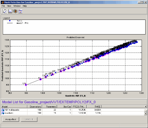
The plot shows the data used to fit this model, against the predicted values found by
evaluating the model at these data points. The straight black line is the plot of
y=x. If the model fitted the data exactly, all the blue points would
lie on this line. The error bars show the 95% confidence interval of the model fit.
For single inputs, the response is plotted directly against the input.
The Predicted/Observed view only allows single selection of models for display. Right-click to toggle operating point number display, as you can on most plots.
Response Surface View
This view shows the model surface in a variety of ways.
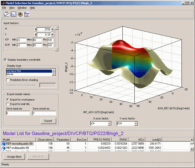
The default view is a 3-D plot of the model surface, as in the example. This model has five dependent factors; you can see these in the controls at the top left (there is a scroll bar as only four can be seen at once at this size of window).
You can choose which input factors to display by using the drop-down menus below the plot. The unselected input factors are held constant and you can change their values using the controls at the top left of the view (either by clicking the arrow buttons or by typing directly in the edit box).
Display using (S - datum) — If a
datum model is being displayed, this check box appears. The datum
variable here is spark angle, S. When you select
this box, the model is displayed in terms of spark angle relative
to the datum. The appropriate local variable name appears here. See Datum Models.
Display boundary constraint — If you have boundary models you can display them by selecting the check box. Areas outside the boundary are yellow, as shown in the example. Areas outside the boundary are yellow (or gray in table view). They are shown on all display types (contour, 2-D, surface, movie and table).
Display Type— Changes the model plot. Display options are available for some of these views and are described under the relevant view. The choices are as follows:
A table showing the model evaluated at a series of input factor values.
A 2-D plot against one input factor.
A 2-D plot with several lines on it (called a multiline plot); this shows variation against two input factors.
A contour plot.
The Contours button opens the Contour Values dialog box. Here you can set the number, position, and coloring of contour lines.
Fill Contour colors each space between contours a different color.
Contour Labels toggles the contour value numbers on and off. Without labels a color bar is shown to give you a scale.
Auto (the default) automatically generates contours across the model range.
N Contour Lines opens an edit box where you can enter any number of contour lines you want.
Specify values opens an edit box where you can enter the start and end values where you want contour lines to appear, separated by a colon. For example, entering
5:15gives you 10 contour lines from 5 to 15. You can also enter the interval between the start and end values; for example1:100:600gives you contour lines between 1 and 600 at intervals of 100.A surface (shown in the example).
Prediction Error shading — Colors the surface in terms of the prediction error (sqrt (Prediction Error Variance)) of the model at each point. A color bar appears, to show the value associated with each color.
Note
For datum models, Prediction Error shading is only available when the Display using (local variable - datum) check box is not selected.
Prediction Error threshold — To see good color contrast in the range of PE of interest, you can set the upper limit of the coloring range. All values above this threshold are colored as maximum P.E.
A movie: this is a sequence of surfaces as a third input factor's value changes.
Replay replays the movie.
Frame/second selects the speed of movie replay.
The number of frames in the movie is defined by the number of points in the input factor control (in the array at the top left) that corresponds to the Time factor below the plot.
Export model values allows the currently
displayed model surface to be saved to a MAT file
or to the MATLAB® workspace.
Right-click on the plot to reach the context menu and change many display properties (lighting, colormap etc.) and print to figure.
Within a test plan the memory is retained of the evaluation region, plot type and the number of points resolution last displayed in the Response Surface view.
Likelihood View
The likelihood view shows two plots relating to the log likelihood function evaluated at each operating point. It is useful for identifying problem operating points for maximum likelihood estimation (MLE).
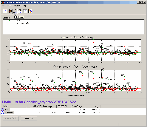
Each plot has a context menu that allows operating point numbers to be displayed on the plots and also offers autoscaling of the plots. You can also Print to Figure.
The likelihood view allows several models to be displayed simultaneously; click the Select All button at the bottom of the window or, in the model list view, Shift+click or Ctrl+click to select the models for display.
The upper plot shows values of the negative log likelihood function for each operating point. This shows the contribution of each operating point to the overall negative log likelihood function for the model, as compared with the average, as indicated by the horizontal green line.
The lower plot shows values of the T-squared statistic for each operating point. This is a weighted sum squared error of the response feature models for each operating point. As above, the purpose of this plot is to show how each operating point contributes to the overall T-squared statistic for this model. The horizontal line indicates the average.
RMSE View
The Root Mean Squared Errors view has three different plots, each showing standard errors in the model fit for each operating point.
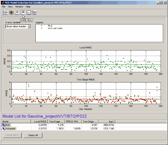
Each plot has a context menu that allows operating point numbers to be displayed on the plots, and you can Print to Figure.
The X variable menu allows you to use different variables as the x-axis of these plots.
The RMSE view allows several models to be displayed simultaneously; click the Select All button at the bottom of the window or, in the model list view, Shift+click or Ctrl+click to select the models for display.
Local RMSE shows the root mean squared error in the local model fit for each operating point.
Two-Stage RMSE shows the root mean squared error in the two-stage model fit to the data for each operating point. You should expect this to be higher than the local RMSE.
PRESS RMSE is available when all response feature models are linear. This plot shows the root mean squared error in the PRESS two-stage model fit at each operating point.
For information on PRESS RMSE see Guidelines for Selecting the Best Model Fit.
Residuals View
The residuals view shows the scatter plots of observation number, predicted and observed response, input factors, and residuals.
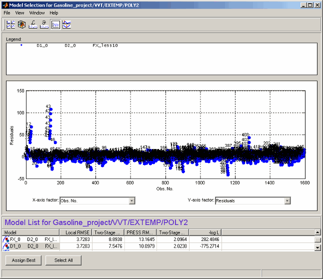
This view allows several models to be displayed simultaneously; click the Select All button at the bottom of the window or, in the model list view, Shift+click or Ctrl+click to select the models for display.
A context menu allows the operating point number of each point to be displayed when only one model is being displayed, as shown.
The X-axis factor and Y-axis factor menus allow you to display various statistics.
Cross Section View
The cross-section view shows an array of cross sections through the model surface. You can choose the point of cross section in each factor. Data points near cross sections are displayed, and you can alter the tolerances to determine how much data is shown. The only exception is when you evaluate a model without data; in this case no data points are displayed.
You can select individual data points by operating point number (using the Select Data Point button). You can double-click a data point in a graph to take the display directly to that point. You can choose to use a common Y-axis limit for all graphs using the check box.
If you have boundary models you can choose to display them here using the check box; regions outside the boundary are yellow, as shown in the example.
Within a test plan the memory is retained of the point last displayed in the Cross Section view; when you reopen the view you return to the same point.
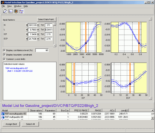
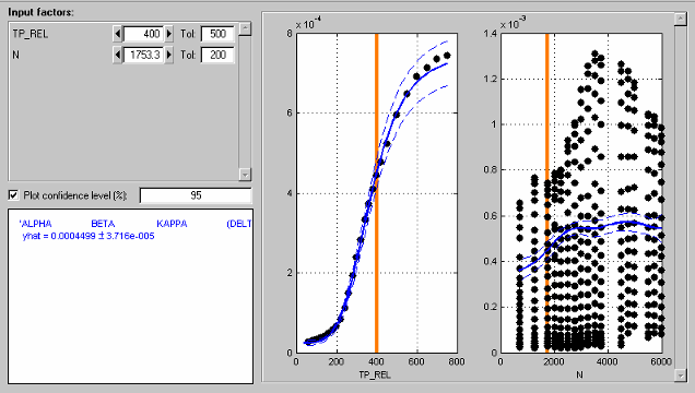
The number of plots is the same as the number of input factors to the model. The plot
in S shows the value of the model for a range of values of
S while the other input factors are held constant. Their values are
displayed in the controls at the top left, and are indicated on the plots by the vertical
orange bars.
You can change the values of the input factors by dragging the orange bars on the plots, using the buttons on the controls, or by typing directly into the edit boxes.
For example, changing the value of N to 1000 (in any of these ways) does nothing to the graph of N, but all the other factor plots now show cross sections through the model surface at N = 1000 (and the values of the other variables shown in the controls).
On the plots, the dotted lines indicate a confidence interval around the model. You define the confidence associated with these bounding lines using the Display confidence level (%) edit box. You can toggle confidence intervals on and off using the check box on this control.
For each model displayed, the value of the model and the confidence interval around
this are recorded in the legend at the lower left. The text colors match the plot colors.
In the example shown, two models are selected for display, resulting in blue
(PS22 model) and green (POLY2 model) legends on
the left to correspond with the blue and green plots. You can select multiple models to
display in the list at the bottom using Ctrl+click, or click
Select All. The values of the input factors (for which the model
is evaluated) can be found in the controls (in the Input factors
pane) and seen as the orange lines on the plots.
Data points are displayed when they fall within the tolerance limit near each cross section. You can set the tolerance in the Tol edit boxes.
For example, if N is set to 1000, and the tolerance for N is set to 500, all data points with values between N = 500 and N = 1500 appear on the plots of the other factors.
This means that changing the tolerance in one factor affects the data points that appear on the plots of all the other factors. It does not affect the plots of that factor.
You can click data points in the plots to see their values. Several points can mask each other; in this case the values of all coincident data points are displayed. Double-click to move the display directly to a data point.
The following example illustrates how the tolerance level determines which data points
are displayed. The tolerance for TP_REL (500) includes all points in
the data set (this is an extreme example). The plot for N therefore
shows the data points for all the operating points. Note that you can see the structure of
the data as each operating point shows as a vertical line of points.
You can see that the orange line on the N plot passes through an
operating point. This orange line shows the value of N for the
cross-section plot of TP_REL. You can also read the value in the edit
box (N=1753.3). The tolerance for N (200) only includes data points of this operating
point. Data in adjacent operating points fall outside this tolerance. Therefore the TP_REL
plot shows the data points from one operating point only.
Increasing the tolerance on N will mean that more data points fall
within the tolerance and so would appear on the TP_REL plot.