Visualize and Assess Model Performance in Regression Learner
After training regression models in the Regression Learner app, you can compare models based on model metrics, visualize results in a response plot or by plotting the actual versus predicted response, and evaluate models using the residual plot.
If you use k-fold cross-validation, the app computes the model metrics (such as the root mean squared error, or RMSE) using the combined set of observations in the k validation folds. The app makes predictions on the observations in the validation folds, and displays the predictions in the plots. The app also computes the residuals using the observations in the validation folds.
When you import data into the app, the app automatically uses cross-validation by default. To select a different validation scheme, see Select Validation Scheme in Classification Learner or Regression Learner.
If you use holdout validation, the app makes predictions and computes model metrics using the observations in the validation set. The app uses the predictions in the plots and also computes the residuals based on the predictions.
If you use resubstitution validation, the app makes predictions and computes model metrics using the same training data set used to train the full model.
Check Performance in Models Pane
After training a model in Regression Learner, check the Models pane to see which model has the best overall score. The best RMSE (Validation) is highlighted in a box. This score is the root mean squared error (RMSE) on the validation set. The score estimates the performance of the trained model on new data. Use the score to help you choose the best model.
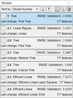
The best overall score might not be the best model for your goal. Sometimes a model with a slightly lower overall score is the better model for your goal. You want to avoid overfitting, and you might want to exclude some predictors where data collection is expensive or difficult.
View Model Metrics in Summary Tab and Models Pane
You can view model metrics in the model Summary tab and the Models pane, and use these metrics to assess and compare models. Alternatively, you can use the compare results plot and the Results Table tab to compare models. For more information, see View Model Information and Results in Compare Results Plot and Compare Model Information and Results in Table View.
The Training Results metrics are calculated on the validation set. The Test Results metrics, if displayed, are calculated on a test set. For more information, see Test Trained Models in Classification Learner or Regression Learner.
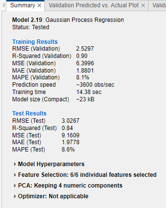
Model Metrics
| Statistic | Description | Tip |
|---|---|---|
| RMSE | Root mean squared error. The RMSE is always positive and its units match the units of your response. | Look for smaller values of the RMSE. |
| R-Squared (R2) | Coefficient of determination. The app calculates ordinary
(unadjusted) R2
values. R2 is always
smaller than 1 and usually larger than 0. It compares the trained
model with the model where the response is constant and equals the
mean of the training response. If your model is worse than this
constant model, then
R2 is negative.
The R2 statistic is
not a useful metric for most nonlinear regression models. For more
information, see Rsquared. | Look for an R2 value close to 1. |
| MSE | Mean squared error. The MSE is the square of the RMSE. | Look for smaller values of the MSE. |
| MAE | Mean absolute error. The MAE is always positive and similar to the RMSE, but less sensitive to outliers. | Look for smaller values of the MAE. |
| MAPE | Mean absolute percentage error. The MAPE is always nonnegative and indicates how the prediction error compares to the response. For more information, see Mean Absolute Percentage Error. | Look for smaller values of the MAPE. |
| Prediction speed | Estimated prediction speed for new data, based on the prediction times for the validation data sets | Background processes inside and outside the app can affect this estimate, so train models under similar conditions for better comparisons. |
| Training time | Time spent training the model | Background processes inside and outside the app can affect this estimate, so train models under similar conditions for better comparisons. |
| Model size (Compact) | Size of the machine learning model object if exported as a
compact model (that is, without training data). When you export a
model to the workspace, the exported structure contains the model
object and additional fields. The app displays the size of the model
object (in bytes) as returned by the whos function. Note
that the learnersize function might return a different size
for some model types, because it calls gather on the model
object before calling whos. | Look for model size values that fit the memory requirements of target applications. |
| Model size (Coder) | Approximate size of the model (in bytes) in C/C++ code generated
by MATLAB®
Coder™. The app displays the size (in bytes) returned by the
learnersize function with
type="coder". The coder model size is
NaN for model types that are not supported
for code generation. | For a list of supported model types, see Export Regression Model to MATLAB Coder to Generate C/C++ Code. |
You can sort models in the Models pane based on different model metrics. To select a metric for sorting, use the Sort by list at the top of the Models pane. Not all metrics are available for model sorting in the Models pane. You can sort models by other metrics in the Results Table (see Compare Model Information and Results in Table View).
You can also delete unwanted models listed in the Models pane. Select the model you want to delete and click the Delete selected model button in the upper right of the pane or right-click the model and select Delete. You cannot delete the last remaining model in the Models pane.
Compare Model Information and Results in Table View
Rather than using the Summary tab or the Models pane to compare model metrics, you can use a table of results. On the Learn tab, in the Plots and Results section, click Results Table. In the Results Table tab, you can sort models by their training and test results, as well as by their options (such as model type, selected features, PCA, and so on). For example, to sort models by root mean squared error, click the sorting arrows in the RMSE (Validation) column header. An up arrow indicates that models are sorted from lowest RMSE to highest RMSE.
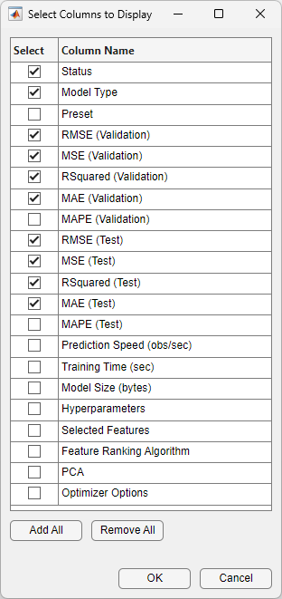
To view more table column options, click the "Select columns to display" button
![]() at the top right of the table. In the Select
Columns to Display dialog box, check the boxes for the columns you want to display
in the results table. Newly selected columns are appended to the table on the right.
at the top right of the table. In the Select
Columns to Display dialog box, check the boxes for the columns you want to display
in the results table. Newly selected columns are appended to the table on the right.
Within the results table, you can manually drag and drop the table columns so that they appear in your preferred order.
You can mark some models as favorites by using the Favorite column. The app keeps the selection of favorite models consistent between the results table and the Models pane. Unlike other columns, the Favorite and Model Number columns cannot be removed from the table.
To remove a row from the table, right-click any entry within the row and click Hide row (or Hide selected row(s) if the row is highlighted). To remove consecutive rows, click any entry within the first row you want to remove, press Shift, and click any entry within the last row you want to remove. Then, right-click one of the highlighted entries and click Hide selected row(s). To restore all removed rows, right-click any entry in the table and click Show all rows. The restored rows are appended to the bottom of the table.
To export the information in the table, use one of the export buttons
![]() at the top right of the table. Choose between
exporting the table to the workspace or to a file. The exported table includes only
the displayed rows and columns.
at the top right of the table. Choose between
exporting the table to the workspace or to a file. The exported table includes only
the displayed rows and columns.
View Model Information and Results in Compare Results Plot
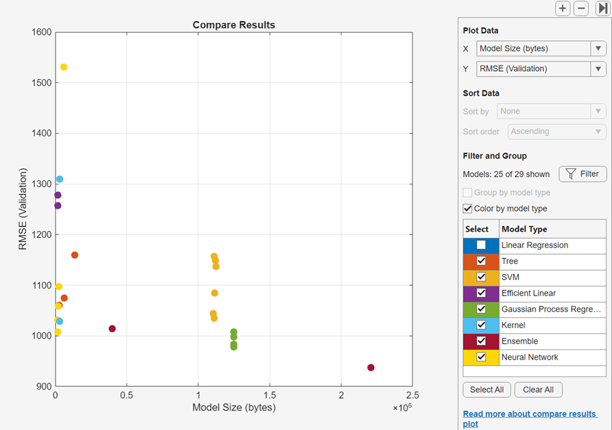
You can view model information and results in a Compare results plot. On the Learn or Test tab, in the Plots and Results section, click Compare Results. Alternatively, click the Plot Results button in the Results Table tab. The plot shows a bar chart of validation RMSE for the models, ordered from lowest to highest RMSE value. You can sort the models by other training and test results using the Sort by list under Sort Data. To group models of the same type, select Group by model type. To assign the same color to all model types, clear Color by model type.
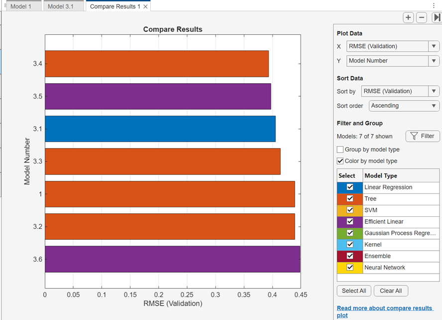
Select model types to display using the check boxes under Select. Hide a displayed model by right-clicking a bar in the plot and selecting Hide Model.
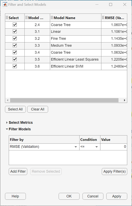
You can also select and filter the displayed models by clicking the Filter button under Filter and Group. In the Filter and Select Models dialog box, click Select Metrics and select the metrics to display in the table of models at the top of the dialog box. Within the table, you can drag the table columns so that they appear in your preferred order. Click the sorting arrows in the table headers to sort the table. To filter models by metric value, first select a metric in the Filter by column. Then select a condition in the Filter Models table, enter a value in the Value field, and click Apply Filter(s). The app updates the selections in the table of models. You can specify additional conditions by clicking the Add Filter button. Click OK to display the updated plot.
Select other metrics to plot in the X and
Y lists under Plot Data. If you do not
select Model Number for X or
Y, the app displays a scatter plot.
To export a compare results plot to a figure, see Export Plots in Regression Learner App.
To export the results table to the workspace, click Export Plot and select Export Plot Data. In the Export Result Metrics Plot Data dialog box, edit the name of the exported variable, if necessary, and click OK. The app creates a structure array that contains the results table.
Explore Data and Results in Response Plot
View the regression model results by using the response plot, which displays the predicted response versus the record number. After you train a regression model, the app automatically opens the response plot for that model. If you train an "All" model, the app opens the response plot for the first model only. To view the response plot for another model, select the model in the Models pane. On the Learn tab, in the Plots and Results section, click the arrow to open the gallery, and then click Response in the Validation Results group. If you are using holdout or cross-validation, then the predicted response values are the predictions on the held-out (validation) observations. In other words, the software obtains each prediction by using a model that was trained without the corresponding observation.
To investigate your results, use the controls on the right. You can:
Plot predicted and/or true responses. Use the check boxes under Plot to make your selection.
Show prediction errors, drawn as vertical lines between the predicted and true responses, by selecting the Errors check box.
Choose the variable to plot on the x-axis under X-axis. You can choose the record number or one of your predictor variables.
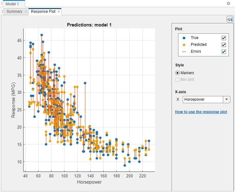
Plot the response as markers, or as a box plot under Style. You can select Box plot only when the variable on the x-axis has few unique values.
A box plot displays the typical values of the response and any possible outliers. The central mark indicates the median, and the bottom and top edges of the box are the 25th and 75th percentiles, respectively. Vertical lines, called whiskers, extend from the boxes to the most extreme data points that are not considered outliers. The outliers are plotted individually using the
"o"symbol. For more information about box plots, seeboxchart.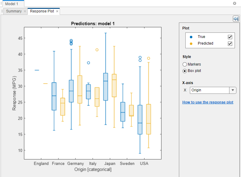
To export the response plots you create in the app to figures, see Export Plots in Regression Learner App.
Plot Predicted vs. Actual Response
Use the Predicted vs. Actual plot to check model performance. Use this plot to understand how well the regression model makes predictions for different response values. To view the Predicted vs. Actual plot after training a model, click the arrow in the Plots and Results section to open the gallery, and then click Predicted vs. Actual (Validation) in the Validation Results group.
When you open the plot, the predicted response of your model is plotted against the actual, true response. A perfect regression model has a predicted response equal to the true response, so all the points lie on a diagonal line. The vertical distance from the line to any point is the error of the prediction for that point. A good model has small errors, which means the predictions are scattered near the line.
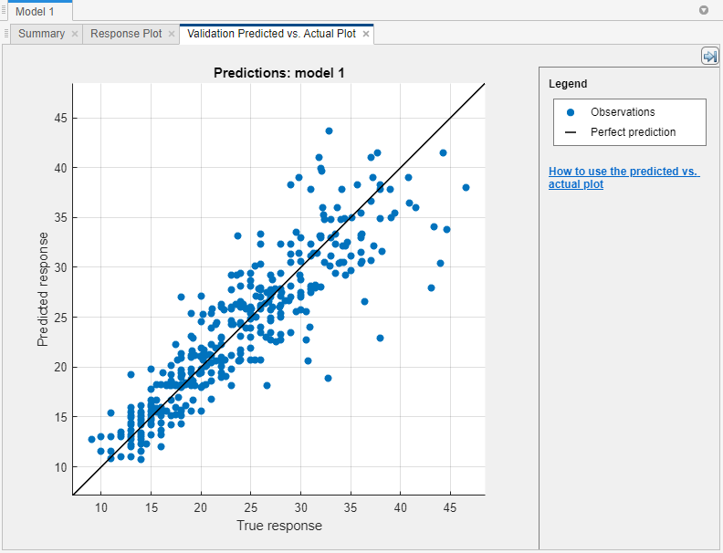
Usually a good model has points scattered roughly symmetrically around the diagonal line. If you can see any clear patterns in the plot, it is likely that you can improve your model. Try training a different model type or making your current model type more flexible by duplicating the model and using the Model Hyperparameters options in the model Summary tab. If you are unable to improve your model, it is possible that you need more data, or that you are missing an important predictor.
To export the Predicted vs. Actual plots you create in the app to figures, see Export Plots in Regression Learner App.
Evaluate Model Using Residuals Plot
Use the residuals plot to check model performance. To view the residuals plot after training a model, click the arrow in the Plots and Results section to open the gallery, and then click Residuals (Validation) in the Validation Results group. The residuals plot displays the difference between the predicted and true responses. Choose the variable to plot on the x-axis under X-axis. Choose the true response, predicted response, record number, or one of the predictors.
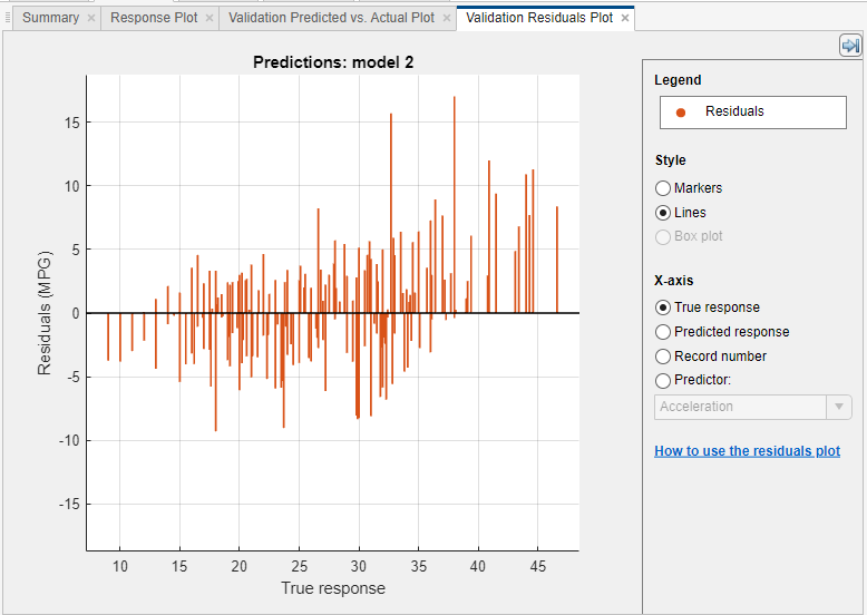
Usually a good model has residuals scattered roughly symmetrically around 0. If you can see any clear patterns in the residuals, it is likely that you can improve your model. Look for these patterns:
Residuals are not symmetrically distributed around 0.
Residuals change significantly in size from left to right in the plot.
Outliers occur, that is, residuals that are much larger than the rest of the residuals.
A clear, nonlinear pattern appears in the residuals.
Try training a different model type, or making your current model type more flexible by duplicating the model and using the Model Hyperparameters options in the model Summary tab. If you are unable to improve your model, it is possible that you need more data, or that you are missing an important predictor.
To export the residuals plots you create in the app to figures, see Export Plots in Regression Learner App.
Compare Model Plots by Changing Layout
Visualize the results of models trained in Regression Learner by using the plot
options in the Plots and Results section of the
Learn tab. You can rearrange the layout of the plots to
compare results across multiple models: use the options in the
Layout button, drag and drop plots, or select the options
provided by the Document Actions button ![]() located to the right of the model plot tabs.
located to the right of the model plot tabs.
For example, after training two models in Regression Learner, display a plot for each model and change the plot layout to compare the plots by using one of these procedures:
In the Plots and Results section, click Layout and select Compare models.
Click the second model tab name, and then drag and drop the second model tab to the right.
Click the Document Actions button
 located to the far right of the model plot tabs.
Select the
located to the far right of the model plot tabs.
Select the Tile Alloption and specify a 1-by-2 layout.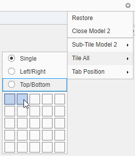
Note that you can click the Hide plot options button
![]() at the top right of the plots to make more room
for the plots.
at the top right of the plots to make more room
for the plots.
Evaluate Model Performance Using Test Data Set
After training a model in Regression Learner, you can evaluate the model performance on a test data set in the app. For more information, see Test Trained Models in Classification Learner or Regression Learner.