Analyze Quality of Life in US Cities Using PCA
This example shows how to perform a weighted principal components analysis and interpret the results.
Load Sample Data
Load the sample data. The data includes ratings for 9 different indicators of the quality of life in 329 US cities. These are climate, housing, health, crime, transportation, education, arts, recreation, and economics. For each category, a higher rating is better. For example, a higher rating for crime means a lower crime rate.
Display the categories variable.
load cities
categories
categories = 9×14 char array
'climate '
'housing '
'health '
'crime '
'transportation'
'education '
'arts '
'recreation '
'economics '
In total, the cities data set contains three variables:
categories, a character matrix containing the names of the indicesnames, a character matrix containing the 329 city namesratings, the data matrix with 329 rows and 9 columns
Plot Data
Make a box plot to look at the distribution of the ratings data.
figure()
boxplot(ratings,'Orientation','horizontal','Labels',categories)
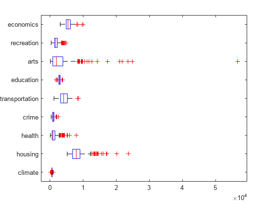
There is more variability in the ratings of the arts and housing than in the ratings of crime and climate.
Check Pairwise Correlation
Check the pairwise correlation between the variables.
C = corr(ratings,ratings);
The correlation among some variables is as high as 0.85. Principal components analysis constructs independent new variables which are linear combinations of the original variables.
Compute Principal Components
When all variables are in the same unit, it is appropriate to compute principal components for raw data. When the variables are in different units or the difference in the variance of different columns is substantial (as in this case), scaling of the data or use of weights is often preferable.
Perform the principal component analysis by using the inverse variances of the ratings as weights.
w = 1./var(ratings);
[wcoeff,score,latent,tsquared,explained] = pca(ratings, ...
    'VariableWeights',w);
Or equivalently:
[wcoeff,score,latent,tsquared,explained] = pca(ratings, ...
    'VariableWeights','variance');
The following sections explain the five outputs of pca.
Component Coefficients
The first output wcoeff contains the coefficients of the principal components.
The first three principal component coefficient vectors are:
c3 = wcoeff(:,1:3)
c3 = 9×3
103 ×

    0.0249   -0.0263   -0.0834
    0.8504   -0.5978   -0.4965
    0.4616    0.3004   -0.0073
    0.1005   -0.1269    0.0661
    0.5096    0.2606    0.2124
    0.0883    0.1551    0.0737
    2.1496    0.9043   -0.1229
    0.2649   -0.3106   -0.0411
    0.1469   -0.5111    0.6586
These coefficients are weighted, hence the coefficient matrix is not orthonormal.
Transform Coefficients
Transform the coefficients so that they are orthonormal.
coefforth = diag(std(ratings))\wcoeff;
Note that if you use a weights vector, w, while conducting the pca, then
coefforth = diag(sqrt(w))*wcoeff;
Check Coefficients
The transformed coefficients are now orthonormal.
I = coefforth'*coefforth;
I(1:3,1:3)
ans = 3×3

    1.0000    0.0000    0.0000
    0.0000    1.0000   -0.0000
    0.0000   -0.0000    1.0000
Component Scores
The second output score contains the coordinates of the original data in the new coordinate system defined by the principal components. The score matrix is the same size as the input data matrix. You can also obtain the component scores using the orthonormal coefficients and the standardized ratings as follows.
cscores = zscore(ratings)*coefforth;
cscores and score are identical matrices.
Plot Component Scores
Create a plot of the first two columns of score.
figure
plot(score(:,1),score(:,2),'+')
xlabel('1st Principal Component')
ylabel('2nd Principal Component')
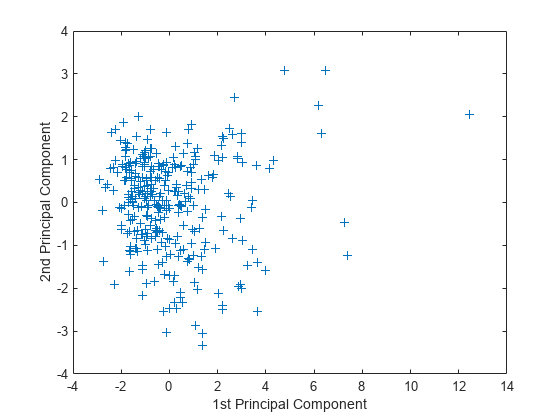
This plot shows the centered and scaled ratings data projected onto the first two principal components. pca computes the scores to have mean zero.
Explore Plot Interactively
Note the outlying points in the right half of the plot. You can graphically identify these points as follows.
gname
Move your cursor over the plot and click once near the rightmost seven points. This labels the points by their row numbers as in the following figure.
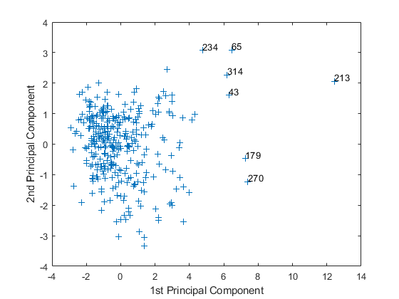
After labeling points, press Return.
Extract Observation Names
Create an index variable containing the row numbers of all the cities you chose and get the names of the cities.
metro = [43 65 179 213 234 270 314];
names(metro,:)
ans = 7×43 char array
    'Boston, MA                                 '
    'Chicago, IL                                '
    'Los Angeles, Long Beach, CA                '
    'New York, NY                               '
    'Philadelphia, PA-NJ                        '
    'San Francisco, CA                          '
    'Washington, DC-MD-VA                       '
These labeled cities are some of the biggest population centers in the United States and they appear more extreme than the remainder of the data.
Component Variances
The third output latent is a vector containing the variance explained by the corresponding principal component. Each column of score has a sample variance equal to the corresponding row of latent.
latent
latent = 9×1

    3.4083
    1.2140
    1.1415
    0.9209
    0.7533
    0.6306
    0.4930
    0.3180
    0.1204
Percent Variance Explained
The fifth output explained is a vector containing the percent variance explained by the corresponding principal component.
explained
explained = 9×1

   37.8699
   13.4886
   12.6831
   10.2324
    8.3698
    7.0062
    5.4783
    3.5338
    1.3378
Create Scree Plot
Make a scree plot of the percent variability explained by each principal component.
figure
pareto(explained)
xlabel('Principal Component')
ylabel('Variance Explained (%)')
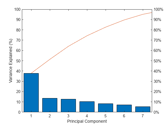
This scree plot only shows the first seven (instead of the total nine) components that explain 95% of the total variance. The only clear break in the amount of variance accounted for by each component is between the first and second components. However, the first component by itself explains less than 40% of the variance, so more components might be needed. You can see that the first three principal components explain roughly two-thirds of the total variability in the standardized ratings, so that might be a reasonable way to reduce the dimensions.
Hotelling's T-squared Statistic
The last output from pca is tsquared, which is Hotelling's , a statistical measure of the multivariate distance of each observation from the center of the data set. This is an analytical way to find the most extreme points in the data.
[st2,index] = sort(tsquared,'descend'); % sort in descending order
extreme = index(1);
names(extreme,:)
ans =
'New York, NY                               '
The ratings for New York are the furthest from the average US city.
Visualize Results
Visualize both the orthonormal principal component coefficients for each variable and the principal component scores for each observation in a single plot.
figure
biplot(coefforth(:,1:2),'Scores',score(:,1:2),'Varlabels',categories)
axis([-.26 0.6 -.51 .51]);
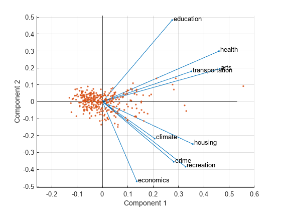
All nine variables are represented in this biplot by a vector, and the direction and length of the vector indicate how each variable contributes to the two principal components in the plot. For example, the first principal component, on the horizontal axis, has positive coefficients for all nine variables. That is why the nine vectors are directed into the right half of the plot. The largest coefficients in the first principal component are the third and seventh elements, corresponding to the variables health and arts.
The second principal component, on the vertical axis, has positive coefficients for the variables education, health, arts, and transportation, and negative coefficients for the remaining five variables. This indicates that the second component distinguishes among cities that have high values for the first set of variables and low for the second, and cities that have the opposite.
The variable labels in this figure are somewhat crowded. You can either exclude the VarLabels name-value argument when making the plot, or select and drag some of the labels to better positions using the Edit Plot tool from the figure window toolbar.
This 2-D biplot also includes a point for each of the 329 observations, with coordinates indicating the score of each observation for the two principal components in the plot. For example, points near the left edge of this plot have the lowest scores for the first principal component. The points are scaled with respect to the maximum score value and maximum coefficient length, so only their relative locations can be determined from the plot.
You can identify items in the plot by selecting Tools>Data Tips in the figure window. By clicking a variable (vector), you can read the variable label and coefficients for each principal component. By clicking an observation (point), you can read the observation name and scores for each principal component. You can specify 'ObsLabels',names to show the observation names instead of the observation numbers in the data cursor display.
Create Three-Dimensional Biplot
You can also make a biplot in three dimensions.
figure
biplot(coefforth(:,1:3),'Scores',score(:,1:3),'ObsLabels',names)
axis([-.26 0.8 -.51 .51 -.61 .81])
view([30 40])
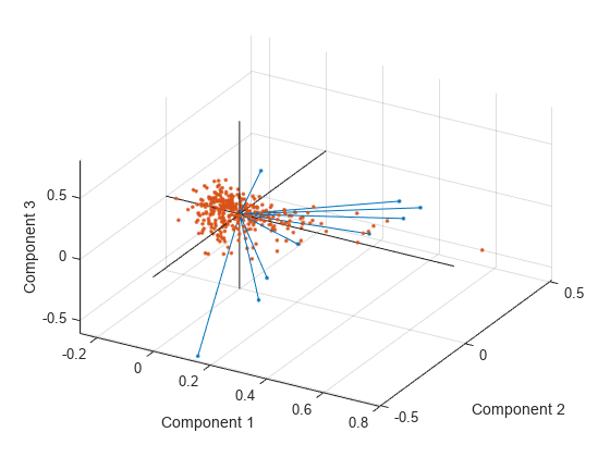
This graph is useful if the first two principal coordinates do not explain enough of the variance in your data. You can also rotate the figure to see it from different angles by selecting the Tools>Rotate 3D.
See Also
pca | pcacov | pcares | ppca | incrementalPCA | boxplot | biplot