Calculate NCA Parameters and Fit Model to PK/PD Data Using SimBiology Model Analyzer
This example shows how to perform noncompartmental analysis to calculate NCA parameters and estimate the tumor growth model [1] parameters from experimental data using nonlinear regression in the SimBiology Model Analyzer app.
Tumor Growth Model
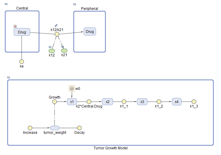
The model used in this example is a SimBiology® implementation of the pharmacokinetic/pharmacodynamic (PK/PD) model by Simeoni et al. It quantifies the effect of anticancer drugs on tumor growth kinetics from in vivo animal studies. The drug pharmacokinetics are described by a two-compartment model with IV bolus dosing and linear elimination (ke) from the Central compartment. Tumor growth is a biphasic process with an initial exponential growth followed by linear growth. The growth rate of the proliferating tumor cells is described by
L0, L1, and Ψ are tumor growth parameters, x1 is the weight of the proliferating tumor cells, and w is the total tumor weight. In the absence of any drugs, the tumor consists of proliferating cells only, that is, w = x1. In the presence of an anticancer agent, a fraction of the proliferating cells is transformed into nonproliferating cells. The rate of this transformation is assumed to be a function of the drug concentration in the plasma and an efficacy factor k2. The nonproliferating cells x2 go through a series of transit stages (x3 and x4) and are eventually cleared from the system. The flow-through of the transit compartments is modeled as a first-order process with the rate constant k1.
The SimBiology model makes these adjustments to the pharmacodynamics of tumor growth:
Instead of defining the tumor weight as the sum of x1, x2, x3, and x4, the model defines the tumor weight by the reaction named Increase, null → tumor_weight, with the reaction rate . tumor_weight is the total tumor weight, x1 is the weight of the proliferating tumor cells, and L0, and L1 are tumor growth parameters [2].
Similarly, the model defines the decrease in tumor weight by the reaction named Decay, tumor_weight → null, with the reaction rate k1*x4. The constant k1 is the forward rate parameter, and x4 is the last species in the series of transit reductions in tumor weight.
ke is a function of the clearance and the volume of the central compartment: ke = Cl_Central/Central.
PK/PD Data Description
The experimental (synthetic) data contains measurements from eight patients for three responses: measured drug concentrations in the central compartment, in the peripheral compartment, and measured tumor weight. The data also contains the dosing information, and each patient receives an IV dose at day 7.
The data set contains the following columns.
ID — Patient IDs
Time — Times when measurements are taken
CentralConc — Drug concentration in the central compartment
PeripheralConc — Drug concentration in the peripheral compartment
Dose — Dosing information for each patient
k1 and Cl_Central — Variant columns which contain group-specific values for the parameters k1 and Cl_Central.
NaN values are used whenever there is no measurement or no dose is given.
Load Tumor Growth Model and Data
Enter the following command to open the tumor growth model and data in SimBIology Model Analyzer.
openExample('simbio/CalculateNCAParametersAndFitDataSimBiologyModelAnalyzerExample')
In the Browser pane of the app, the Models folder contains the Tumor Growth Model and the Data1 folder contains the experimental data along with the dosing information.
Classify the data columns so that such variable classifications can be used by the Fit program later in the example. The app performs automatic classifications as appropriate (such as the ID, Time, Dose columns). But for the measured response data columns such as CentralConc, you need to manually classify them as the dependent variables. To do so, first open the data sheet as follows. In the Browser pane, expand the Data1 folder and double-click Datasheet1.
In the Data1 table, double-click Classification under CentralConc. Select dependent. Repeat the same process for PeripheralConc and TumorWeight. You can leave the k1 and Cl_Central columns unset.
Note: The app has automatically classified:
The ID column as group (a grouping variable).
The Time column as independent (an independent variable).
The Dose column as dose1 (a dosing variable). If there are more than one dose columns, they can be classified as dose2, dose3, and so on.

Visualize Experimental Data
After you load the data, you can visualize the measured responses.
In the Browser pane, click Data1.
On the Home tab, in the Plot section, click the time plot. The app generates a time plot of all three responses, namely: CentralConc, PeripheralConc, and TumorWeight.
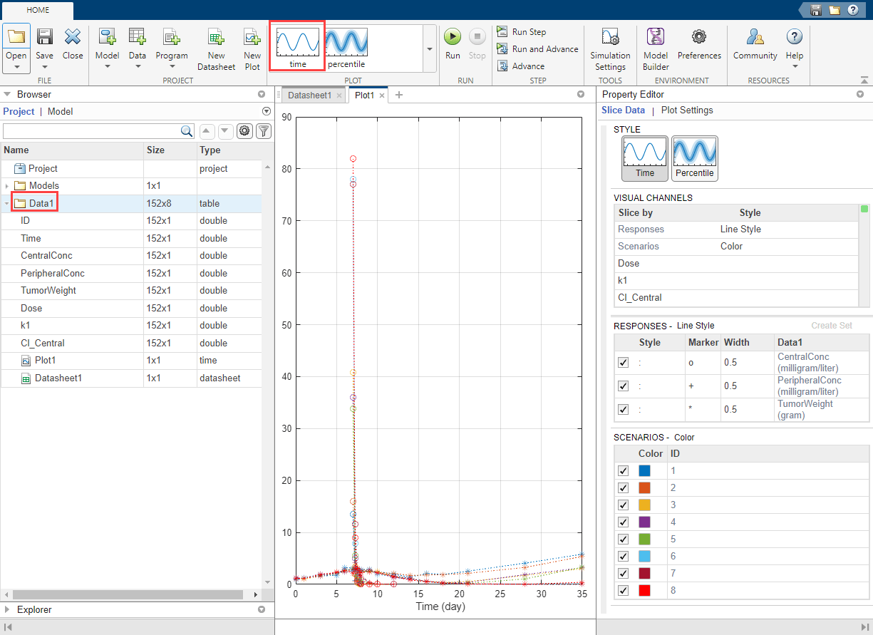
In the default time plot, Responses correspond to the measured responses and are plotted using different line styles. Scenarios refers to different groups (eight patients) in the data and are plotted using different colors.
Tip: Plots are backed by data that are currently present in the app workspace. Plots are not snapshots. When the data (either experimental data or simulation results) is removed or changed, the plots are also updated according to the changes in the underlying data.
Customize Data Visualization
The steps in this section are optional and are not necessary for fitting. You can customize the plot to make it clearer. For example, you can plot the PD data (TumorWeight) on a different axis than the PK data (CentralConc and PeripheralConc). To do so, create two different groups (sets) of responses, where the first set contains only TumorWeight and the second set contains CentralConc and PeripheralConc.
Right-click TumorWeight (gram) in the Responses table and select Create New Set. The app creates Set 1 and Set 2. Set 1 contains only TumorWeight, which is now plotted on a different axis than Set 2, which contains CentralConc and PeripheralConc.
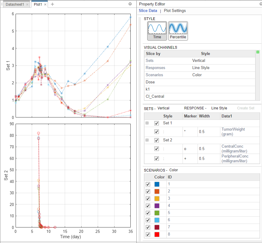
The Visual Channels table now contains Sets. This table is a summary table of all slicing variables that are currently present in the plot and their corresponding plot styles. In this current plot, the slicing variables are Sets, Responses, and Scenarios.
Tip: You can slice data using different slicing variables. Each slicing variable appears in the plot with a different visual style (or channel) such as color, line style, and axes position. Slicing variables can represent attributes of data, such as responses or scenarios (that is, groups or simulation runs). Slicing variables can also be covariates or parameter values associated with a scenario or group. By default, the app provides slicing variables for different response variables and different scenarios in the plotted data. You can add other visual styles (or channels) for sets of responses and associated parameter or covariate variables.
Group Responses Based on Dose Amounts
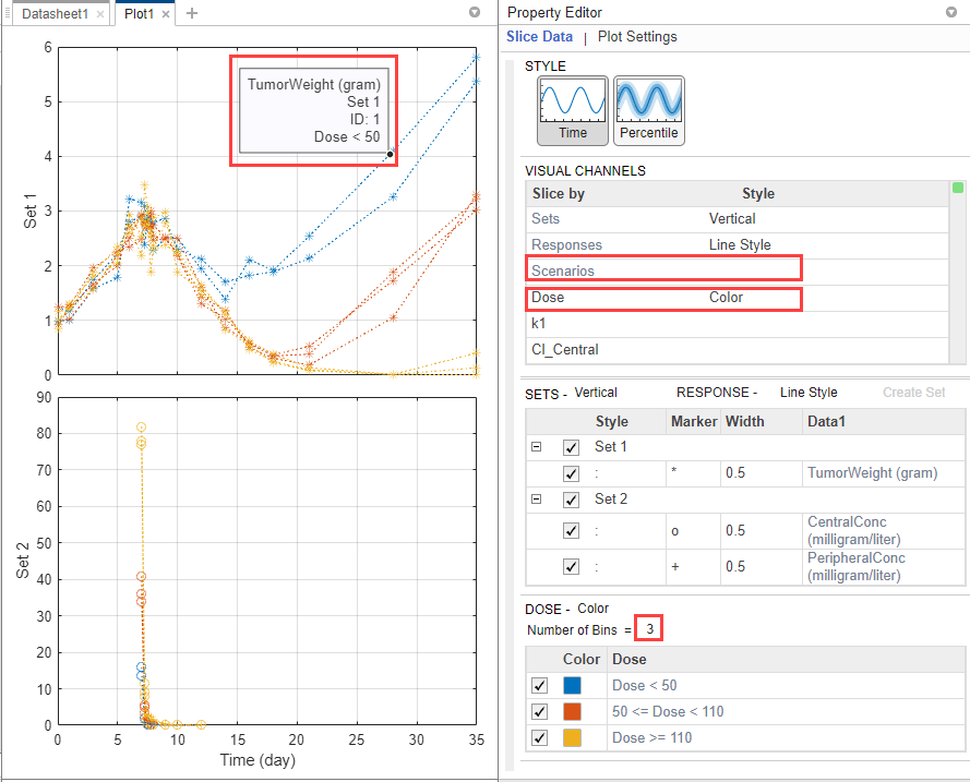
You can also group the responses based on different dose amounts that the patients receive. There are three different dose groups: 30, 75, and 150 mg.
In the Visual Channels table, at the Dose row, double-click the empty cell and select Color. A red indicator appears because another slicing variable (Scenarios) has the same plot style. Clear the style (visual channel) for Scenarios by selecting empty.
In the Dose table, the app has automatically binned the dose amounts. Set Number of Bins to 3. You can now see that the dose amount has an impact on the tumor size. The higher the dose is, the smaller the tumor becomes.
You can also query the corresponding dose group from each line by showing its data tip. Press Ctrl and click a blue line to display its data tip. To remove it, Ctrl + Click again anywhere on the same line.
Perform Noncompartmental Analysis (NCA)
Using the drug pharmacokinetic data, you can estimate NCA parameters. NCA is model agnostic and can give insights into the drug pharmacokinetics without any underlying assumptions. You can use some of the NCA results as initial estimates when calibrating the model to the data, as discussed later in this example. For details on the list of available NCA parameters and their formulas, see Noncompartmental Analysis.
NCA Program Setup
On the Home tab, select Program > Non-Compartmental Analysis. A new program (Program1) appears.
The Data setup step of the program defines the data set to use for the NCA analysis. In this example, the program automatically selects Data1.

The NCA execution step defines the data column associations and algorithm details. In the Definition table, set Concentration to CentralConc. Leave the other settings unchanged.

On the Home tab, click Run. Once the NCA analysis is complete, the app opens a new datasheet containing the results.

The program also saves the results in the LastRun folder of the program by default. To access the results, in the Browser pane, expand the Program1 folder. Then expand LastRun folder. The NCA results are stored in the table named results. For details about calculated NCA parameters, see Noncompartmental Analysis.
Export Results to MATLAB Workspace
You can export the NCA results to the MATLAB® workspace and perform further data analyses at the command line.
Right-click results. Select Export Data to MATLAB Workspace.

The SimBiology Data Export dialog box opens. Change the name of the variable to ncatable. Click OK.
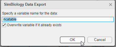
After you export the data to the MATLAB® workspace, you can analyze the data at the command-line. For instance, you can calculate the average drug clearance from the NCA data and use it as the model parameter value.
Estimate Model Parameters Using Nonlinear Regression
SimBiology provides different regression techniques to estimate model parameters based on experimental data. This example details the steps for using the nonlinear regression method lsqnonlin (requires Optimization Toolbox[tm]) to fit the model to the data. If you do not have Optimization Toolbox[tm], the app uses fminsearch instead. For the purposes of the example, only some of the PK/PD model parameters are estimated, namely: k1, L0, L1, Cl_Central, k12, and k21.
Fit Program Setup
From the Home tab, select Program > Fit Data. A new program (Program2) appears on a new tab. The Data and Model steps have been prepopulated with Data1 and Tumor Growth Model, respectively.
By default, the Fit step autogenerates plots after the fitting is complete. Disable the plot generation by clicking the plot icon at the top of the Fit program step for now. The plots will be explored later in the example.
In the Data Map table, define the mapping between the model components and the data columns from the input data.
The group row identifies which column in the data is a grouping variable, such as patient IDs.
The independent row identifies which column in the data is an independent variable, such as time.
The response row identifies which response or measurement data column corresponds to which model component. If there are multiple response data, you can add more response rows by clicking the Response button at the bottom of the Data Map table. To delete a response from the table, right-click and select Delete.
The dose from data row defines which column in the data maps to which model component as a dose target. If there are multiple dose columns, you can add more rows by clicking the Dose button.
The variant from data row defines which column in the data contains alternative parameter values for which model component. Click the Variant button to see the row or add more variants.
Note: In this example, the app uses the classification information from the data sheet of the input data and maps the ID column as the grouping variable (defined by the group row in the table), and Time column as an independent variable (defined by the independent row in the table). It has also identified CentralConc, PeripheralConc, and TumorWeight as response columns.
In the first response row, next to CentralConc, double-click the cell Component, and enter Central.Drug as the corresponding model component for that measurement data column.
Similarly, map the PeripheralConc column to Peripheral.Drug.
Map TumorWeight to [Tumor Growth Model].tumor_weight.
Map the Dose column to Central.Drug to indicate that the Drug species in the Central compartment is being dosed.

Leave the Variant and Dose Setup table as is because there is no group-specific doses or variants being used in this example. For details on how to use this table, see Simulate Groups Using Doses and Variants from Data Set.
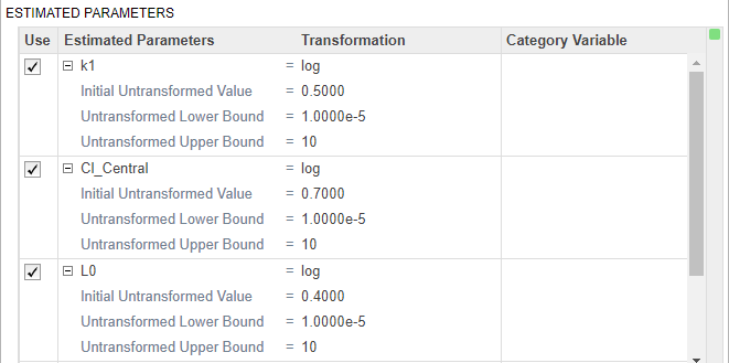
In the Fit step, define the model parameters to estimate in the Estimated Parameters table. Double-click the empty cell in the Estimated Parameters column and type k1. The app shows model components with matching names. Select k1 from the list.

By default, the parameter is log-transformed as indicated by the transformation log. You can change the transformation to no transformation none, probit, or logit transformation. For details, see Parameter Transformations. For this example, keep the default log transform because it often improves the convergence. The Initial Untransformed Value is automatically set to the model value which is 0.5.
Enforce the biological parameters to stay positive by specifying the Untransformed Lower Bound and Untransformed Upper Bound as 1e-5 and 10, respectively.
Similarly, add the following parameters: Cl_Central, L0, L1, k12, and k21.
Select Pooled fit to estimate one set of parameters for all patients (population fit). If you do not select Pooled fit, the app estimates one set of parameters for each patient (individual fit).
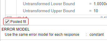
The default error model is the constant error model. SimBiology supports constant, proportional, exponential, and combined error models. For details, see Error Models. For now, use the constant error model.
Keep the rest of the fitting settings unchanged. These settings are
Estimation Method — The default method is lsqnonlin if you have Optimization Toolbox[tm]. If you do not, the app uses fminsearch.

For more information, see Supported Methods for Parameter Estimation in SimBiology.
Algorithm Settings — Most common options for the estimation method. Click to expand the section and see the options. To see the description of each option, click the info icon to the right of the header.

Advanced Algorithm Settings — Advanced settings for the estimation method. The table is empty by default.
Run Fit Program
After you set the fitting options, you can run the Fit step.
At the top of the Fit step, click the Run this program step button.
By default, the Fit step shows the progress of parameter estimation in a separate figure. The progress plot shows the live status of parameter estimation and fitting quality measures such as log likelihood. For details, see Progress Plot.
The progress plot shows that the fit converged. You can close the progress plot.
If you are using fminsearch, the fit can fail to converge due to reaching the maximum number of iterations. You can increase MaxIter in the Algorithm Settings, but for the purposes of this example, you can continue completing the steps without doing so.
Visualize Fit Results
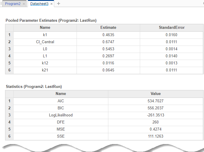
Once the parameter estimation is complete, the fit results are shown in a new data sheet. The datasheet contains parameter estimates and other information related to fit quality measures, such as AIC and BIC, which can be useful to compare the performance of different error models.
In addition to quality statistics, you can also view various fit plots, such as actual versus predicted plots and residual distribution plots.
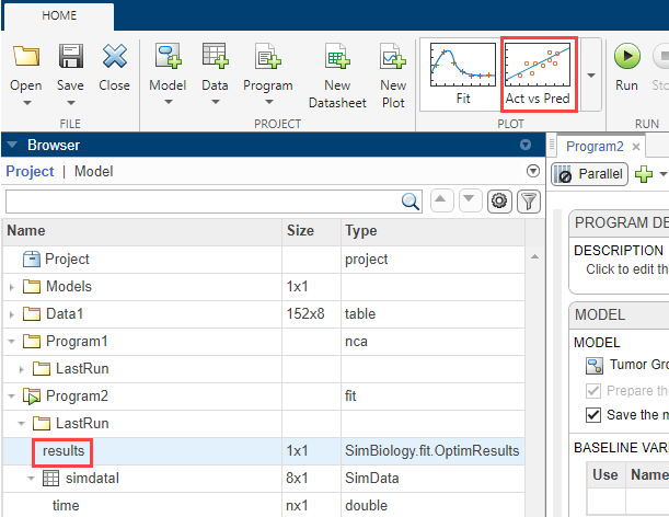
In the Browser pane, expand Program2 > LastRun, which contains results and simdataI. results contains estimated parameter values and fit statistics. simdataI contains the simulated model responses for each individual (patient or group) using the estimated parameter values.
Click results. Available fit plots are automatically listed in the Plot section on the Home tab. Then select Act vs Pred from the list.
The actual versus predicted plot appears on a separate tab. The predicted responses are plotted on the x-axis and the observed (experimental) responses are plotted on the y-axis.

You can change the plot to other supported plots by selecting one of the plots from the Style section in the Property Editor. If you want the new plot on its own separate tab and you do not want to reuse the existing plot tab, select the plot from the Plot section on the Home tab.
Change the plot to a residual distribution plot by selecting Res Dist in the Style section.

The plot shows whether the residuals for each response are normally distributed. In an ideal normal probability plot of residuals, the residuals line up along the diagonal line across the plot and the histograms indicate a normal fit. However, from the plot, the residuals for all three responses, especially CentralConc and PeripheralConc, do not seem to be normally distributed. It could be an indication that the constant error model assumption is incorrect.
Compare Different Error Models
The following steps show how to change the error model to an exponential error model to fit the data again and compare the fit statistics of two different error models.
Save Fit Results
Before fitting the data again using the exponential error model, save the constant error model result in a separate folder. Otherwise, the program, by default, overwrites results from the LastRun folder every time you run the fit.
Right-click the LastRun folder of the fit program in the Browser pane.
Select Save Data.
In the Save Data dialog, enter fit_constant as the data name.
Rerun Fit With Exponential Error Model
After you save the data, you can rerun the fit program with a different error model.
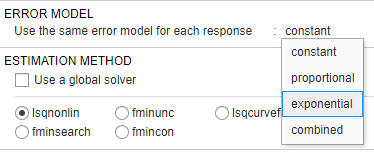
Return to the fit program by clicking the Program2 tab. In the Error Model section, select exponential.
At the top of the Fit step, click the Run this program step button.

Close the progress plot after the fit completes.
If you closed the previous datasheet (Datasheet3) that contains the fit statistics from the previous fit, reopen the datasheet. To do so, in the Browser pane, expand Program2 > fit_constant. Then double-click Datasheet3.
From the LastRun folder, drag results onto Datasheet3. New columns (Program2_LastRun) containing the latest fit results are added next to the previous fit results (Program2_fit_constant).
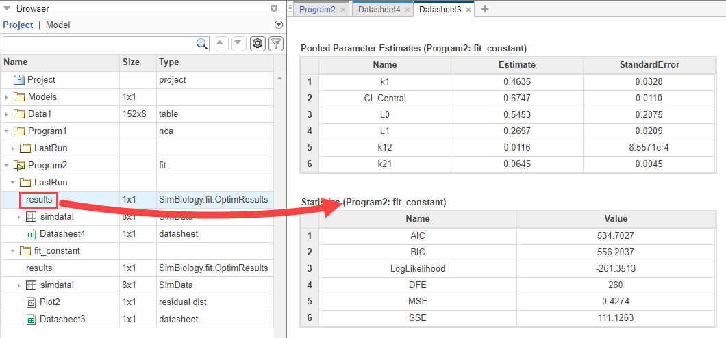
The table is updated as follows.

The Statistics table compares the fit quality measures. From the comparison, both the AIC and BIC of the fit using the exponential error model are smaller than those of the previous fit. This indicates that the exponential error model fits the data better than the constant error model. The larger log likelihood of the exponential error model also indicates it is a better fit.
Next, look at the residual distribution plot. Click results from the LastRun folder. Then click Residual Dist from the Plot section on the Home tab.
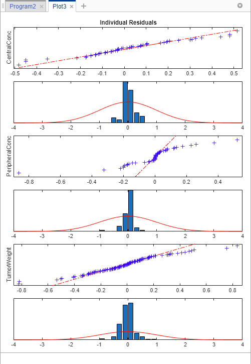
Compared to the residual distributions of the constant error model, the residual distributions from the exponential error model look more normal, indicating that the exponential error model fits the data better.
Calculate Confidence Intervals
Another way to assess the quality of fit results is to compute 95% confidence intervals for the estimated parameters and model predictions — that is, model simulation results using the estimated parameters. This step requires Statistics and Machine Learning Toolbox™.
Click the Program2 tab. Click the green (+) icon at the upper left and select Confidence Interval. A Confidence Interval step appears following the Fit step.
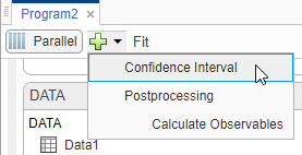
At the top of the Confidence Interval step, disable the autogeneration of plots by clicking the plot icon. For both Parameter Confidence Intervals and Prediction Confidence Intervals, use the default method gaussian and 95% confidence level. Click the Run this program step button to compute confidence intervals.
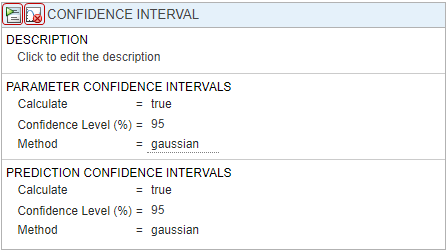
For parameter confidence intervals, the supported methods are Gaussian Confidence Interval Calculation, Profile Likelihood Confidence Interval Calculation, and Bootstrap Confidence Interval Calculation. For prediction confidence intervals, the supported methods are Gaussian Confidence Interval Calculation for Model Predictions and Bootstrap Confidence Interval Calculation.
Once completed, the results are stored as parameterCI and predictionCI in the LastRun folder of the program. parameterCI contains 95% confidence intervals for the estimated parameters. predictionCI contains 95% confidence intervals for the model predictions.
Plot 95% confidence intervals for the estimated parameters. Click parameterCI in the Browser pane and select Confidence in the Plot section.
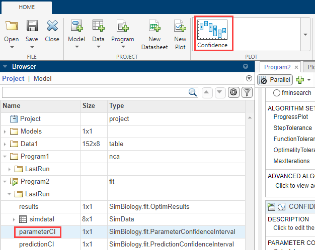
The confidence interval for each estimated parameter is shown in a new plot. The plot indicates the successful computation of the confidence intervals for all estimated parameters.
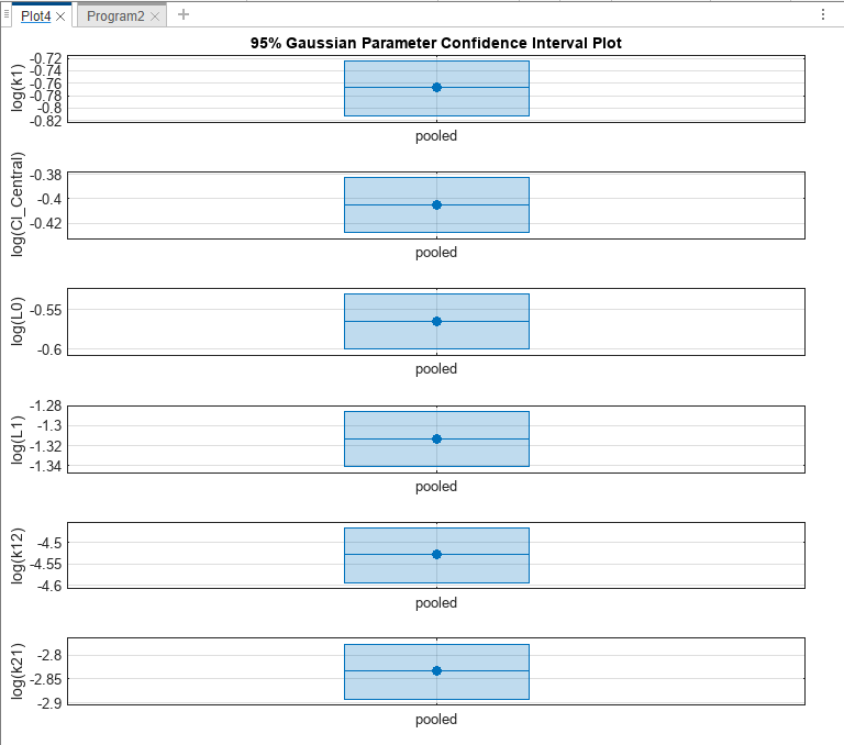
Depending on the outcome (status) of the confidence interval estimation, the app plots the results differently.
If the status of confidence interval estimation is a success (as in the above plot), the app uses the first default color (blue) to plot a line and a centered dot for every parameter estimate. The app also plots a box to indicate the confidence intervals.
If the status is constrained or estimable, the app uses the second default color (red) and plots a line, centered dot, and box to indicate the confidence intervals.
If the status is not estimable, the app plots only a line and a centered cross in red.
If there are any transformed parameters with estimated values that are 0 (for the log transform) and 0 or 1 (for the probit or logit transform), no confidence intervals are plotted for those parameter estimates.
For more details on the definitions of different statuses, see Parameter Confidence Interval Estimation Status.
You can also change the Layout of the plot in Plot Settings.
The 'split' layout displays the confidence interval for each parameter estimate on a separate axis.
The 'grouped' layout displays all confidence intervals on one axis, grouped by parameter estimates. Each estimated parameter is separated by a vertical black line.
In both cases, the parameter bounds defined in the original fit are marked by square brackets. The app uses vertical dotted lines to group confidence intervals of parameter estimates that have been computed in a common fit.
Similarly, plot 95% confidence intervals for the model predictions. Click predictionCI in the Browser pane and select Confidence in the Plot section.
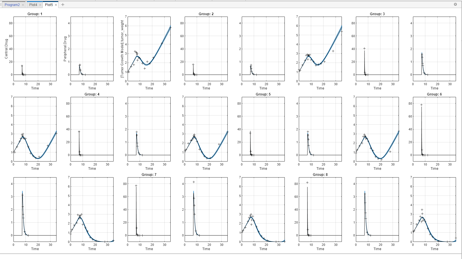
The plot indicates the successful computation of the confidence intervals because there are no red plot. The plotting behavior differs depending on the outcome (Status) of the confidence interval calculation.
If the status is constrained or not estimable, the app uses the second default color (red) to plot the confidence intervals.
Otherwise, the app uses the first default color (blue) and plots the confidence intervals as shaded areas (as in the above plot).
For details, see Gaussian Confidence Interval Calculation for Model Predictions and Bootstrap Confidence Interval Calculation.
Visualize Simulation Statistics and Overlay Experimental Data Using Percentile Plot
The percentile plot lets you visualize simulation results and statistics that can be overlaid with experimental data. For example, you can plot 5th and 95th percentile curves of simulation data over time instead of seeing the individual time courses. You can also visualize the mean, standard deviation, minimum, and maximum of simulation and experimental data. For details, see Percentile Plot.
Note: If you have not completed the prior steps that generated the required results to continue, you can load the completed project instead by doing the next three steps. Otherwise, skip them.
1. Enter the following command at the command line:
openExample('simbio/CalculateNCAParametersAndFitDataSimBiologyModelAnalyzerExample')
2.SimBiology Model Analyzer opens with the initial project loaded.
3. Click Open and navigate to the current folder. Select project file name "tumor_growth_fitPKPD_completed.sbproj".
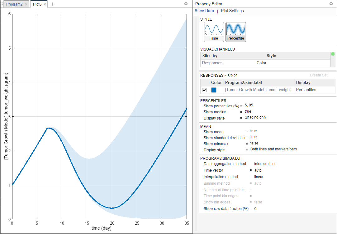
In the LastRun folder of Program2, select simDataI > [Tumor Growth Model].tumor_weight.
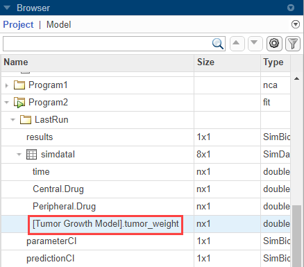
On the Home tab, click percentile.

The percentile plot shows the 5th and 95th percentile curves by default.
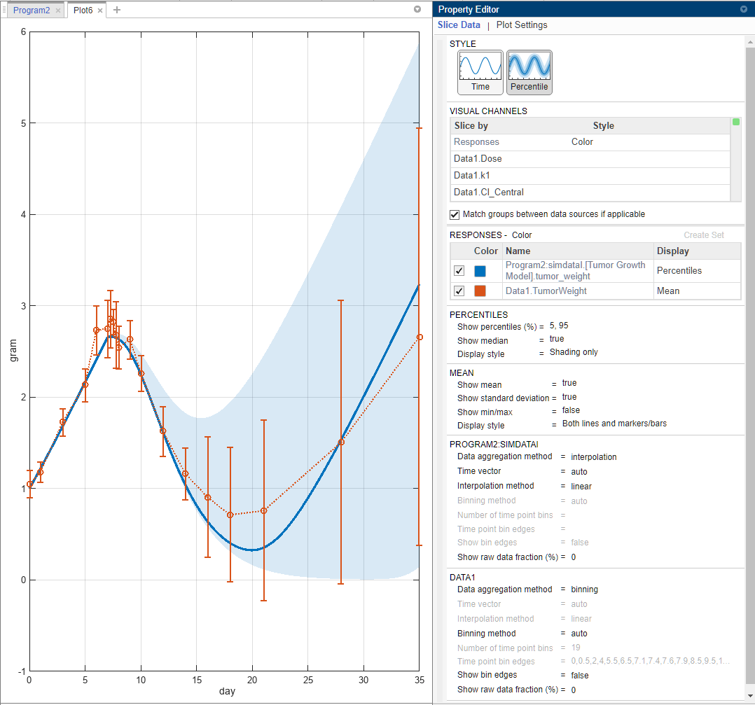
Select Data1 > TumorWeight. Drag and drop it on to the plot.

By default, the Display type of the experimental data is automatically set to Mean, which shows the mean measurement at each time with ±1 standard deviation. If you want to visualize only the raw data, double-click Mean and select Raw Data. For this example, keep the Mean display.
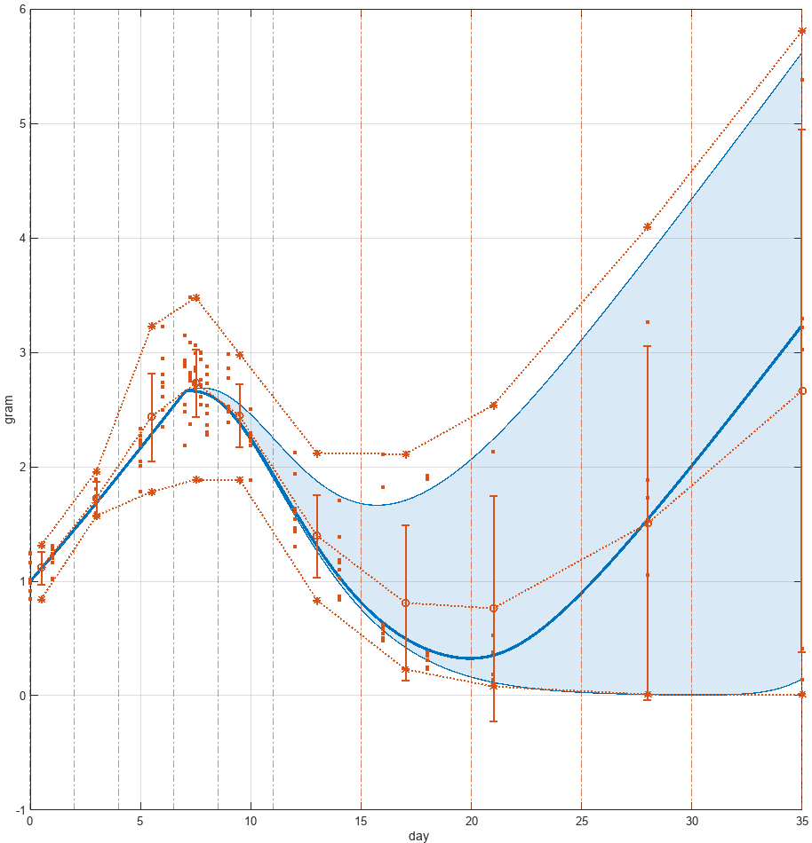
In the Percentiles section, for the Show percentiles (%) option, enter 10,80 to show the 10th and 80th percentiles.
Change Display style to Both lines and shading.

In the Mean section, show the minimum and maximum response data points at each time by setting Show min/max to true.

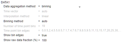
In the Data1 section, change Show raw data fraction (%) to 100 to show all the underlying raw data points. You can also enter a custom percentage number. You can also see the bins used to generate the summary statistics. Change Show bin edges to true.
The percentile plot is updated as follows. The asterisks (*) represent the calculated minimum and maximum values after interpolation, and the dots (.) represent original data points.

You can also specify a custom number of bins or specific bin edges. For instance, change Binning method to specify number of bins. Then enter 10 for Number of time point bins. The percentile plot is updated as follows. For details on how the app computes the underlying statistics, see Percentile Plot.
After parameter estimation, you can set the model values to the parameter estimates and perform other analyses. For instance, you can find out important model parameters using sensitivity analysis (for details, see Find Important Tumor Growth Parameters with Local Sensitivity Analysis Using SimBiology Model Analyzer) and vary the sensitive parameters to investigate model variability by using virtual patients (for details, see Explore Biological Variability with Virtual Patients Using SimBiology Model Analyzer).
References
[1] Simeoni, Monica, Paolo Magni, Cristiano Cammia, Giuseppe De Nicolao, Valter Croci, Enrico Pesenti, Massimiliano Germani, Italo Poggesi, and Maurizio Rocchetti. “Predictive Pharmacokinetic-Pharmacodynamic Modeling of Tumor Growth Kinetics in Xenograft Models after Administration of Anticancer Agents.” Cancer Research 64, no. 3 (February 1, 2004): 1094–1101.
[2] Koch, Gilbert, Antje Walz, Gezim Lahu, and Johannes Schropp. “Modeling of Tumor Growth and Anticancer Effects of Combination Therapy.” Journal of Pharmacokinetics and Pharmacodynamics 36, no. 2 (April 2009): 179–97.