Interact with Plots in Sensitivity Analyzer
This topic shows how to interact with and interpret plots generated in the Sensitivity Analyzer app.
Parameter Set Plots
After you have generated parameter values for sensitivity analysis, you can plot the generated parameter set. For information about parameter generation, see Generate Parameter Samples for Sensitivity Analysis.
The app displays the generated parameter set and the corresponding parameter set table. The number of rows in the parameter set table correspond to the number of samples you specified. To plot the generated parameters in the app:
Select the generated parameter set in the Parameter Sets area of the app.

On the Plots tab, select Scatter Plot.
Alternatively, right-click the parameter set, and select Plot in the drop-down menu.
The diagonal subplots display the histograms of generated parameter values. The off-diagonal subplots are pair-wise scatter plots of the parameters. The number of data points in each scatter plot equals the number of rows in the parameter set table.

You can inspect the histograms to ensure that the generated parameter values match the desired parameter distributions within the constraints of a finite sample size. Inspect the off-diagonal scatter plots to ensure that any specified correlations between parameters are present. For more information, see Inspect the Generated Parameter Set.
Requirement Plots
After you have specified design requirements, you can plot the requirements and associated model response. For information about specifying the requirements, see Specify Time-Domain Requirements and Specify Frequency-Domain Requirements.
The specified requirements are displayed in the Requirements area of the app. To plot the requirement in the app, right-click the requirement, and select Plot.

Alternatively, select the requirement, and in the Plots tab of the app, select the plot type. A plot is generated and a new tab associated with the plot appears in the app. In the new tab, you can perform additional tasks such as preprocessing imported data (for signal matching requirement only), zooming, and plotting the associated model response. The model response is the signal or system on which the requirement is applied. The response is plotted using the parameter values specified in the model workspace and is not updated during evaluation.

Evaluated Result Scatter Plots
After you have evaluated your design requirements, an evaluation results table lists the samples in the parameter set and the corresponding evaluated requirement (cost function) values. For requirements that involve a bound, a positive requirement value indicates that your requirement was violated, while a negative value indicates that the requirement was satisfied for that sample of parameter values.
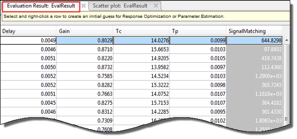
An evaluation result plot is also generated. The scatter subplots display the evaluated requirement (cost function value) as a function of each parameter in the parameter set. The number of points in each scatter plot equals the number of rows in the parameter set. The last column of subplots displays histograms of the probability distribution of the evaluated cost function values.
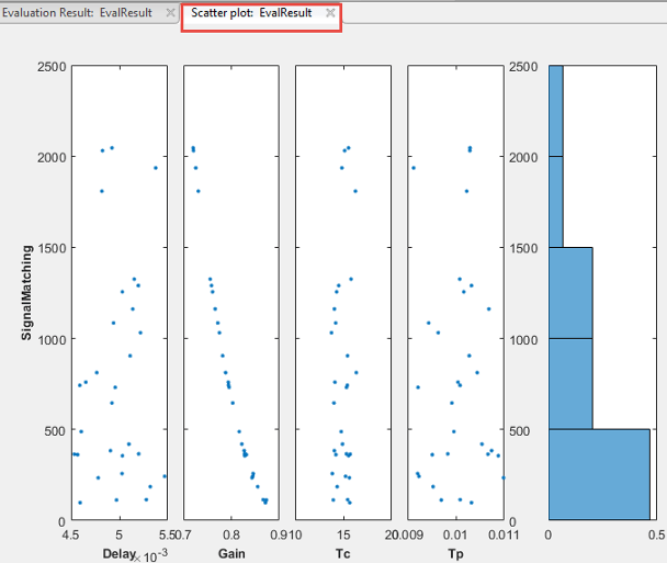
Use this plot to visually analyze the relation
between parameters and requirements. For example, in this case, the
SignalMatching requirement looks monotonically related to the
Gain parameter.
Evaluated Result Contour Plots
After you have evaluated your design requirements, an evaluation results table lists the samples in the parameter set and the corresponding evaluated requirement (cost function) values. For information about evaluation, see Evaluate Design Requirements.
You can plot a contour plot of the evaluated results. To do so, select the evaluated result in the Results area of the app, and choose a contour plot in the Plots tab of the app.

Use this plot to visually analyze the relation between parameters and design requirements. Select the parameters to plot in the X parameter and Y parameter drop-down lists. The evaluated requirement value is plotted as a function of these parameters.
Evaluated Result Multiobjective Scatter Plots
After you have evaluated your design requirements, an evaluation results table lists the samples in the parameter set and the corresponding evaluated requirement (cost function) values. For information about evaluation, see Evaluate Design Requirements.
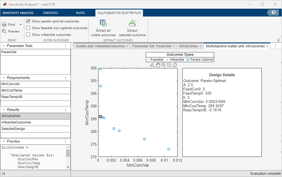
You can visualize the objective (requirement) space by making a multiobjective scatter plot of the evaluated results. To do so, select the evaluated result in the Results area of the app and choose Multiobjective scatter plot in the Plots tab of the app. The Multiobjective scatter plot option is only available when there are two or more requirements which either minimize or maximize the cost.
The multiobjective scatter plot shows the objective values for all possible combinations of the parameters. If there are more than two objectives, the multiobjective scatter plot consists of pairwise scatter plots. Each point in the plot is a design outcome that corresponds to a row in the evaluation result table. The plot determines the optimal, feasible, and infeasible designs, and helps you select the design outcome that best solves the tradeoff between the objectives. By default, the plot displays:
Pareto-optimal outcomes
Feasible non-optimal outcomes
Infeasible outcomes
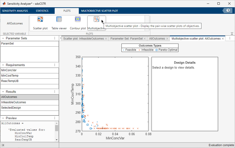
To visualize only the pareto-optimal outcomes, in the Multiobjective Scatter Plot tab, only select Show pareto-optimal outcomes. Similarly, you can also visualize only non-optimal outcomes or infeasible outcomes by selecting the corresponding option in the Multiobjective Scatter Plot tab. Click on a design outcome to view the design details on the right side of the plot. These details show the values of the parameters and objectives corresponding to the selected design outcome.
To export the parameter values for the selected design, in the Multiobjective Scatter Plot tab, click Extract selected outcome. A new object containing these parameter values appears in the Results section of the app. To export the parameter values of all visible outcomes in the plot, in the Multiobjective Scatter Plot tab, click Extract all visible outcomes.
For a detailed example that shows how to select the best design outcome, see Design Selection Using Multiobjective Tradeoff Analysis.
Evaluated Result Parallel Plots
After you have evaluated your design requirements, an evaluation results table lists the samples in the parameter set and the corresponding evaluated requirement (cost function) values. For information about evaluation, see Evaluate Design Requirements.
You can create a parallel coordinates plot from the evaluation results table. To do so, select the evaluated result in the Results area of the app and choose Parallel plot in the Plots tab of the app. Note that the Parallel plot option is only available when there are two or more requirements that either minimize or maximize the cost.

Each line in the parallel plot represents a row in the evaluation results table. Each coordinate variable in the plot corresponds to a column in the table. The plot determines the optimal, feasible, and infeasible designs, and helps you select the design outcome that best solves the tradeoff between the objectives. By default, the plot displays:
Pareto-optimal outcomes
Feasible non-optimal outcomes
Infeasible outcomes
You can visualize either Pareto-optimal, feasible non-optimal, or infeasible outcomes by selecting the corresponding option in the Multiobjective Scatter Plot tab. Point to a line in the plot to view the design details. These details show the row number in the evaluation result table, the type of outcome, and the parameter and objective values corresponding to the line.

To export the parameter values of all visible outcomes in the plot, in the Parallel Plot tab, click Extract all visible outcomes. A new object containing these parameter values appears in the Results section of the app.
For information on parallel coordinates plots, see parallelplot.
Statistical Analysis Tornado Plots
After you have evaluated the design requirements for each parameter, you can perform statistical analysis to analyze how the parameters of your Simulink® model influence the requirements.
To generate a tornado plot ranking the influence of parameters on requirements:
In the Statistics tab of the app, select the evaluation results you want to analyze in the Evaluation Results to Analyze list.

Specify the statistical analysis methods.
You can choose to calculate a correlation coefficient, standardized regression coefficient, and partial correlation coefficient (requires Statistics and Machine Learning Toolbox™ software).
For more information, see Analyze Relation Between Parameters and Design Requirements.
For each of these methods, specify what data to use for the analysis. You can choose from Linear (Pearson), Ranked (Spearman), and Kendall analysis types. Kendall is applicable when the analysis method is Correlation, and requires Statistics and Machine Learning Toolbox software.
You can compute all applicable combinations of analysis methods and types.
Calculate the coefficients, and generate a tornado plot.
Click
 Compute Statistics.
The resulting tornado plot displays the calculated coefficients for each specified analysis method and type. The coefficients are plotted in order of influence of parameters on the cost function. The parameter with the greatest magnitude of influence on the cost function is displayed on the top, giving the plot a tornado shape. When more than one type of coefficient is calculated, the tornado plot sorts the parameters based on the first calculated coefficient. The coefficients are calculated in the following order:
Correlation
Rank correlation
Kendall correlation
Partial correlation
Rank partial correlation
Standardized regression
Rank Standardized Regression
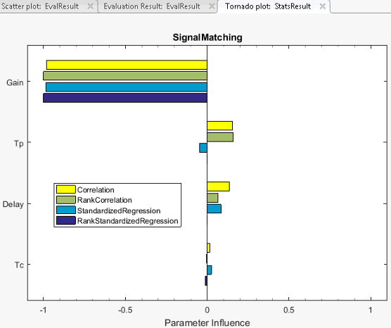
In this tornado plot, the parameters are sorted based on the Correlation
coefficient. For all calculated coefficients, the Gain parameter
has the most influence on the design requirement cost function.
