Use Partial Dependence Plots to Interpret Regression Models Trained in Regression Learner App
For trained regression models, partial dependence plots (PDPs) show the relationship between a predictor and the predicted response. The partial dependence on the selected predictor is defined by the averaged prediction obtained by marginalizing out the effect of the other predictors.
This example shows how to train regression models in the Regression Learner app and interpret the best-performing models using PDPs. You can use PDP results to confirm that models use features as expected, or to remove unhelpful features from model training.
In the MATLAB® Command Window, load the
carbigdata set, which contains measurements of cars made in the 1970s and early 1980s. Preprocess the data by categorizing the cars based on whether they were made in the USA, and remove rows where the table has missing values.load carbig Origin = categorical(cellstr(Origin)); Origin = mergecats(Origin,["France","Japan","Germany", ... "Sweden","Italy","England"],"NotUSA"); cars = table(Acceleration,Displacement,Horsepower, ... Model_Year,Origin,Weight,MPG); cars = rmmissing(cars)
Open Regression Learner using the cars table and the Origin variable as the response.
regressionLearner(cars,"Origin")
In the Test section of the New Session from Arguments dialog box, specify to set aside
15percent of the imported data as a test set.To accept the options and continue, click Start Session.
Train all preset models. On the Learn tab, in the Models section, click the arrow to open the gallery. In the Get Started group, click All. In the Train section, click Train All and select Train All. The app trains one of each preset model type, along with the default fine tree model, and displays the models in the Models pane.
Note
If you have Parallel Computing Toolbox™, then the Use Parallel button is selected by default. After you click Train All and select Train All or Train Selected, the app opens a parallel pool of workers. During this time, you cannot interact with the software. After the pool opens, you can continue to interact with the app while models train in parallel.
If you do not have Parallel Computing Toolbox, then the Use Background Training check box in the Train All menu is selected by default. After you select an option to train models, the app opens a background pool. After the pool opens, you can continue to interact with the app while models train in the background.
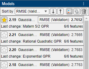
Sort the trained models based on the validation root mean squared error (RMSE). In the Models pane, open the Sort by list and select
RMSE (Validation).In the Models pane, click the star icon next to the model with the lowest validation RMSE values. The app highlights the lowest validation RMSE by outlining it in a box. In this example, the trained Matern 5/2 GPR model has the lowest validation RMSE.
Note
Validation introduces some randomness into the results. Your model validation results might vary from the results shown in this example.
For the starred model, you can check the model performance by using various plots (for example, response, Predicted vs. Actual, and residuals plots). In the Models pane, select the model. On the Learn tab, in the Plots and Results section, click the arrow to open the gallery. Then, click any of the buttons in the Validation Results group to open the corresponding plot.
After opening multiple plots, you can change the layout of the plots by using the Document Actions button
 located to the far right of the model plot tabs. For
example, click the button, select the
 Sub-Tileoption, and specify a layout. For more information on how to use and display validation plots, see Visualize and Assess Model Performance in Regression Learner.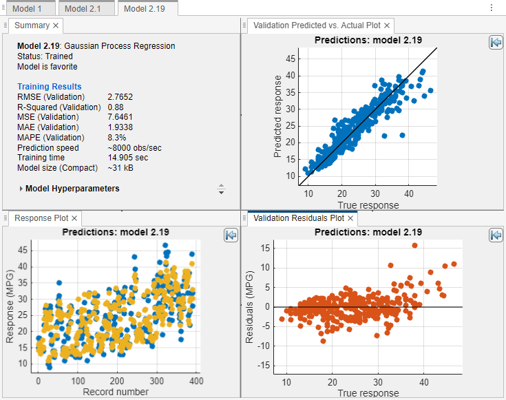
To return to the original layout, you can click the Layout button in the Plots and Results section and select Single model (Default).
For the starred model, see how the model features relate to the model predictions by using partial dependence plots (PDPs). On the Explain tab, in the Global Dependence section, click Partial Dependence. The PDP allows you to visualize the marginal effect of each predictor on the predicted response of the trained model. To compute the partial dependence values, the app uses the model trained on the 85% of observations in
carsnot reserved for testing.Examine the relationship between the model predictors and model predictions on the training data (that is, 85% of the observations in
cars). Under Data, select Training set.Look for features that seem to contribute to model predictions. For example, under Feature, select
Weight.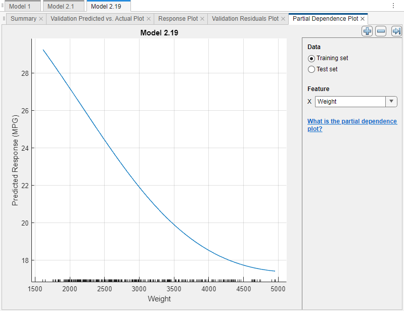
The blue plotted line represents the averaged partial relationship between the
Weightfeature and the predictedMPGresponse. The tick marks along the x-axis indicate the uniqueWeightvalues in the training data set. According to this model (Model 2.19), the MPG (miles per gallon) value tends to decrease as the car weight increases.Note
In general, consider the distribution of values when interpreting partial dependence plots. Results tend to be more reliable in intervals where you have sufficient observations whose predictor values are spread evenly.
You can tune your best-performing model by removing predictors that do not seem to contribute to model predictions. A PDP where the predicted response remains constant across all predictor values can indicate a poor predictor.
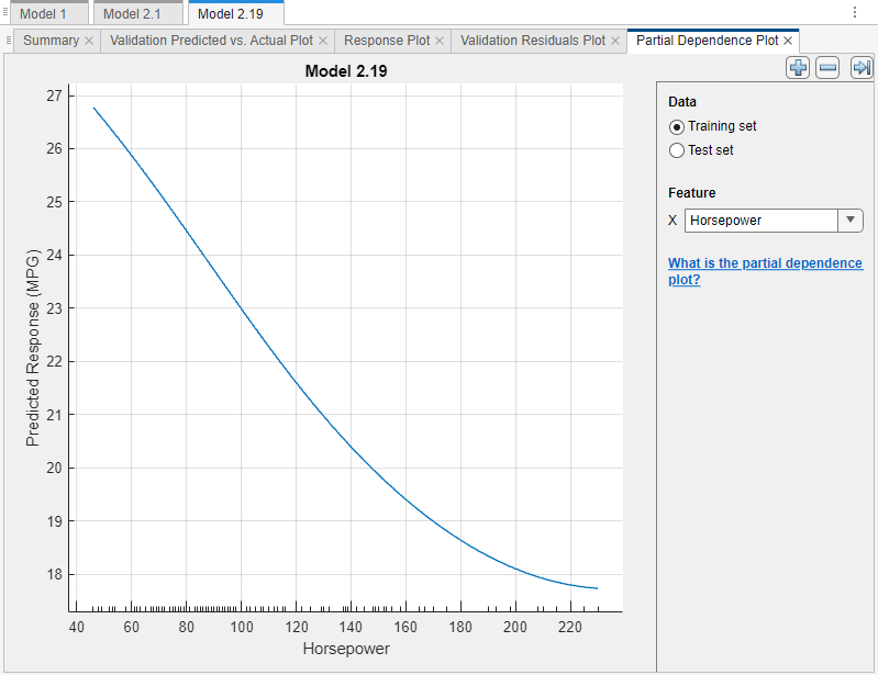
In this example, none of the predictors have a PDP where the plotted line is flat. However, two predictors,
DisplacementandHorsepower, show a similar relationship to the model predicted response as theWeightpredictor.Under Feature, first select
Displacementand then selectHorsepower.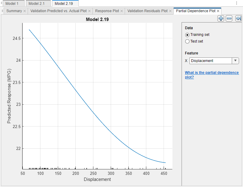
Remove the
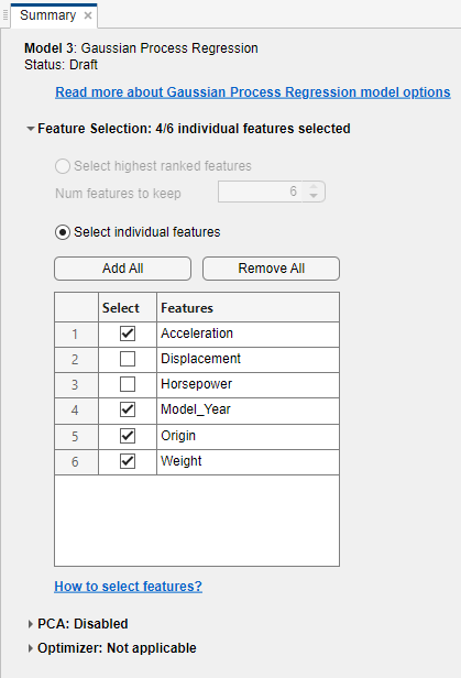
DisplacementandHorsepowerpredictors from the best-performing model. Create a copy of the starred model. Right-click the model in the Models pane, and select Duplicate.Then, in the model Summary tab, expand the Feature Selection section, and clear the Select check boxes for the Displacement and Horsepower features.
Train the new model. In the Train section of the Learn tab, click Train All and select Train Selected.
In the Models pane, click the star icon next to the new model. To group the starred models together, open the Sort by list and select
Favorites.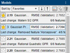
The model trained with fewer features, Model 3, performs slightly better than the model trained with all features, Model 2.19.
For each starred model, compute the RMSE of the model on the test set. First, select the model in the Models pane. Then, on the Test tab, in the Test section, click Test Selected.
Compare the validation and test RMSE results for the starred models by using a table. On the Test tab, in the Plots and Results section, click Results Table. In the Results Table tab, click the "Select columns to display" button at the top right of the table.
In the Select Columns to Display dialog box, check the Select box for the Preset column, and clear the Select check boxes for the MSE (Validation), RSquared (Validation), MAE (Validation), MSE (Test), RSquared (Test), and MAE (Test) columns. Click OK.
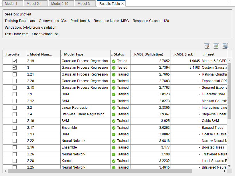
In this example, both of the starred models perform well on the test set.
For the best-performing model, look at the PDPs on the test data set. Ensure that the partial relationships meet expectations.
For this example, because the model trained on fewer features still performs well on the test set, select this model (Model 3). Compare the training set and test set PDPs for the
Accelerationfeature and the Model 3 predicted response. In the Partial Dependence Plot tab, under Feature, selectAcceleration. Under Data, select Training set and then select Test set to see each plot.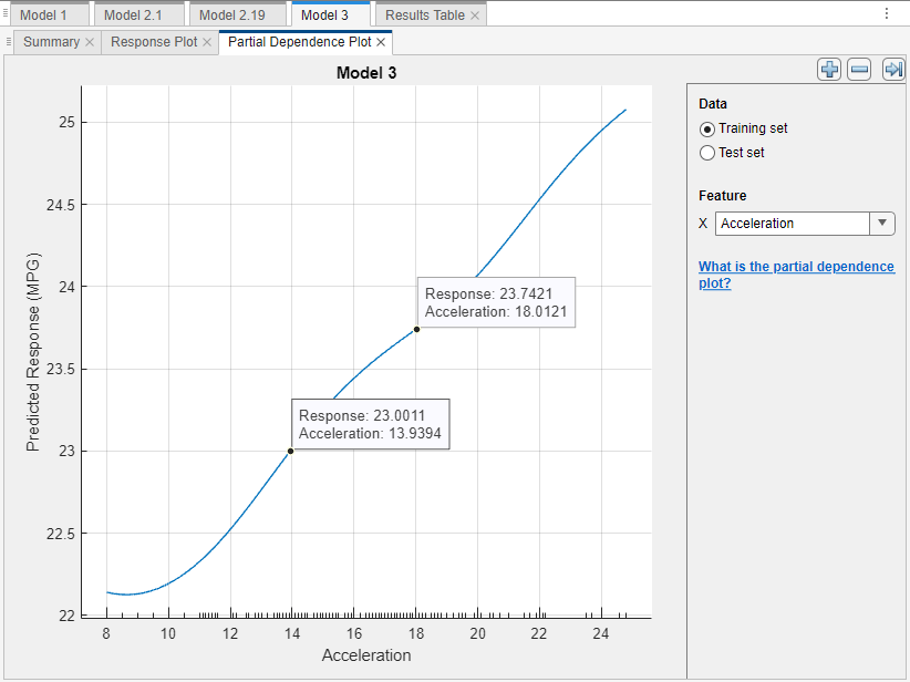
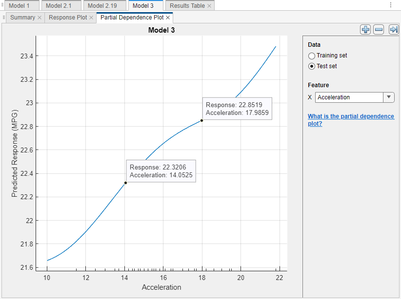
The PDPs have similar trends for the training and test data sets. However, the predicted response values vary slightly between the plots. This discrepancy might be due to a difference in the distribution of training set observations and test set observations.
If you are satisfied with the best-performing model, you can export the trained model to the workspace. For more information, see Export Model to Workspace. You can also export any of the partial dependence plots you create in Regression Learner. For more information, see Export Plots in Regression Learner App.
See Also
plotPartialDependence | partialDependence