geopcolor
Description
The geopcolor function creates a pseudocolor raster plot
from raster data with coordinates in any supported geographic or projected coordinate
reference system (CRS). You can create a pseudocolor raster plot in a geographic axes or a map
axes, which affects the map projection that the function uses to display the
data:
Geographic axes — A Web Mercator projection
Map axes — The projection specified by the
ProjectedCRSproperty of the map axes
Pseudocolor raster plots are useful for displaying data such as elevation, bathymetry, temperature, and precipitation.
geopcolor(___,
specifies properties of the pseudocolor plot using one or more name-value arguments in
addition to any combination of input arguments from the previous syntaxes. For a full list
of properties, see PseudocolorRaster Properties.Name=Value)
p = geopcolor(___)PseudocolorRaster object. Use p to set properties
after creating the pseudocolor plot. For a full list of properties, see PseudocolorRaster Properties.
Examples
A pseudocolor raster plot displays raster data by assigning colors to the values stored in the raster. The plot applies scaled color using the colormap of the axes.
Read elevation data for Colorado [1] into the workspace as a matrix and a raster reference object.
[Z,R] = readgeoraster("n40_w106_3arc_v2.dt1");Display the data on a map. When the current axes is not a geographic or map axes, or when there is no current axes, the function displays the data in a new geographic axes.
figure
geopcolor(Z,R)
Apply a colormap that is appropriate for elevation data.
demcmap(Z)
Add a color bar and a title.
colorbar
title("Elevation (m)")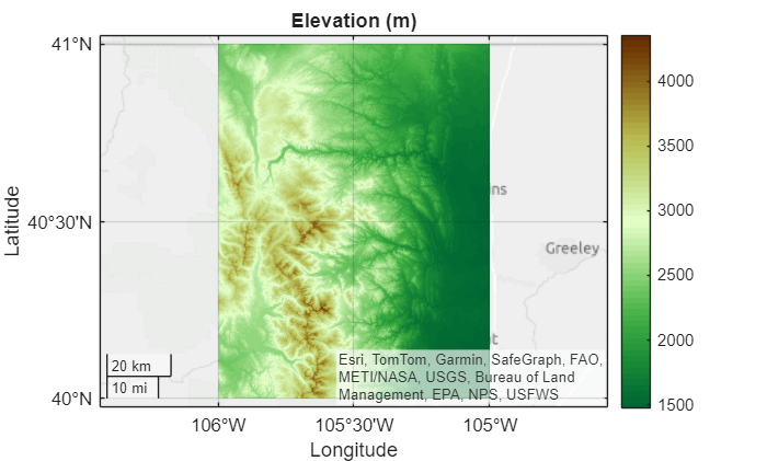
Apply a satellite basemap. Zoom out by changing the geographic limits.
geobasemap satellite
geolimits([39.5 41.5],[-107.5 -104])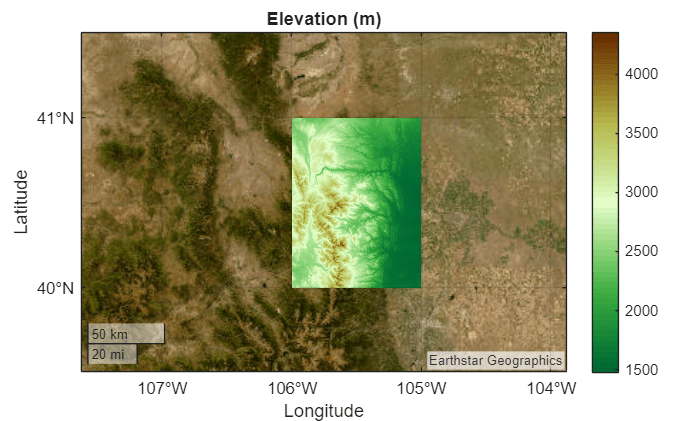
[1] The elevation data used in this example is from the US Geological Survey.
Read two global data sets into the workspace:
A shapefile containing world land areas. The
readgeotablefunction returns a geospatial table, which represents the land areas using polygons.Geoid heights from the Earth Gravitational Model of 1996 (EGM96). The
egm96geoidfunction represents the geoid heights using a matrix and a raster reference object.
land = readgeotable("landareas.shp");
[geoidN,geoidR] = egm96geoid;
Create a map axes that uses the default Equal Earth projection. Display the land areas by using the geoplot function. Then, display the geoid heights by using the geopcolor function. To make the geoid heights semitransparent, specify the AlphaData argument as a scalar in the interval (0, 1).
figure
newmap
geoplot(land,FaceColor=[0.8 0.8 0.8],FaceAlpha=1,EdgeColor="none")
hold on
geopcolor(geoidN,geoidR,AlphaData=0.5)
Change the colormap and add a labeled color bar.
colormap turbo

c = colorbar;
c.Label.String = "Geoid heights (m)";
Add a title and subtitle.
title("Geoid Heights from EGM96")

mx = gca;
subtitle(mx.ProjectedCRS.Name)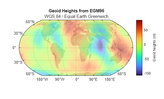
You can display data within a range by changing the transparency of the raster elements outside the range.
Read a band of sea ice concentrations [1][2] into the workspace as a matrix and a raster reference object. Convert the concentrations to percentages.
[A,R] = readgeoraster("seaice.grib",Bands=1);
A = A*100;
Create a map that uses a projected CRS for an Arctic region. Use the WGS 84 / UPS North (E,N) projected CRS, which has the EPSG code 5041. Provide geographic context for the map by reading and displaying a subset of world land areas.
figure
pcrs = projcrs(5041);
newmap(pcrs)

land = readgeotable("landareas.shp");
land = land(2:end,:);
geoplot(land,FaceColor=[0.8 0.8 0.8],FaceAlpha=1)
hold on
Prepare to display only the raster elements that are 40% ice or more by creating a logical matrix of transparency values. A value of 1 indicates that the corresponding element is opaque, and a value of 0 indicates that the corresponding element is transparent.
idx = (A >= 40);
Display the sea ice concentrations. Avoid displaying raster elements that are less than 40% ice by specifying the AlphaData argument as the logical matrix.
geopcolor(A,R,AlphaData=idx)
Add a color bar, a title, and a subtitle.
colorbar
title("Sea Ice Concentrations (%)")
subtitle(pcrs.ProjectionMethod)
[1] Hersbach, H., B. Bell, P. Berrisford, G. Biavati, A. Horányi, J. Muñoz Sabater, J. Nicolas, et al. "ERA5 Hourly Data on Single Levels from 1940 to Present." Copernicus Climate Change Service (C3S) Climate Data Store (CDS), 2023. Accessed May 22, 2023. https://doi.org/10.24381/cds.adbb2d47.
[2] Neither the European Commission nor ECMWF is responsible for any use that may be made of the Copernicus information or data it contains.
Raster data sets sometimes indicate missing data values using a large negative number. You can avoid plotting missing data by using the MissingDataIndicator name-value argument.
Read elevation data for Mt. Washington into the workspace as a matrix and a raster reference object.
filename = "MtWashington-ft.grd";
[Z,R] = readgeoraster(filename);
Find the missing data indicator by using the georasterinfo function.
info = georasterinfo(filename);
m = info.MissingDataIndicator
m =
-32766
Verify that the raster data contains missing data by using the ismember function. The ismember function returns logical 1 (true) if the raster contains the missing data indicator.
ismember(m,Z)
ans = logical
   1
Create a map axes using the projected CRS that is stored in the reference object. Then, display the elevation data on the map. Avoid plotting the missing data by using the MissingDataIndicator argument.
figure
pcrs = R.ProjectedCRS;
newmap(pcrs)
geopcolor(Z,R,MissingDataIndicator=m)
Add a color bar, a title, and a subtitle.
colorbar
title("Elevation (m)")
subtitle(pcrs.Name)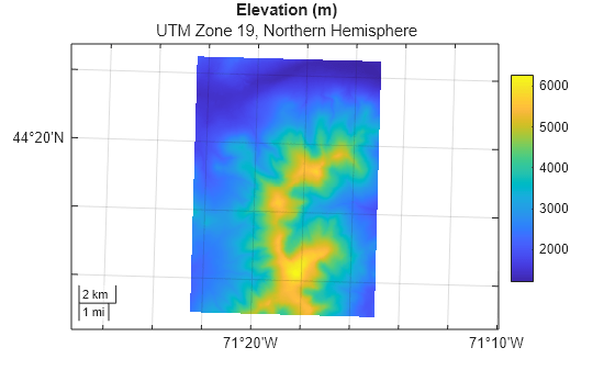
By default, the geopcolor function displays raster data using nearest-neighbor interpolation. To create a pseudocolor plot with a smoother appearance, use bilinear interpolation instead.
Read synthetic raster data into the workspace as a raster reference object and a matrix.
R = georefpostings([0 10],[0 10],1,1);
A = geopeaks(R);
Create a map axes that uses the default Equal Earth projection. Display the raster with bilinear interpolation by specifying the Interpolation argument as "bilinear".
figure
newmap
geopcolor(A,R,Interpolation="bilinear")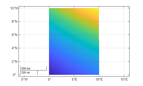
Create multiple maps in one figure by using a tiled chart layout.
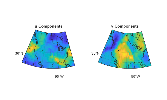
Load a subset of a MAT file containing data about air currents over North America. The matrices lat and lon represent position in latitude and longitude. The matrices u and v represent velocity components.
load("wind.mat","x","y","u","v")
lat = y(:,:,3);
lon = -x(:,:,3);
u = u(:,:,3);
v = v(:,:,3);
Create a raster reference object for the air currents by passing the latitude limits, the longitude limits, and the matrix size as input to the georefpostings function.
[latmin,latmax] = bounds(lat,"all");
latlim = [latmin,latmax];

[lonmin,lonmax] = bounds(lon,"all");
lonlim = [lonmin,lonmax];

sz = size(lat);

R = georefpostings(latlim,lonlim,sz,RowsStartFrom="east");
Create a 1-by-2 tiled chart layout by using the tiledlayout function.
figure
t = tiledlayout(1,2);
Prepare to create the maps. Create a projected CRS that uses the North America Albers Equal Area Conic projected CRS, which has the ESRI code 102008. Read a shapefile of world land areas into the workspace.
pcrs = projcrs(102008,Authority="ESRI");
land = readgeotable("landareas.shp");
Display the u-components in the left tile and the v-components in the right tile. For each tile in the layout:
Place a map axes in a new tile.
Display the velocity components.
Provide geographic context by displaying the land areas.
Add a title.
Apply a cartographic map layout.
% Left tile
nexttile
mx1 = newmap(pcrs);
geopcolor(mx1,u,R)
hold(mx1,"on")
geoplot(mx1,land,FaceColor="none",AffectAutoLimits="off")
title(mx1,"u-Components")
mx1.MapLayout="cartographic";

% Right tile
nexttile
mx2 = newmap(pcrs);
geopcolor(mx2,v,R)
hold(mx2,"on")
geoplot(mx2,land,FaceColor="none",AffectAutoLimits="off")
title(mx2,"v-Components")
mx2.MapLayout = "cartographic";
Read elevation data for Colorado [1] into the workspace as a matrix and a raster reference object.
[Z,R] = readgeoraster("n40_w106_3arc_v2.dt1");Geocode the placename Mount Julian, Colorado using the administrative level for physical features. The function represents the geocoded placename using a polygon.
GT = geocode("Mount Julian, Colorado","physical");
Display the elevation data in a geographic axes with no basemap. Prepare to change properties of the plot by returning the PseudocolorRaster object p. Then, display the polygon.
figure
geobasemap none
p = geopcolor(Z,R);
hold on
geoplot(GT)
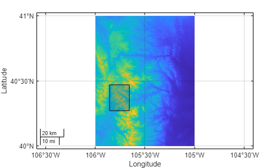
By default, MATLAB includes both the elevation data and the polygon in the automatic selection of the axes limits. Exclude the elevation data from the automatic selection of limits by setting the AffectAutoLimits property of the PseudocolorRaster object to "off".
p.AffectAutoLimits = "off";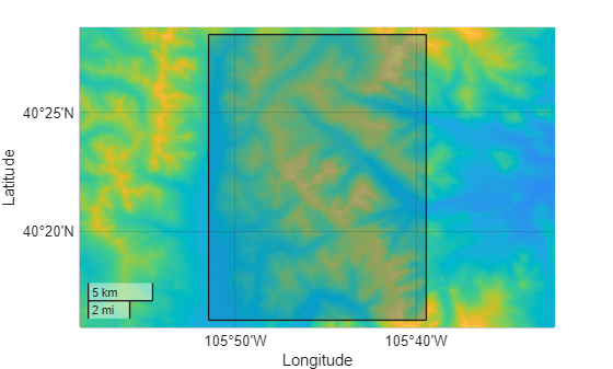
[1] The elevation data used in this example is from the US Geological Survey.
Input Arguments
Name-Value Arguments
Specify optional pairs of arguments as
Name1=Value1,...,NameN=ValueN, where Name is
the argument name and Value is the corresponding value.
Name-value arguments must appear after other arguments, but the order of the
pairs does not matter.
Example: geopcolor(A,R,AlphaData=0.5) creates a semitransparent
pseudocolor raster plot.
Note
Use name-value arguments to specify values for the properties of the
PseudocolorRaster object created by this function. The properties
listed here are only a subset. For a full list, see PseudocolorRaster Properties.
Transparency data, specified as one of these options:
A scalar — Use a consistent transparency across the entire pseudocolor raster plot.
A matrix — Each element of the matrix specifies the transparency for the corresponding element of the raster. The size of the matrix must match the size of
ColorData.
The interpretation of AlphaData depends on the data type:
If
AlphaDatais of typesingleordouble, then a value of0or less is completely transparent and a value of1or greater is opaque. Values between0and1are semitransparent.If
AlphaDatais an integer type, then the object uses the full range of data to determine the transparency. For example, ifAlphaDatais of typeint8, then-128is completely transparent and127is opaque. Values between-128and127are semitransparent.If
AlphaDatais of typelogical, then0is completely transparent and1is opaque.
Data Types: single | double | int8 | int16 | int32 | int64 | uint8 | uint16 | uint32 | uint64 | logical
Interpolation method for displaying the pseudocolor raster plot, specified as one of these options:
'nearest'— Nearest-neighbor interpolation. The value of a displayed raster element is the value of the closest raster element inColorData.'bilinear'— Bilinear interpolation. Use this method to create a pseudocolor raster plot with a smoother appearance. MATLAB® displays each raster element by calculating a weighted average of the surrounding raster elements.
The value of Interpolation does not affect the data stored in
ColorData or
AlphaData.
Include the pseudocolor raster plot in the automatic selection of the axes limits,
specified as "on"or "off", or as a logical
1 (true) or 0
(false). A value of "on" is equivalent to
true, and "off" is equivalent to
false. Thus, you can use the value of this property as a logical
value. The value is stored as an on/off logical value of type matlab.lang.OnOffSwitchState. The reference object associated with the
raster defines the location of the pseudocolor raster plot.
By default, the axes limits automatically change to include the data range for each
successive plot you create in the axes. Setting this property enables you to focus on
the range of a subset of data. To exclude the data range of a pseudocolor raster plot
from the automatic selection, set its AffectAutoLimits property to
"off".
Pseudocolor Plot with AffectAutoLimits Set to
"on"
| Pseudocolor Plot with AffectAutoLimits Set to
"off"
|
|---|---|
|
|
|
Output Arguments
More About
Tips
To display a raster image that specifies color using RGB triplets, use the
geoimagefunction instead.If your raster data is referenced to coordinate locations instead of a raster reference object, then you must convert the coordinates to a reference object before using the
geopcolorfunction. For information about converting coordinates into reference objects, see Reference Regularly Spaced Raster Data Using Coordinates.
Alternative Functionality
A pseudocolor raster plot is a type of heatmap. Other types of heatmaps that you can create on maps include:
Choropleth maps, which display the values of numeric attributes within polygons. For an example, see Create Choropleth Map from Table Data.
Density plots, which display the relative distribution of points in latitude and longitude coordinates. For an example, see Visualize Density Using Geographic Density Plots.
Binned scatter plots, which partition points into bins and display the number of points in each bin. For an example, see Create Binned Scatter Plot from Latitude and Longitude Data.
Version History
Introduced in R2026a
1 Alignment of boundaries and region labels are a presentation of the feature provided by the data vendors and do not imply endorsement by MathWorks®.