Thematic Maps
Most published and online maps fall into four categories:
Navigation maps, including topographic maps and nautical and aeronautical charts
Geophysical maps, that show the structure and dynamics of earth, oceans and atmosphere
Location maps, that depict the locations and names of physical features
Thematic maps, that portray attribute data about locations and features
Although online maps often combine these categories in new and unexpected ways, published maps and atlases tend to respect them.
Thematic maps tend to be more highly stylized than other types of maps and frequently omit locational information such as place names, physical features, coordinate grids, and map scales. This is because rather than showing physical features on the ground, such as shorelines, roads, settlements, topography, and vegetation, a thematic map displays quantified facts (a "theme"), such as statistics for a region or sets of regions. Examples include the locations of traffic accidents in a city, or election results by state. Thematic maps have a wide vocabulary of cartographic symbols, such as point symbols, dot distributions, "quiver" vectors, isolines, colored zones, raised prisms, and continuous 3-D surfaces.
Choropleth and Classification Maps
Choropleth and classification maps use colors or patterns to represent attributes associated with certain geographic regions.
Choropleth maps indicate the values of numeric attributes within spatial regions by using colors along a gradient. Choropleth maps are commonly used to illustrate population density within specified regions. For examples of how to create choropleth maps, see Create Choropleth Map of Population Density and Create Choropleth Map from Table Data.
Classification maps indicate the values of classified or categorical attributes within spatial regions by using discrete colors. Classification maps are commonly used to illustrate climate classes, land cover classes, and binned population density within specified regions. For an example of how to create a classification map, see Create Classification Map from Table Data.
Scatter and Bubble Maps
Scatter and bubble plots display symbols at specified point locations. If the symbols are small and inconspicuous and do not vary in size, the result is a dot-distribution map. If the symbols vary in size and/or shape according to a vector of attribute values, the result is a proportional symbol map.
You can create scatter and bubble plots in these ways:
Create scatter plots in map axes and geographic axes by using the
geoscatterfunction.Create scatter plots in
axesm-based maps by using thescattermfunction.Create bubble plots in map axes and geographic axes by using the
bubblechartfunction.Create a geographic bubble chart by using the
geobubblefunction.
Contour Maps
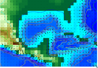
Contour and quiver plots can be useful in analyzing matrix data. This image shows contour elevation lines and quiver plots over a topographical map of the Gulf of Mexico. The quiver plots illustrate the gradient of the topographical matrix.

Create contour plots by using the contourm, contour3m, or contourfm function. Create 2-D or 3-D quiver plots over
axesm-based maps by using the quiverm or quiver3m function.
Stem Maps
Stem plots are 3-D geographic bar graphs portraying numeric attributes at point locations, usually on vector base maps. Below is an example of a stem plot over a map of the continental United States. The bars could represent anything from selected city populations to the number of units of a product purchased at each location.

You can create stem plots over axesm-based maps by using the
stem3m function.