图的绘制和自定义
此示例演示如何绘制图,然后自定义显示内容以向图节点和边添加标签或高亮显示。
图绘图对象
使用 plot 函数绘制 graph 和 digraph 对象。默认情况下,plot 会检查图的大小和类型,以确定要使用的布局。生成的图窗窗口不包含轴刻度线。但是,如果使用 XData、YData 或 ZData 名称-值对组指定节点的 (x,y) 坐标,图窗将包含轴刻度线。
节点数不超过 100 的图会自动包含节点标签。节点标签使用节点名称(如果可用);否则标签为数值节点索引。
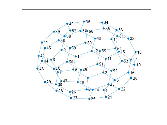
例如,使用巴基球邻接矩阵创建一个图,然后使用所有的默认选项绘制该图。如果您调用 plot 并指定输出参量,则此函数将返回 GraphPlot 对象的句柄。随后,您可以使用该对象调整绘图的属性。例如,可以更改边的颜色或样式、节点的大小和颜色等。
G = graph(bucky);
p = plot(G)
p =
  GraphPlot with properties:

     NodeColor: [0.0660 0.4430 0.7450]
    MarkerSize: 4
        Marker: 'o'
     EdgeColor: [0.0660 0.4430 0.7450]
     LineWidth: 0.5000
     LineStyle: '-'
     NodeLabel: {1×60 cell}
     EdgeLabel: {}
         XData: [0.1033 1.3374 2.2460 1.3509 0.0019 -1.0591 -2.2901 -2.8275 -1.9881 -0.8836 1.5240 0.4128 0.6749 1.9866 2.5705 3.3263 3.5310 3.9022 3.8191 3.5570 1.5481 2.6091 1.7355 0.4849 0.2159 -1.3293 -1.2235 -2.3934 -3.3302 -2.4370 … ] (1×60 double)
         YData: [-1.8039 -1.2709 -2.0484 -3.0776 -2.9916 -0.9642 -1.2170 0.0739 1.0849 0.3856 0.1564 0.9579 2.2450 2.1623 0.8879 -1.2600 0.0757 0.8580 -0.4702 -1.8545 -3.7775 -2.9634 -2.4820 -3.0334 -3.9854 -3.2572 -3.8936 -3.1331 … ] (1×60 double)
         ZData: [0 0 0 0 0 0 0 0 0 0 0 0 0 0 0 0 0 0 0 0 0 0 0 0 0 0 0 0 0 0 0 0 0 0 0 0 0 0 0 0 0 0 0 0 0 0 0 0 0 0 0 0 0 0 0 0 0 0 0 0]

  Show all properties
获得 GraphPlot 对象的句柄后,便可以使用点索引访问或更改属性值。有关您可以调整的属性的完整列表,请参阅GraphPlot 属性。
将 NodeColor 的值更改为 'red'。
p.NodeColor = 'red';
确定边的线宽。
p.LineWidth
ans =
0.5000
创建并绘制图
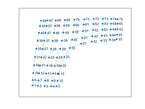
创建并绘制一个表示 L 形膜的图,L 形膜是基于一侧有 12 个节点的方形网格构建的。使用 plot 指定输出参量以返回 GraphPlot 对象的句柄。
n = 12;
A = delsq(numgrid('L',n));
G = graph(A,'omitselfloops')
G =
  graph with properties:

    Edges: [130×2 table]
    Nodes: [75×0 table]
p = plot(G)
p =
  GraphPlot with properties:

     NodeColor: [0.0660 0.4430 0.7450]
    MarkerSize: 4
        Marker: 'o'
     EdgeColor: [0.0660 0.4430 0.7450]
     LineWidth: 0.5000
     LineStyle: '-'
     NodeLabel: {1×75 cell}
     EdgeLabel: {}
         XData: [-2.5225 -2.1251 -1.6498 -1.1759 -0.7827 -2.5017 -2.0929 -1.6027 -1.1131 -0.7069 -2.4678 -2.0495 -1.5430 -1.0351 -0.6142 -2.4152 -1.9850 -1.4576 -0.9223 -0.4717 -2.3401 -1.8927 -1.3355 -0.7509 -0.2292 -2.2479 -1.7828 … ] (1×75 double)
         YData: [-3.5040 -3.5417 -3.5684 -3.5799 -3.5791 -3.0286 -3.0574 -3.0811 -3.0940 -3.0997 -2.4191 -2.4414 -2.4623 -2.4757 -2.4811 -1.7384 -1.7570 -1.7762 -1.7860 -1.7781 -1.0225 -1.0384 -1.0553 -1.0568 -1.0144 -0.2977 -0.3097 … ] (1×75 double)
         ZData: [0 0 0 0 0 0 0 0 0 0 0 0 0 0 0 0 0 0 0 0 0 0 0 0 0 0 0 0 0 0 0 0 0 0 0 0 0 0 0 0 0 0 0 0 0 0 0 0 0 0 0 0 0 0 0 0 0 0 0 0 0 0 0 0 0 0 0 0 0 0 0 0 0 0 0]

  Show all properties
更改图节点的布局
使用 layout 函数更改绘图中的图节点的布局。不同的布局选项会自动计算绘图的节点坐标。或者,可以使用 GraphPlot 对象的 XData、YData 和 ZData 属性来指定您自己的节点坐标。
不使用默认的二维布局方法,而是使用 layout 来指定 'force3' 布局(三维力导向图布局)。
layout(p,'force3')
view(3)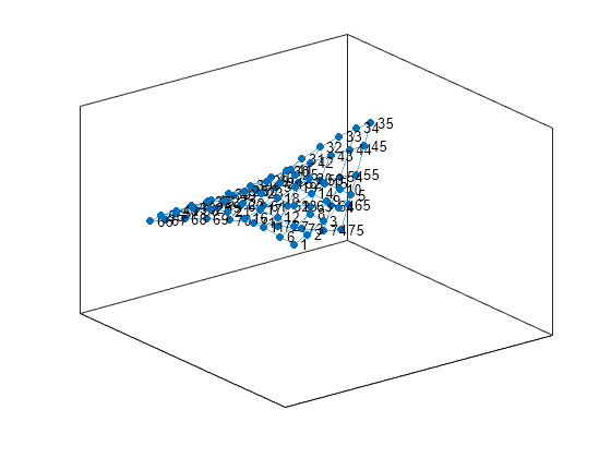
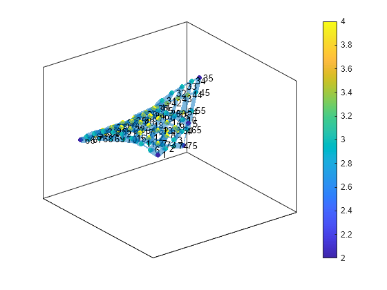
按比例对节点着色
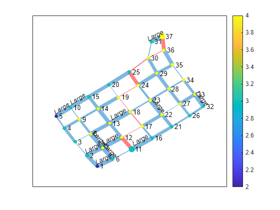
根据图节点的出入度为它们着色。在该图中,所有内部节点都具有最大度数 4,沿图边的节点的度数为 3,角节点具有最小度数 2。将该节点着色数据存储为 G.Nodes 中的变量 NodeColors。
G.Nodes.NodeColors = degree(G);
p.NodeCData = G.Nodes.NodeColors;
colorbar

按权重列出的边线宽度
向图边添加一些随机整数权重,然后绘制这些边,使它们的线宽与权重成比例。由于约大于 7 的边线宽度开始变得很复杂,因此缩放线宽,使权重最大的边的线宽为 7。将该边宽数据存储为 G.Edges 中的变量 LWidths。
G.Edges.Weight = randi([10 250],130,1);
G.Edges.LWidths = 7*G.Edges.Weight/max(G.Edges.Weight);
p.LineWidth = G.Edges.LWidths;
提取子图
提取 G 的右上角并将其作为子图绘制,以更便于读取图上的详细信息。新图 H 从 G 继承 NodeColors 和 LWidths 变量,因此最直接的方式就是重新创建之前的绘图自定义项。但是,系统会对 H 中的节点重新进行编号,以将图中的新节点编号考虑在内。
H = subgraph(G,[1:31 36:41]);
p1 = plot(H,'NodeCData',H.Nodes.NodeColors,'LineWidth',H.Edges.LWidths);
colorbar

为节点和边添加标签
使用 labeledge 对宽度大于 6 的边添加标签 'Large'。labelnode 函数以相似的方式为节点添加标签。
labeledge(p1,find(H.Edges.LWidths > 6),'Large')
突出显示最短路径
查找子图 H 中节点 11 与节点 37 之间的最短路径。以红色高亮显示沿此路径的边,并增大路径的结束节点的大小。
path = shortestpath(H,11,37)
path = 1×10

    11    12    17    18    19    24    25    30    36    37
highlight(p1,[11 37])
highlight(p1,path,'EdgeColor','r')
删除节点标签和颜色栏,并使所有节点都变成黑色。
p1.NodeLabel = {};
colorbar off
p1.NodeColor = 'black';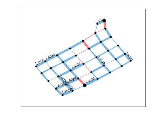
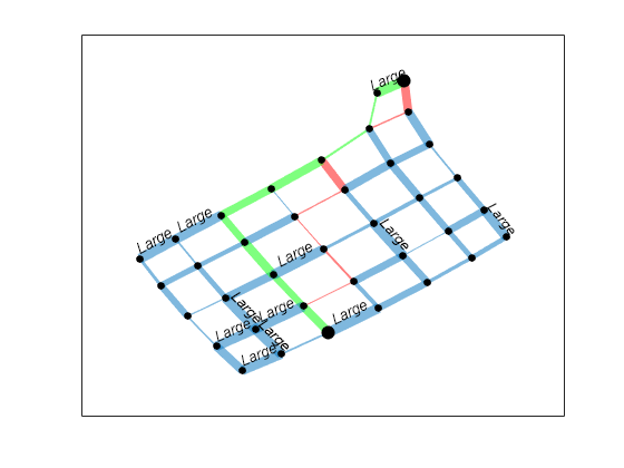
查找忽略边权重的其他最短路径。以绿色突出显示此路径。
path2 = shortestpath(H,11,37,'Method','unweighted')
path2 = 1×10

    11    12    13    14    15    20    25    30    31    37
highlight(p1,path2,'EdgeColor','g')
绘制大图
创建包含数十万个甚至数百万个节点和/或边的图是很常见的。为此,plot 处理大图会略有不同,以保持可读性和性能。处理节点超过 100 个的图时,plot 函数会进行以下调整:
默认的图布局方法始终为
'subspace'。不会再自动为这些节点添加标签。
MarkerSize属性设置为2。(较小的图的标记大小为4)。有向图的
ArrowSize属性设置为4。(较小的有向图使用的箭头大小为7)。
另请参阅
graph | digraph | plot | layoutcoords | GraphPlot