Main Content

normplot

Normal probability plot

Description

normplot(x) creates a normal probability plot comparing the distribution of the data in x to the normal distribution.

normplot plots each data point in x using plus sign ('+') markers and draws two reference lines that represent the theoretical distribution. A solid reference line connects the first and third quartiles of the data, and a dashed reference line extends the solid line to the ends of the data. If the sample data has a normal distribution, then the data points appear along the reference line. A distribution other than normal introduces curvature in the data plot.

example

normplot(ax,x) adds a normal probability plot into the axes specified by ax.

h = normplot(___) returns graphics handles corresponding to the plotted lines, using any of the previous syntaxes.

example

Examples

collapse all

Generate random sample data from a normal distribution with mu = 10 and sigma = 1.

rng default;  % For reproducibility
x = normrnd(10,1,25,1);

Create a normal probability plot of the sample data.

figure;
normplot(x)

Figure contains an axes object. The axes object with title Normal Probability Plot, xlabel Data, ylabel Probability contains 3 objects of type line. One or more of the lines displays its values using only markers

The plot indicates that the data follows a normal distribution.

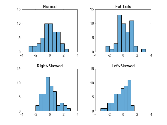
Generate 50 random numbers from each of four different distributions: A standard normal distribution; a Student's-t distribution with five degrees of freedom (a "fat-tailed" distribution); a set of Pearson random numbers with mu equal to 0, sigma equal to 1, skewness equal to 0.5, and kurtosis equal to 3 (a "right-skewed" distribution); and a set of Pearson random numbers with mu equal to 0, sigma equal to 1, skewness equal to -0.5, and kurtosis equal to 3 (a "left-skewed" distribution).

rng(11)  % For reproducibility
x1 = normrnd(0,1,[50,1]);
x2 = trnd(5,[50,1]);
x3 = pearsrnd(0,1,0.5,3,[50,1]);
x4 = pearsrnd(0,1,-0.5,3,[50,1]);

Plot four histograms on the same figure for a visual comparison of the pdf of each distribution.

figure
subplot(2,2,1)
histogram(x1,10)
title('Normal')
axis([-4,4,0,15])

subplot(2,2,2)
histogram(x2,10)
title('Fat Tails')
axis([-4,4,0,15])

subplot(2,2,3)
histogram(x3,10)
title('Right-Skewed')
axis([-4,4,0,15])

subplot(2,2,4)
histogram(x4,10)
title('Left-Skewed')
axis([-4,4,0,15])

Figure contains 4 axes objects. Axes object 1 with title Normal contains an object of type histogram. Axes object 2 with title Fat Tails contains an object of type histogram. Axes object 3 with title Right-Skewed contains an object of type histogram. Axes object 4 with title Left-Skewed contains an object of type histogram.

The histograms show how each sample differs from the normal distribution.

Create a normal probability plot for each sample.

figure
subplot(2,2,1)
normplot(x1)
title('Normal')

subplot(2,2,2)
normplot(x2)
title('Fat Tails')

subplot(2,2,3)
normplot(x3)
title('Right-Skewed')

subplot(2,2,4)
normplot(x4)
title('Left-Skewed')

Figure contains 4 axes objects. Axes object 1 with title Normal, xlabel Data, ylabel Probability contains 3 objects of type line. One or more of the lines displays its values using only markers Axes object 2 with title Fat Tails, xlabel Data, ylabel Probability contains 3 objects of type line. One or more of the lines displays its values using only markers Axes object 3 with title Right-Skewed, xlabel Data, ylabel Probability contains 3 objects of type line. One or more of the lines displays its values using only markers Axes object 4 with title Left-Skewed, xlabel Data, ylabel Probability contains 3 objects of type line. One or more of the lines displays its values using only markers

Create a 50-by-2 matrix containing 50 random numbers from each of two different distributions: A standard normal distribution in column 1, and a set of Pearson random numbers with mu equal to 0, sigma equal to 1, skewness equal to 0.5, and kurtosis equal to 3 (a "right-skewed" distribution) in column 2.

rng default  % For reproducibility
x = [normrnd(0,1,[50,1]) pearsrnd(0,1,0.5,3,[50,1])];

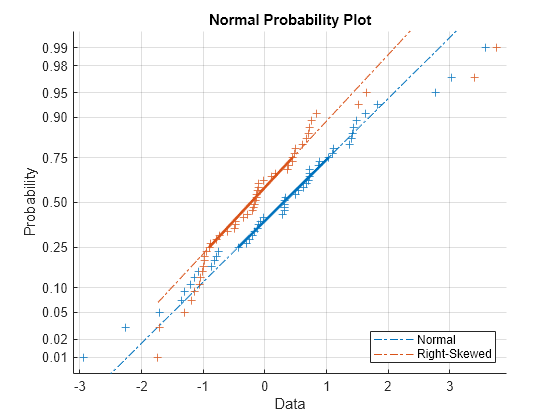
Create a normal probability plot for both samples on the same figure. Return the plot line graphic handles.

figure
h = normplot(x)
h = 
  6x1 Line array:

  Line    (Data)
  Line    (Data)
  Line    (Reference Mid)
  Line    (Reference Mid)
  Line    (Reference Ends)
  Line    (Reference Ends)

legend({'Normal','Right-Skewed'},'Location','southeast')

Figure contains an axes object. The axes object with title Normal Probability Plot, xlabel Data, ylabel Probability contains 6 objects of type line. One or more of the lines displays its values using only markers These objects represent Normal, Right-Skewed.

The handles h(1) and h(2) correspond to the data points for the normal and skewed distributions, respectively. The handles h(3) and h(4) correspond to the second and third quartile line fit to the sample data. The handles h(5) and h(6) correspond to the extrapolated line that extends to the minimum and maximum of each set of sample data.

To illustrate, increase the line width of the second and third quartile line for the normally distributed data sample (represented by h(3)) to 2.

h(3).LineWidth = 2;
h(4).LineWidth = 2;

Figure contains an axes object. The axes object with title Normal Probability Plot, xlabel Data, ylabel Probability contains 6 objects of type line. One or more of the lines displays its values using only markers These objects represent Normal, Right-Skewed.

Input Arguments

collapse all

Sample data, specified as a numeric vector or numeric matrix. normplot displays each value in x using the symbol '+'. If x is a matrix, then normplot displays a separate line for each column of x.

Data Types: single | double

Target axes, specified as an Axes object or a UIAxes object. normplot adds an additional plot into the axes specified by ax. For details, see Axes Properties and UIAxes Properties.

Use gca to return the current axes for the current figure.

Output Arguments

collapse all

Graphics handles for line objects, returned as a vector of Line graphics handles. Graphics handles are unique identifiers that you can use to query and modify the properties of a specific line on the plot. For each column of x, normplot returns three handles:

  • The line representing the data points. normplot represents each data point in x using plus sign ('+') markers.

  • The line joining the first and third quartiles of each column of x, represented as a solid line.

  • The extrapolation of the quartile line, extended to the minimum and maximum values of x, represented as a dashed line.

To view and set properties of line objects, use dot notation. For information on using dot notation, see Access Property Values. For information on the Line properties that you can set, see Line Properties.

Algorithms

normplot matches the quantiles of sample data to the quantiles of a normal distribution. The sample data is sorted and plotted on the x-axis. The y-axis represents the quantiles of the normal distribution, converted into probability values. Therefore, the y-axis scaling is not linear.

Where the x-axis value is the ith sorted value from a sample of size N, the y-axis value is the midpoint between evaluation points of the empirical cumulative distribution function of the data. The midpoint is equal to (i0.5)N.

normplot superimposes a reference line to assess the linearity of the plot. The line goes through the first and third quartiles of the data.

Alternative Functionality

You can use the probplot function to create a probability plot. The probplot function enables you to indicate censored data and specify the distribution for a probability plot.

Version History

Introduced before R2006a