swarmchart
Description
swarmchart( creates a swarm chart,
or scatter plot with jittered (offset) points, for each predictor in
explainer)explainer.BlackboxModel.PredictorNames, where
explainer is a shapley object. For
each predictor, the function displays the Shapley values for the query points in
explainer.QueryPoints. The corresponding swarm chart shows the
distribution of the Shapley values.
If explainer.BlackboxModel is a classification model, the function
displays swarm charts for class explainer.BlackboxModel.ClassNames(1) by
default.
swarmchart(
specifies additional options using one or more name-value arguments. For example, specify
explainer,Name=Value)NumImportantPredictors=5 to create swarm charts for the five predictors
with the greatest mean absolute Shapley values
(explainer.MeanAbsoluteShapley).
swarmchart( displays the
swarm charts in the target axes ax,___)ax. Specify ax as
the first argument in any of the previous syntaxes.
s = swarmchart(___)Scatter objects. Use s to query or modify the
properties (Scatter Properties) of an object after you
create it.
Examples
Train a classification model and create a shapley object. Then visualize the Shapley values for multiple query points by using the swarmchart object function.
Load the CreditRating_Historical data set. The data set contains customer IDs and their financial ratios, industry labels, and credit ratings.
tbl = readtable("CreditRating_Historical.dat");Display the first three rows of the table.
head(tbl,3)
     ID      WC_TA    RE_TA    EBIT_TA    MVE_BVTD    S_TA     Industry    Rating
    _____    _____    _____    _______    ________    _____    ________    ______

    62394    0.013    0.104     0.036      0.447      0.142       3        {'BB'}
    48608    0.232    0.335     0.062      1.969      0.281       8        {'A' }
    42444    0.311    0.367     0.074      1.935      0.366       1        {'A' }
Train a blackbox model of credit ratings by using the fitcecoc function. Use the variables from the second through seventh columns in tbl as the predictor variables. A recommended practice is to specify the class names to set the order of the classes.
blackbox = fitcecoc(tbl,"Rating", ...
    PredictorNames=tbl.Properties.VariableNames(2:7), ...
    CategoricalPredictors="Industry", ...
    ClassNames={'AAA','AA','A','BBB','BB','B','CCC'});
Create a shapley object that explains the predictions for multiple query points. For faster computation, shapley subsamples 100 observations from the predictor data in blackbox to compute the Shapley values. Specify the sampled observations as the query points in the call to the fit object function.
rng("default") % For reproducibility
explainer = shapley(blackbox);
queryPoints = explainer.X(explainer.SampledObservationIndices,:);
explainer = fit(explainer,queryPoints);
Visualize the Shapley values by using the swarmchart object function.
swarmchart(explainer)

By default, the function shows the Shapley values for the first class, AAA. For each predictor, the function displays the Shapley values for the query points. The corresponding swarm chart shows the distribution of the Shapley values. The function determines the order of the predictors by using the mean absolute Shapley values.
For class AAA, the Shapley values for the RE_TA predictor seem to follow the trend of the predictor values. That is, query points with lower RE_TA values seem to have lower RE_TA Shapley values. Similarly, query points with higher RE_TA values seem to have higher RE_TA Shapley values. You can use data tips to see the query point predictor values.
Train a regression model and create a shapley object. Use the object function fit to compute the Shapley values for the specified query points. Then plot the Shapley values for multiple query points by using the swarmchart object function.
Load the carbig data set, which contains measurements of cars made in the 1970s and early 1980s.
load carbigCreate a table containing the predictor variables Acceleration, Cylinders, and so on, as well as the response variable MPG.
tbl = table(Acceleration,Cylinders,Displacement, ...
    Horsepower,Model_Year,Weight,MPG);
Removing missing values in a training set helps to reduce memory consumption and speed up training for the fitrkernel function. Remove missing values in tbl.
tbl = rmmissing(tbl);
Train a blackbox model of MPG by using the fitrkernel function. Specify the Cylinders and Model_Year variables as categorical predictors. Standardize the remaining predictors.
rng("default") % For reproducibility
mdl = fitrkernel(tbl,"MPG",CategoricalPredictors=[2 5], ...
    Standardize=true);
Create a shapley object. Because mdl does not contain training data, specify the data set tbl.
explainer = shapley(mdl,tbl)
explainer =
            BlackboxModel: [1×1 RegressionKernel]
              QueryPoints: []
           BlackboxFitted: []
                  Shapley: []
                        X: [392×7 table]
    CategoricalPredictors: [2 5]
                   Method: "interventional-kernel"
                Intercept: 23.2474
               NumSubsets: 64
explainer stores the training data tbl in the X property. By default, shapley subsamples 100 observations from the data in X, and stores their indices in the SampledObservationIndices property.
Compute the Shapley values for all observations in tbl. To speed up computations, the fit object function uses the sampled observations instead of all of X to compute the Shapley values. If you have a Parallel Computing Toolbox™ license, you can further reduce computational time by setting the UseParallel name-value argument.
explainer = fit(explainer,tbl,UseParallel=true);
For a regression model, fit computes Shapley values using the predicted response, and stores them in the Shapley property of the shapley object. Because explainer contains Shapley values for multiple query points, display the mean absolute Shapley values instead.
explainer.MeanAbsoluteShapley
ans=6×2 table
      Predictor        Value
    ______________    _______

    "Acceleration"     0.5678
    "Cylinders"       0.96799
    "Displacement"    0.79668
    "Horsepower"      0.78681
    "Model_Year"      0.86258
    "Weight"            0.987
For each predictor, the mean absolute Shapley value is the absolute value of the Shapley values, averaged across all query points. The Cylinders predictor has the greatest mean absolute Shapley value, and the Acceleration predictor has the smallest mean absolute Shapley value.
Visualize the Shapley values by using the swarmchart object function. Specify to use the "copper" colormap.
swarmchart(explainer,ColorMap="copper")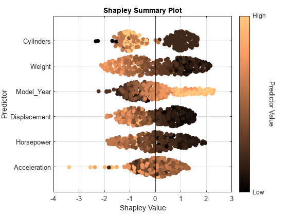
For each predictor, the function displays the Shapley values for the query points. The corresponding swarm chart shows the distribution of the Shapley values. The function determines the order of the predictors by using the mean absolute Shapley values.
Query points with low Weight values seem to have large positive Shapley values. That is, for these query points, the Weight predictor contributes to an increase in the MPG predicted value from the average. Similarly, query points with high Weight values seem to have large negative Shapley values. That is, for these query points, the Weight predictor contributes to a decrease in the MPG predicted value from the average. These results match the idea that car weights are inversely correlated with MPG values.
Input Arguments
Name-Value Arguments
More About
Tips
Use
swarmchartwhenexplainercontains Shapley values for many query points.