Main Content

plotEffects

Plot main effects of predictors in linear regression model

Description

plotEffects(mdl) creates an effects plot of the predictors in the linear regression model mdl. An effects plot shows the estimated main effect on the response from changing each predictor value, averaging out the effects of the other predictors. A horizontal line through an effect value indicates the 95% confidence interval for the effect value.

example

plotEffects(ax,mdl) plots into the axes specified by ax instead of the current axes (gca). Alternatively, you can specify Parent=ax as the last input argument. (since R2024a)

h = plotEffects(___) returns line objects using any of the input argument combinations in the previous syntaxes. Use h to modify the properties of a specific line after you create the plot. For a list of properties, see Line Properties.

Examples

collapse all

Load the carsmall data set and fit a linear regression model of the mileage as a function of model year, weight, and weight squared.

load carsmall
tbl = table(MPG,Weight);
tbl.Year = categorical(Model_Year);
mdl = fitlm(tbl,'MPG ~ Year + Weight^2');

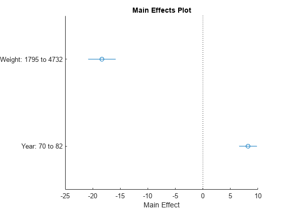
Create an effects plot.

plotEffects(mdl)

Figure contains an axes object. The axes object with title Main Effects Plot, xlabel Main Effect contains 4 objects of type line. One or more of the lines displays its values using only markers

The length of each horizontal line in the figure shows a 95% confidence interval for the effect on the response of the change shown for each predictor. For example, the estimated effect of changing Year from 70 to 82 is an increase of about 8, and is between 6 and 10 with 95% confidence.

Input Arguments

collapse all

Linear regression model object, specified as a LinearModel object created by using fitlm or stepwiselm, or a CompactLinearModel object created by using compact.

Since R2024a

Target axes, specified as an Axes object. If you do not specify the axes, then plotEffects uses the current axes (gca).

Output Arguments

collapse all

Line objects, returned as a vector. h(1) corresponds to the circles that represent the effect estimates, and h(j+1) corresponds to the 95% confidence interval for the effect of predictor j. Use dot notation to query and set properties of line objects. For details, see Line Properties.

More About

collapse all

Main Effect

An effect, or main effect, of a predictor represents an effect of one predictor on the response from changing the predictor value while averaging out the effects of the other predictors.

For a predictor variable xs, the effect is defined by

g(xsi) – g(xsj) ,

where g is an Adjusted Response function. The plotEffects function chooses the observations i and j as follows. For a categorical variable that is not ordinal, xsi and xsj are the predictor values that produce the maximum and minimum adjusted responses, respectively, so that the effect value is always positive. For a numeric variable or an ordinal categorical variable, the function chooses two predictor values that produce the minimum and maximum adjusted responses where xsi < xsj.

plotEffects plots the effect value and the 95% confidence interval of the effect value for each predictor variable.

Adjusted Response

An adjusted response function describes the relationship between the fitted response and a single predictor, with the other predictors averaged out by averaging the fitted values over the data used in the fit.

A regression model for the predictor variables (x1, x2, …, xp) and the response variable y has the form

yi = f(x1i, x2i, …, xpi) + ri,

where f is a fitted regression function and r is a residual. The subscript i represents the observation number.

The adjusted response function for the first predictor variable x1, for example, is defined as

g(x1)=1ni=1nf(x1,x2i,x3i,...,xpi),

where n is the number of observations. The adjusted response data value is the sum of the adjusted fitted value and the residual for each observation.

y˜i=g(x1i)+ri.

plotAdjustedResponse plots the adjusted response function and the adjusted response data values for a selected predictor variable.

Tips

  • The data cursor displays the values of the selected plot point in a data tip (small text box located next to the data point). The data tip includes the x-axis and y-axis values for the selected point. Use the x-axis values to view an estimated effect value and its confidence bounds.

Alternative Functionality

  • A LinearModel object provides multiple plotting functions.

    • When creating a model, use plotAdded to understand the effect of adding or removing a predictor variable.

    • When verifying a model, use plotDiagnostics to find questionable data and to understand the effect of each observation. Also, use plotResiduals to analyze the residuals of the model.

    • After fitting a model, use plotAdjustedResponse, plotPartialDependence, and plotEffects to understand the effect of a particular predictor. Use plotInteraction to understand the interaction effect between two predictors. Also, use plotSlice to plot slices through the prediction surface.
Extended Capabilities

Version History

Introduced in R2012a

expand all