Add Components to the GUIDE Layout Area
Note
The GUIDE environment will be removed in a future release. After GUIDE is removed, existing GUIDE apps will continue to run in MATLAB® but they will not be editable in GUIDE.
To continue editing an existing GUIDE app, see GUIDE Migration Strategies for information on how to help maintain compatibility of the app with future MATLAB releases. To create new apps interactively, Develop Apps Using App Designer instead.
Place Components
The component palette at the left side of the Layout Editor contains the components that you can add to your UI.
To place components in the GUIDE layout area and give each component a unique identifier, follow these steps:
Display component names on the palette.
On the MATLAB Home tab, in the Environment section, click Preferences.
In the Preferences dialog box, click GUIDE.
Select Show Names in Component Palette, and then click OK.
Place components in the layout area according to your design.
Drag a component from the palette and drop it in the layout area.
Click a component in the palette and move the cursor over the layout area. The cursor changes to a cross. Click again to add the component in its default size, or click and drag to size the component as you add it.
Once you have defined a UI component in the layout area, selecting it automatically shows it in the Property Inspector. If the Property Inspector is not open or is not visible, double-clicking a component raises the inspector and focuses it on that component.
The components listed in the following table have additional considerations; read more about them in the sections described there.
If You Are Adding... Then... Panels or button groups See Add a Component to a Panel or Button Group. Menus See Create Menus for GUIDE Apps Assign a unique identifier to each component. Do this by setting the value of the component
Tagproperties. See Assign an Identifier to Each Component for more information.Specify the look and feel of each component by setting the appropriate properties. The following topics contain specific information.
This is an example of a UI in the Layout Editor. Components in the Layout Editor are not active.
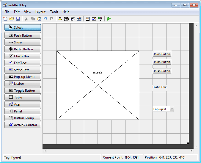
Use Coordinates to Place Components
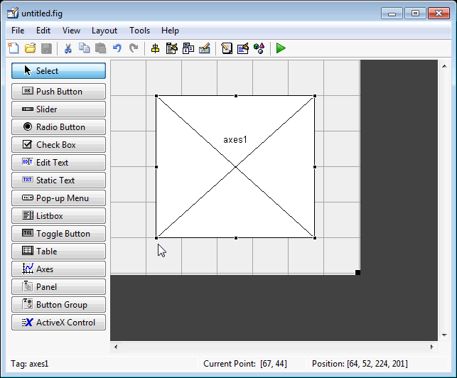
The status bar at the bottom of the GUIDE Layout Editor displays:
Current Point — The current location of the mouse relative to the lower left corner of the grid area in the Layout Editor.
Position — The
Positionproperty of the selected component is a vector: [distance from left, distance from bottom, width, height], where distances are relative to the parent figure, panel, or button group.
Here is how to interpret the coordinates in the status bar and rulers:
The Position values updates as you move and resize components. The first two elements in the vector change as you move the component. The last two elements of the vector change as the height and width of the component change.
When no components are selected, the Position value displays the location and size of the figure.
Add a Component to a Panel or Button Group
To add a component to a panel or button group, select the component in the component palette then move the cursor over the desired panel or button group. The position of the cursor determines the component's parent.
GUIDE highlights the potential parent as shown in the following figure. The highlight indicates that if you drop the component or click the cursor, the component will be a child of the highlighted panel, button group, or figure.

Assign a unique identifier to each component in your panel or
button group by setting the value of its
Tag property. See Assign an Identifier to Each Component
for more information.
Include Existing Components in Panels and Button Groups. When you add a new component or drag an existing component to a panel or button group, it will become a member, or child, of the panel or button group automatically, whether fully or partially enclosed by it. However, if the component is not entirely contained in the panel or button group, it appears to be clipped in the Layout Editor and in the running app.
You can add a new panel or button group to a UI in order to group any of its existing controls. In order to include such controls in a new panel or button group, do the following. The instructions refer to panels, but you do the same for components inside button groups.
Select the New Panel or New Button Group tool and drag out a rectangle to have the size and position you want.
The panel will not obscure any controls within its boundary unless they are axes, tables, or other panels or button groups. Only overlap panels you want to nest, and then make sure the overlap is complete.
You can use Send Backward or Send to Back on the Layout menu to layer the new panel behind components you do not want it to obscure, if your layout has this problem. As you add components to it or drag components into it, the panel will automatically layer itself behind them.
Now is a good time to set the panel's
TagandStringproperties to whatever you want them to be, using the Property Inspector.Open the Object Browser from the View menu and find the panel you just added. Use this tool to verify that it contains all the controls you intend it to group together. If any are missing, perform the following steps.
Drag controls that you want to include but don't fit within the panel inside it to positions you want them to have. Also, slightly move controls that are already in their correct positions to group them with the panel.
The panel highlights when you move a control, indicating it now contains the control. The Object Browser updates to confirm the relationship. If you now move the panel, its child controls move with it.
Tip
You need to move controls with the mouse to register them with the surrounding panel or button group, even if only by a pixel or two. Selecting them and using arrow keys to move them does not accomplish this. Use the Object Browser to verify that controls are properly nested.
See Panels and Button Groups for more information on how to incorporate panels and button groups into a UI.
Assign an Identifier to Each Component
Use the Tag property to assign a unique
and meaningful identifier to your components.
When you place a component in the layout area, GUIDE assigns a
default value to the Tag property. Before
saving the UI, replace this value with a name or
abbreviation that reflects the role of the component in the
UI.
The name you assign is used by code to identify the component
and must be unique in the UI. To set the
Tag property:
Select View > Property Inspector or click the Property Inspector button
 .
.In the layout area, select the component for which you want to set
Tag.In the Property Inspector, select
Tagand then replace the value with the name you want to use as the identifier. In the following figure,Tagis set topushbutton1.
User Interface Controls
User interface controls include push buttons, toggle buttons, sliders, radio buttons, edit text controls, static text controls, pop-up menus, check boxes, and list boxes.
To define user interface controls, you must set certain properties. To do this:
Use the Property Inspector to modify the appropriate properties. Open the Property Inspector by selecting View > Property Inspector or by clicking the Property Inspector button
 .
. In the layout area, select the component you are defining.
Subsequent topics describe commonly used properties of user interface controls and offer a simple example for each kind of control:
Commonly Used Properties
The most commonly used properties needed to describe a user interface control are shown in the following table. Instructions for a particular control may also list properties that are specific to that control.
| Property | Value | Description |
|---|---|---|
Enable | on,
inactive,
off. Default is
on. | Determines whether the control is available to the user |
Max | Scalar. Default is 1. | Maximum value. Interpretation depends on the type of component. |
Min | Scalar. Default is 0. | Minimum value. Interpretation depends on the type of component. |
Position | 4-element vector: [distance from left, distance from bottom, width, height]. | Size of the component and its location relative to its parent. |
String | Character vector (for example,
'button1'). Can an also be a
character array or a cell array of character
vectors. | Component label. For list boxes and pop-up menus it is a list of the items. |
Units | characters,
centimeters,
inches,
normalized,
pixels,
points. Default is
characters. | Units of measurement used to interpret the
Position property
vector |
Value | Scalar or vector | Value of the component. Interpretation depends on the type of component. |
For a complete list of properties and for more information about the properties listed in the table, see UIControl Properties.
Push Button
To create a push button with label Button 1, as shown in this figure:
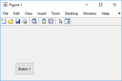
Specify the push button label by setting the
Stringproperty to the desired label, in this case,Button 1.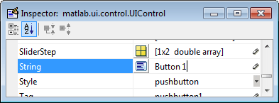
To display the & character in a label, use two
&characters. The wordsremove,default, andfactory(case sensitive) are reserved. To use one of these as a label, prepend a backslash character (\). For example,\removeyields remove.The push button accommodates only a single line of text. If you specify more than one line, only the first line is shown. If you create a push button that is too narrow to accommodate the specified
Stringproperty value, MATLAB truncates the value with an ellipsis.
If you want to set the position or size of the component to an exact value, then modify its
Positionproperty.To add an image to a push button, assign the button's
CDataproperty as an m-by-n-by-3 array of RGB values that defines a truecolor image. You must do this programmatically in the opening function of the code file. For example, the arrayimgdefines a 16-by-64-by-3 truecolor image using random values between 0 and 1 (generated byrand).img = rand(16,64,3); set(handles.pushbutton1,'CData',img);
where
pushbutton1is the push button'sTagproperty.
See
ind2rgbfor information on converting a matrixXand corresponding colormap, i.e., an(X, MAP)image, to RGB (truecolor) format.
Slider
To create a slider as shown in this figure:
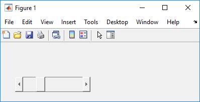
Specify the range of the slider by setting its
Minproperty to the minimum value of the slider and itsMaxproperty to the maximum value. TheMinproperty must be less thanMax.Specify the value indicated by the slider when it is created by setting the
Valueproperty to the appropriate number. This number must be less than or equal toMaxand greater than or equal toMin. If you specifyValueoutside the specified range, the slider is not displayed.The slider
Valuechanges by a small amount when a user clicks the arrow button, and changes by a larger amount when the user clicks the trough (also called the channel). Control how the slider responds to these actions by setting theSliderStepproperty. SpecifySliderStepas a two-element vector,[minor_step major_step], whereminor_stepis less than or equal tomajor_step. Because specifying very small values can cause unpredictable slider behavior, make bothminor_stepandmajor_stepgreater than1e-6. Setmajor_stepto the proportion of the range that clicking the trough moves the slider thumb. Setting it to1or higher causes the thumb to move toMaxorMinwhen the trough is clicked.As
major_stepincreases, the thumb grows longer. Whenmajor_stepis 1, the thumb is half as long as the trough. Whenmajor_stepis greater than 1, the thumb continues to grow, slowly approaching the full length of the trough. When a slider serves as a scroll bar, you can uses this behavior to indicate how much of the document is currently visible by changing the value ofmajor_step.
If you want to set the location or size of the component to an exact value, then modify its
Positionproperty.The slider component provides no text description or data entry capability. Use a Static Text component to label the slider. Use an Edit Text component to enable a user to input a value to apply to the slider.
On Mac platforms, the height of a horizontal slider is constrained. If the height you set in the position vector exceeds this constraint, the displayed height of the slider is the maximum allowed. The height element of the position vector is not changed.
Radio Button
To create a radio button with label Indent nested functions, as shown in this figure:

Specify the radio button label by setting the
Stringproperty to the desired label, in this case,Indent nested functions.
To display the & character in a label, use two
&characters. The wordsremove,default, andfactory(case sensitive) are reserved. To use one of these as a label, prepend a backslash character (\). For example,\removeyields remove.The radio button accommodates only a single line of text. If you specify more than one line, only the first line is shown. If you create a radio button that is too narrow to accommodate the specified
Stringproperty value, MATLAB software truncates the value with an ellipsis.
Create the radio button with the button selected by setting its
Valueproperty to the value of itsMaxproperty (default is1). SetValuetoMin(default is0) to leave the radio button unselected. Correspondingly, when the user selects the radio button, the software setsValuetoMax, and toMinwhen the user clears it.If you want to set the position or size of the component to an exact value, then modify its
Positionproperty.To add an image to a radio button, assign the button's
CDataproperty an m-by-n-by-3 array of RGB values that defines a truecolor image. You must do this programmatically in the opening function of the code file. For example, the arrayimgdefines a 16-by-24-by-3 truecolor image using random values between 0 and 1 (generated byrand).img = rand(16,24,3); set(handles.radiobutton1,'CData',img);
To manage exclusive selection of radio buttons and toggle buttons, put them in a button group. See Button Group for more information.
Check Box
To create a check box with label Display file extension that is initially checked, as shown in this figure:

Specify the check box label by setting the
Stringproperty to the desired label, in this case,Display file extension.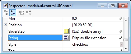
To display the & character in a label, use two
&characters. The wordsremove,default, andfactory(case sensitive) are reserved. To use one of these as a label, prepend a backslash character (\). For example,\removeyields remove.The check box accommodates only a single line of text. If you specify a component width that is too small to accommodate the specified
Stringproperty value, MATLAB software truncates the value with an ellipsis.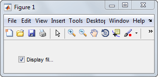
Create the check box with the box checked by setting the
Valueproperty to the value of theMaxproperty (default is1). SetValuetoMin(default is0) to leave the box unchecked. Correspondingly, when the user clicks the check box, the software setsValuetoMaxwhen the user checks the box and toMinwhen the user clears it.If you want to set the position or size of the component to an exact value, then modify its
Positionproperty.
Edit Text
To create an edit text component that displays the initial text Enter your name here, as shown in this figure:

Specify the text to be displayed when the edit text component is created by setting the
Stringproperty to the desired value, in this case,Enter your name here.
To display the & character in a label, use two
&characters. The wordsremove,default, andfactory(case sensitive) are reserved. To use one of these as a label, prepend a backslash character (\). For example,\removeyields remove.To enable multiple-line input, specify the
MaxandMinproperties so that their difference is greater than1. For example,Max = 2,Min = 0.Maxdefault is1,Mindefault is0. MATLAB software wraps the displayed text and adds a scroll bar if necessary. On all platforms, when the user enters a multiline text box via the Tab key, the editing cursor is placed at its previous location and no text highlights.
If
Max-Minis less than or equal to 1, the edit text component allows only a single line of input. If you specify a component width that is too small to accommodate the specified text, MATLAB displays only part of that text. The user can use the arrow keys to move the cursor through the text. On all platforms, when the user enters a single-line text box via the Tab key, the entire contents is highlighted and the editing cursor is at the end of the text.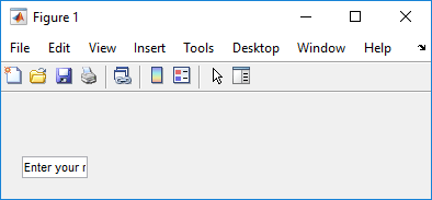
If you want to set the position or size of the component to an exact value, then modify its
Positionproperty.You specify the text font to display in the edit box by typing the name of a font residing on your system into the
FontNameentry in the Property Inspector. On Microsoft® Windows® platforms, the default isMS Sans Serif; on Macintosh and UNIX® platforms, the default isHelvetica.Tip
To find out what fonts are available, type
uisetfontat the MATLAB prompt; a dialog box displays containing a list box from which you can select and preview available fonts. When you select a font, its name and other characteristics are returned in a structure, from which you can copy theFontNameand paste it into the Property Inspector. Not all fonts listed may be available on other systems.
Static Text
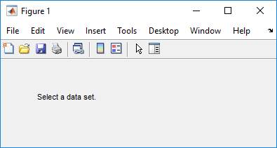
To create a static text component with text Select a data set, as shown in this figure:
Specify the text that appears in the component by setting the component
Stringproperty to the desired text, in this caseSelect a data set.
To display the & character in a list item, use two
&characters. The wordsremove,default, andfactory(case sensitive) are reserved. To use one of these as a label, prepend a backslash character (\). For example,\removeyields remove.If your component is not wide enough to accommodate the specified value, MATLAB wraps the displayed text.

If you want to set the position or size of the component to an exact value, then modify its
Positionproperty.You can specify a text font, including its
FontName,FontWeight,FontAngle,FontSize, andFontUnitsproperties. For details, see the previous topic, Edit Text.
Pop-Up Menu
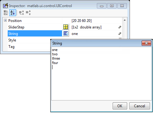
To create a pop-up menu (also known as a drop-down menu or combo box) with items one, two, three, and four, as shown in this figure:

Specify the pop-up menu items to be displayed by setting the
Stringproperty to the desired items. Click the
button to the right of the property name to open the Property Inspector editor.
To display the & character in a menu item, use two
&characters. The wordsremove,default, andfactory(case sensitive) are reserved. To use one of these as a label, prepend a backslash character (\). For example,\removeyields remove.If the width of the component is too small to accommodate one or more of the menu items, MATLAB truncates those items with an ellipsis.
To select an item when the component is created, set
Valueto a scalar that indicates the index of the selected list item, where 1 corresponds to the first item in the list. If you setValueto2, the menu looks like this when it is created: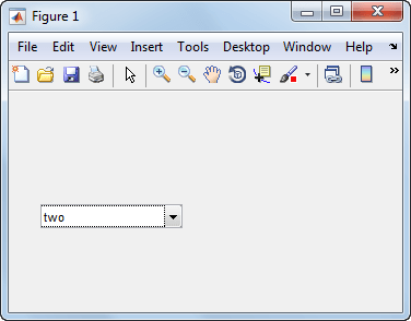
If you want to set the position and size of the component to exact values, then modify its
Positionproperty. The height of a pop-up menu is determined by the font size. The height you set in the position vector is ignored.The pop-up menu does not let you add a label. Use a Static Text component to label the pop-up menu.
List Box
To create a list box with items one, two, three, and four, as shown in this figure:
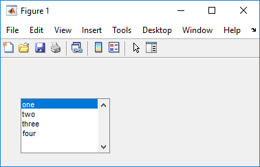
Specify the list of items to be displayed by setting the
Stringproperty to the desired list. Use the Property Inspector editor to enter the list. You can open the editor by clicking the button to the right
of the property name.
To display the & character in a label, use two
&characters. The wordsremove,default, andfactory(case sensitive) are reserved. To use one of these as a label, prepend a backslash character (\). For example,\removeyields remove.If the width of the component is too small to accommodate one or more of the specified list items, MATLAB software truncates those items with an ellipsis.
Specify selection by using the
Valueproperty together with theMaxandMinproperties.To select a single item when the component is created, set
Valueto a scalar that indicates the index of the selected list item, where 1 corresponds to the first item in the list.To select more than one item when the component is created, set
Valueto a vector of indices of the selected items.Value = [1,3]results in the following selection.
To enable selection of more than one item, you must specify the
MaxandMinproperties so that their difference is greater than1. For example,Max = 2,Min = 0.Maxdefault is1,Mindefault is0.If you want no initial selection, set the
MaxandMinproperties to enable multiple selection, i.e.,Max - Min > 1, and then set theValueproperty to an empty matrix[].
If the list box is not large enough to display all list entries, you can set the
ListBoxTopproperty to the index of the item you want to appear at the top when the component is created.If you want to set the position or size of the component to an exact value, then modify its
Positionproperty.The list box does not provide for a label. Use a Static Text component to label the list box.
Toggle Button
To create a toggle button with label Left/Right Tile, as shown in this figure:
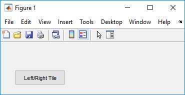
Specify the toggle button label by setting its
Stringproperty to the desired label, in this case,Left/Right Tile.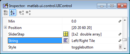
To display the & character in a label, use two
&characters. The wordsremove,default, andfactory(case sensitive) are reserved. To use one of these as a label, prepend a backslash character (\). For example,\removeyields remove.The toggle button accommodates only a single line of text. If you specify more than one line, only the first line is shown. If you create a toggle button that is too narrow to accommodate the specified
Stringvalue, MATLAB truncates the text with an ellipsis.
Create the toggle button with the button selected (depressed) by setting its
Valueproperty to the value of itsMaxproperty (default is1). SetValuetoMin(default is0) to leave the toggle button unselected (raised). Correspondingly, when the user selects the toggle button, MATLAB software setsValuetoMax, and toMinwhen the user clears it. The following figure shows the toggle button in the depressed position.
If you want to set the position or size of the component to an exact value, then modify its
Positionproperty.To add an image to a toggle button, assign the button's
CDataproperty an m-by-n-by-3 array of RGB values that defines a truecolor image. You must do this programmatically in the opening function of the code file. For example, the arrayimgdefines a 16-by-64-by-3 truecolor image using random values between 0 and 1 (generated byrand).img = rand(16,64,3); set(handles.togglebutton1,'CData',img);
where
togglebutton1is the toggle button'sTagproperty.
To manage exclusive selection of radio buttons and toggle buttons, put them in a button group. See
ButtonGroupfor more information.
Panels and Button Groups
Panels and button groups are containers that arrange UI components into groups. If you move the panel or button group, its children move with it and maintain their positions relative to the panel or button group.
To define panels and button groups, you must set certain properties. To do this:
Use the Property Inspector to modify the appropriate properties. Open the Property Inspector by selecting View > Property Inspector or by clicking the Property Inspector button.

In the layout area, select the component you are defining.
Subsequent topics describe commonly used properties of panels and button groups and offer a simple example for each component.
Commonly Used Properties
The most commonly used properties needed to describe a panel or button group are shown in the following table:
Property | Values | Description |
|---|---|---|
Position | 4-element vector: [distance from left, distance from bottom, width, height]. | Size of the component and its location relative to its parent. |
Title | Character vector (for example,
| Component label. |
TitlePosition |
| Location of title in relation to the panel or button group. |
Units |
| Units of measurement used to
interpret the |
For a complete list of properties and for more information
about the properties listed in the table, see Panel and ButtonGroup.
Panel
To create a panel with title My Panel as shown in the following figure:
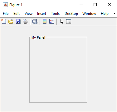
Specify the panel title by setting the
Titleproperty to the desired value, in this caseMy Panel.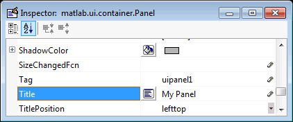
To display the & character in the title, use two & characters. The words remove, default, and factory (case sensitive) are reserved. To use one of these as a label, prepend a backslash character (\). For example,
\removeyields remove.Specify the location of the panel title by selecting one of the available
TitlePositionproperty values from the pop-up menu, in this caselefttop. You can position the title at the left, middle, or right of the top or bottom of the panel.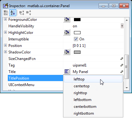
If you want to set the position or size of the panel to an exact value, then modify its
Positionproperty.
Button Group
To create a button group with title My Button Group as shown in the following figure:
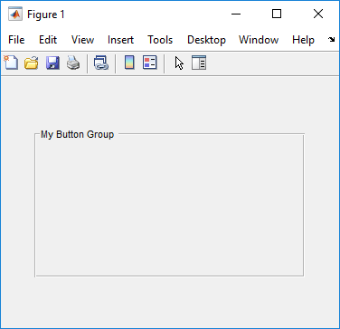
Specify the button group title by setting the
Titleproperty to the desired value, in this caseMy Button Group.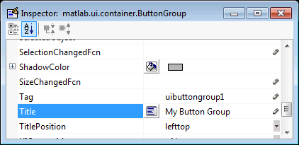
To display the & character in the title, use two & characters. The words remove, default, and factory (case sensitive) are reserved. To use one of these as a label, prepend a backslash characters (\). For example,
\removeyields remove.Specify the location of the button group title by selecting one of the available
TitlePositionproperty values from the pop-up menu, in this caselefttop. You can position the title at the left, middle, or right of the top or bottom of the button group.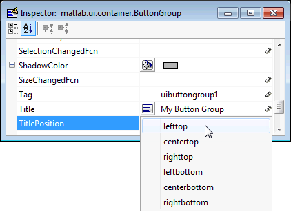
If you want to set the position or size of the button group to an exact value, then modify its
Positionproperty.
Axes
Axes allow you to display graphics such as graphs and images using
commands such as: plot, surf, line, bar, pie, contour, and
mesh.
To define an axes, you must set certain properties. To do this:
Use the Property Inspector to modify the appropriate properties. Open the Property Inspector by selecting View > Property Inspector or by clicking the Property Inspector button
 .
. In the layout area, select the component you are defining.
Subsequent topics describe commonly used properties of axes and offer a simple example.
Commonly Used Properties
The most commonly used properties needed to describe an axes are shown in the following table:
Property | Values | Description |
|---|---|---|
|
| Specifies whether plotting adds graphics, replaces graphics and resets axes properties to default, or replaces graphics only. |
Position | 4-element vector: [distance from left, distance from bottom, width, height]. | Size of the component and its location relative to its parent. |
Units |
| Units of measurement used to interpret position vector |
For a complete list of properties and for more information about the properties listed in the table, see Axes Properties.
See commands such as the following for more information on
axes objects: plot,
surf,
line, bar,
polar,
pie, contour,
imagesc, and
mesh.
Many of these graphing functions reset axes properties by
default, according to the setting of its
NextPlot property, which can
cause unwanted behavior, such as resetting axis limits and
removing axes context menus and callbacks. See Create Axes for
information about setting the NextPlot
property.
Create Axes
Here is an axes in a GUIDE app:
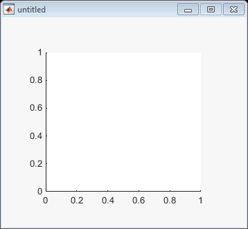
Use these guidelines when you create axes objects in GUIDE:
Allow for tick marks to be placed outside the box that appears in the Layout Editor. The axes above looks like this in the layout editor; placement allows space at the left and bottom of the axes for tick marks. Functions that draw in the axes update the tick marks appropriately.
Use the
title,xlabel,ylabel,zlabel, andtextfunctions in the code file to label an axes component. For example,xlh = (axes_handle,'Years')
labels the X-axis as
Years. The handle of the X-axis label isxlh.The words
remove,default, andfactory(case sensitive) are reserved. To use one of these in component text, prepend a backslash character (\). For example,\removeyields remove.If you want to set the position or size of the axes to an exact value, then modify its
Positionproperty.If you customize axes properties, some of them (or example, callbacks, font characteristics, and axis limits and ticks) may get reset to default every time you draw a graph into the axes when the
NextPlotproperty has its default value of'replace'. To keep customized properties as you want them, setNextPlotto'replacechildren'in the Property Inspector, as shown here.
Table
Tables enable you to display data in a two dimensional table. You can use the Property Inspector to get and set the object property values.
Commonly Used Properties
The most commonly used properties of a table component are
listed in the table below. These are grouped in the order
they appear in the Table Property Editor. Please refer to
uitable
documentation for detail of all the table properties:
| Group | Property | Values | Description |
|---|---|---|---|
| Column | ColumnName | 1-by-n cell array of character vectors | {'numbered'} | empty matrix ([]) | The header label of the column. |
ColumnFormat | Cell array of character vectors | Determines display and editability of columns | |
ColumnWidth | 1-by-n cell array or
'auto' | Width of each column in pixels; individual
column widths can also be set to
'auto' | |
ColumnEditable | logical 1-by-n matrix | scalar logical value | empty matrix ([]) | Determines data in a column as editable | |
| Row | RowName | 1-by-n cell array of character vectors | Row header label names |
| Color | BackgroundColor | n-by-3 matrix of RGB triples | Background color of cells |
RowStriping | {on} | off | Color striping of table rows | |
| Data | Data | Matrix or cell array of numeric, logical, or character data | Table data. |
Create a Table
To create a UI with a table in GUIDE as shown, do the following:

Drag the table icon on to the Layout Editor and right click in the table. From the table’s context menu, select Table Property Editor. You can also select Table Property Editor from the Tools menu when you select a table by itself.

Use the Table Property Editor. When you open it this way, the Table Property Editor
displays the Column
pane. You can also open it from the Property
Inspector by clicking one of its Table Property
Editor icons ![]() , in which case the
Table Property Editor opens to display the pane
appropriate for the property you clicked.
, in which case the
Table Property Editor opens to display the pane
appropriate for the property you clicked.
Clicking items in the list on the left hand side of the Table Property Editor changes the contents of the pane to the right. Use the items to activate controls for specifying the table's Columns, Rows, Data, and Color options.
The Columns and Rows panes each have a data entry area where you can type names and set properties on a per-column or per-row basis. You can edit only one row or column definition at a time. These panes contain a vertical group of five buttons for editing and navigating:
| Button | Purpose | Accelerator Keys | |
|---|---|---|---|
| Windows | Macintosh | ||
| Insert | Inserts a new column or row definition entry below the current one | Insert | Insert |
| Delete | Deletes the current column or row definition entry (no undo) | Ctrl+D | Cmd+D |
| Copy | Inserts a Copy of the selected entry in a new row below it | Ctrl+P | Cmd+P |
| Up | Moves selected entry up one row | Ctrl+ Up Arrow | Cmd+ Up Arrow |
| Down | Moves selected entry down one row | Ctrl+ Down Arrow | Cmd+ Down Arrow |
Keyboard
equivalents only operate when the cursor is in the
data entry area. In addition to those listed above,
typing Ctrl+T or
Cmd+T selects the entire field
containing the cursor for editing (if the field
contains text).
To save changes to the table you make in the Table Property Editor, click OK, or click Apply commit changes and keep on using the Table Property Editor.
Set Column Properties. Click Insert to add two more columns.

Select Show names entered below
as the column headers and set the
ColumnName by entering Rate,
Amount, Available, and Fixed/Adj in Name group. for the
Available and Fixed/Adj columns set the
ColumnEditable property to
on. Lastly set the
ColumnFormat for the four
columns.
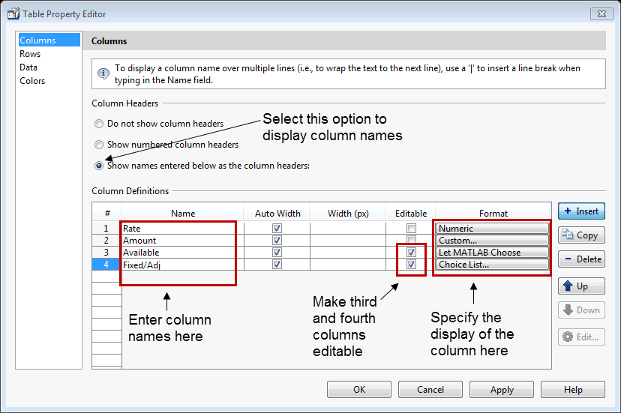
For the Rate column, select Numeric. For the Amount Column select Custom and in the Custom Format Editor, choose Bank.
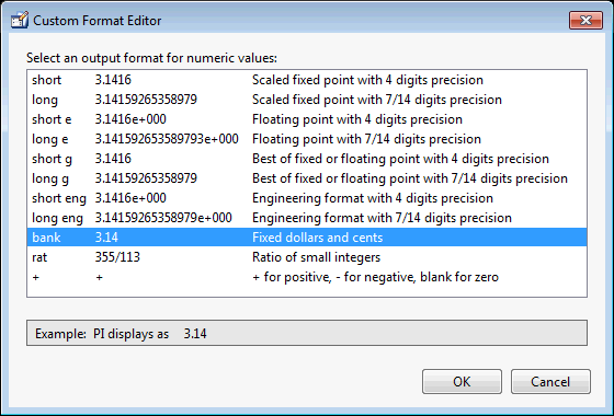
Leave the Available column at the default value. This
allows MATLAB to chose based on the value of the
Data property of the table.
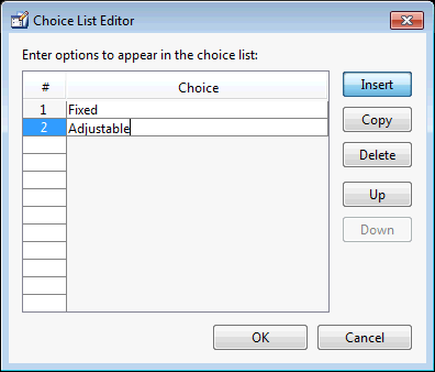
For the Fixed/Adj column select Choice
List to create a pop-up menu. In the
Choice List Editor, click
Insert to add a second
choice and type Fixed and Adjustable as the 2
choices.
Note
For a user to select items from a choice list,
the ColumnEditable property
of the column that the list occupies must be set
to 'true'. The pop-up control
only appears when the column is editable.
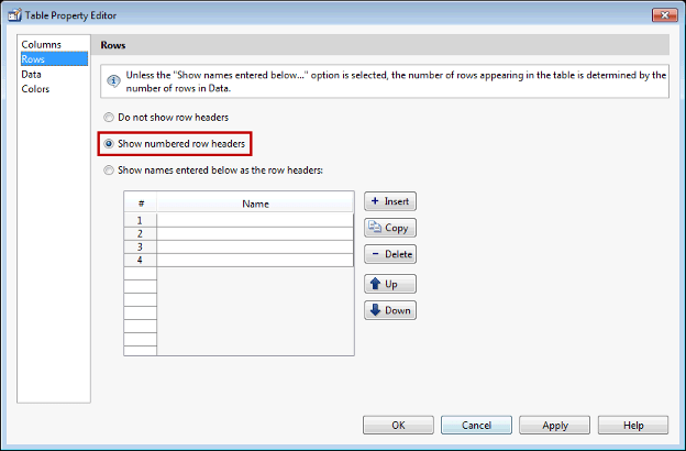
Set Row Properties. In the Row tab, leave the default
RowName, Show numbered row
headers.
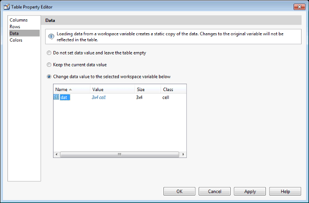
Set Data Properties. Use the Data property to specify
the data in the table. Create the data in the
command window before you specify it in GUIDE. For
this example, type:
dat =  {6.125, 456.3457, true,  'Fixed';...
6.75,  510.2342, false, 'Adjustable';...
7,     658.2,    false, 'Fixed';};
In the Table Property Editor, select the data that you defined and select Change data value to the selected workspace variable below.
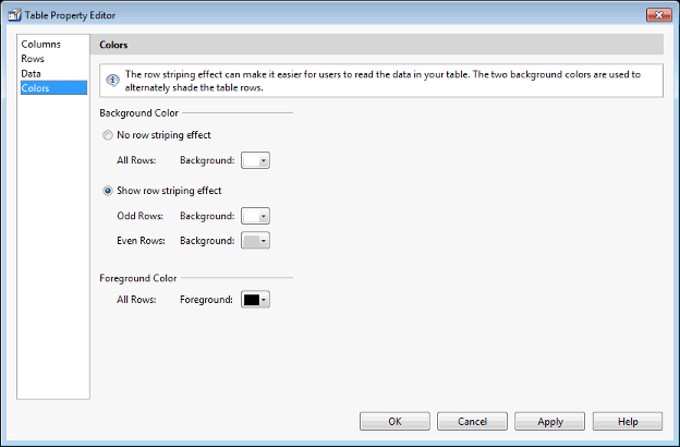
Set Color Properties. Specify the BackgroundColor and
RowStriping for your table in
the Color tab.
You can change other uitable
properties to the table via the Property
Inspector.
Resize GUIDE UI Components
You can resize components in one of the following ways:
Drag a Corner of the Component
Select the component you want to resize. Click one of the corner handles and drag it until the component is the desired size.

Set the Component's Position Property
Select one or more components that you want to resize. Then
select View > Property Inspectoror click the Property Inspector button
![]() .
.
In the Property Inspector, scroll to the
Unitsproperty and note whether the current setting ischaractersornormalized. Click the button next toUnitsand then change the setting toinchesfrom the pop-up menu.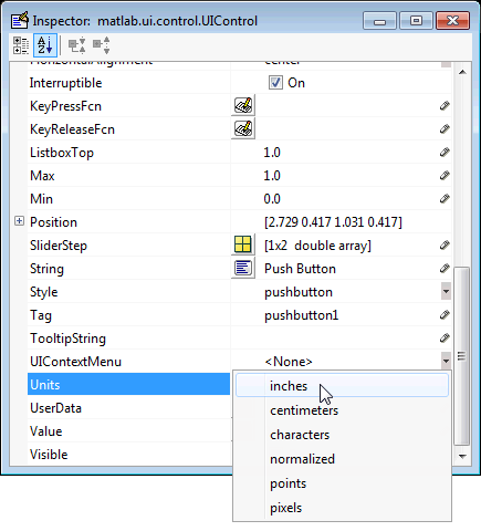
Click the + sign next to
Position. The Property Inspector displays the elements of thePositionproperty.
Type the
widthandheightyou want the components to be.Reset the
Unitsproperty to its previous setting, eithercharactersornormalized.
To select multiple components, they must have the same parent.
That is, they must be contained in the same figure, panel,
or button group. Setting the Units
property to characters (nonresizable UIs)
or normalized (resizable UIs) gives the
UI a more consistent appearance across platforms.
